Bandai Co. is a toy company based in Taitō, Tokyo, Japan. Earlier, it became very successful as a video game company. Several ex-Bandai group companies are known for their anime and tokusatsu programs.
Meaning and history

The history of the brand can be traced back to 1947, when Naoharu Yamashina started working for a textile wholesaler. Eventually, Yamashina and his wife managed to create a modest toy distribution division as part of the textile business.
In the summer of 1950, the toy division was spun off as an independent company called Bandai-ya.
What is Bandai?
Bandai is the name of a Japanese toy manufacturer, which was established at the end of the 1940s in Tokyo. Today the company operates internationally and has several sub-brands, specializing in the production of toys and collectibles.
1950 – 1959
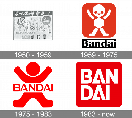
The original Bandai logo, designed in 1950, stayed active for nine years, and featured a monochrome composition, with the drawing of a girl, playing with a ball, and lettering in Japanese set all over the badge, including the main inscription in white, set along with the narrow solid stripe at the top of the badge.
1959 – 1975
While the original Bandai logo was centered on a stylized depiction of a toy, it did have something sinister about it. It was like when the toy theme is used in horror movies. The effect resulted partly from the red color, the color of the blood, and partly from the fact that all the parts of the toy were separated from each other.
Also, the creature had huge eyes, as if it had been scared. Also, the parts of the toy were pretty different from one another, so it looked as if the “toy” was a sort of Frankenstein (compare, for instance, the circular head and the rounded arms with the strict angles of the hexagon body).
1975 – 1983
The logo grew more harmonious in many respects, yet preserved its sinister “dismembered” style.
On the one hand, all the parts of the body now looked consistent and proportional. They were softly rounded, which looked pretty natural, and there were no harsh and unnatural angles, like the hexagon body in the previous version.
And yet, the head was still apart from the body. And, as if to make matters worse, the lettering “Bandai” clearly and uncompromisingly broke the body into two separate parts.
The red color didn’t make things any better.
1983 – Today
Luckily, the poor dismembered figure disappeared. The designers, however, preserved the original red color. Also, the shape of the letters (notably, the “A’s”) was undoubtedly inspired by the 1961 logo. While the way the horizontal bar is joined to the sides of the “A” is slightly different, you can still recognize the unique and dynamic structure.
Font
The 1978 logo is mostly typographic (except for the red box in the background), so the choice of typeface becomes more important than in a typical logo with an emblem. The font is clean and legible. It would have looked generic if not for the recognizable “A’s.”
Colors
The red color, which has been the main color of the Bandai logo since its debut, is immensely popular in logo design. While in the earlier versions, it added an eerie touch, the 1978 version looks pretty normal. You can come across a blue or black-and-white variation, too.


