Aviva plc is a British insurance company seated in London. It was founded in 2000 by the merger of Norwich Union, founded back in 1792, and the Commercial and General Union.
Aviva can trace its history back to the establishment of the Hand in Hand Fire & Life Insurance Society in London in 1696.
Today Aviva plc is the fourth-largest insurance company in Great Britain in the world rating it occupies the fourth place. The company operates in the fields of insurance, investment and savings services and it is recognized as the leader in life and pension insurance in Europe. Its yearly turnover in 2010 was about 91 billion US dollars while the net income reached 2,95 billion US dollars.
Meaning and history
Aviva, a prominent multinational insurance company, was founded by the merger of two British insurance firms, Norwich Union and CGU plc, in 2000. This strategic unification brought together over three centuries of experience in the insurance sector, with Norwich Union tracing its origins back to 1797. The creation of Aviva marked a significant moment in the history of insurance, blending tradition with a modern approach to financial services.
Throughout its history, Aviva has achieved numerous milestones. Notably, it expanded its global presence, establishing a strong foothold in Europe, Asia, and Canada. This expansion was complemented by a series of acquisitions and partnerships that broadened its range of services, making it a comprehensive provider of insurance and financial products. Aviva’s commitment to digital innovation and customer service excellence has been a consistent theme, driving its success and industry recognition.
Currently, Aviva holds a commanding position in the insurance industry. It’s recognized for its diverse range of products, including life insurance, general insurance, and asset management. The company’s focus on sustainable business practices and its proactive approach to addressing contemporary challenges like climate change further enhance its reputation as a forward-thinking and responsible corporate entity. Aviva’s enduring commitment to its customers, shareholders, and the wider community cements its status as a leading figure in the global insurance landscape.
What is Aviva?
A multinational insurance giant, Aviva specializes in life, general insurance, and asset management. Known for its innovative approaches and sustainability focus, it plays a pivotal role in the global insurance industry.
1696
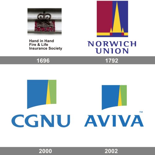
The logo is a classic emblem for the Hand in Hand Fire & Life Insurance Society, one of the oldest insurance companies. The mark features two hands clasped in a handshake, symbolizing trust and mutual agreement, which are core values of insurance. Above the hands is a regal crown, adding a sense of authority and protection. Below this emblem, the name of the society is spelled out in a traditional serif font, which is simple and unembellished, directing all attention to the symbolism of the fire mark above it.
1792
The logo represents the Norwich Union, which was a major insurance group. The logo is a modernist abstraction with a vertical bisecting design, splitting the canvas into two blocks of color: a deep crimson on the left and a royal blue on the right. Overlapping these blocks is a golden chevron pointing upwards, flanked by two smaller chevrons, creating an arrow-like motif that suggests progress, upward movement, and prosperity. The base of the chevrons aligns with a golden line that runs along the bottom of the logo, grounding the design and adding stability. The company’s name is presented below the graphic element in a bold, capitalized sans-serif font, with a color that complements the blue of the logo, signifying reliability and trust. The geometric shapes and use of primary colors reflect a sense of strength, tradition, and solidity.
2000 – 2002
Aviva logo was developed in 2000 after the merger of Norwich and Commercial and General Unions. It had an emblem and the company name in block letters. Initially, it was the abbreviation of the names of the companies that had composed the new venture: CGNU.
The emblem was made in the form of a rectangle with an arched bottom line composed of three vertical fields. The left one, which was the largest of all three, was made in deep admiral blue colour. The right one, much narrower, was in dark green. In between the two fields, there was a cone with its sharp end pointed upward. It was in light yellow. The cone was referred to the previous logo of Norwich Union, where it used to be a part of a Gothic spire. Thus, it was regarded as a unity of a modern logo style with a traditional one, underlining the everlasting history of the company with a long history.
2002 – now
In 2002 the name Aviva was adopted. The word is of Hebrew origin meaning “springtime”. Accordingly, the company logo was changed. Now it had the name “AVIVA” in block letters under the same emblem taken from the 2000 version. Nevertheless, the emblem’ colour palette was also modified. The left field became light cobalt blue, the spire took the honey yellow tone and the right part was had a light chartreuse green tone.
The wordmark letters were made in elegant serif font very close to the commercial Mart Ultra and the colour was also changed to light cobalt blue as the left part of the emblem.


