Apink is a South Korean girl group, which made a debut in April 2011.
Meaning and history
The debut extended play Seven Springs of Apink released in the spring of 2011 already featured their earliest, “black,” logo.
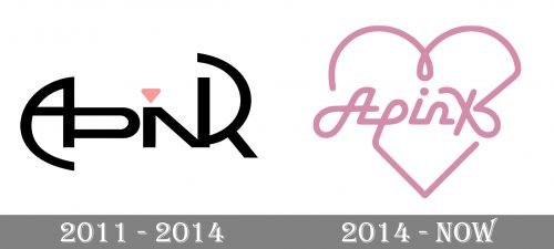
2011 – 2014
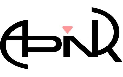
It featured the name of the group made up of two glyphs. The first glyph was formed by the interlaced (or overlapping) letters “A” and “P,” while the second glyph was a combination of the “I,” “N,” and “K.” How did the designers join the letters within a single glyph? The decision was pretty simple: the letters shared one of their vertical lines. For instance, the right side of the “A” also formed the left line of the “P,” while the left line of the “N” also formed the “I.”
The logo had a visual rhythm due to the similar curves of the initial letter, the “A,” and the final letter, the “R.” The only pink element, the diamond “dot” above the “I” formed the center, implying some sort of symmetry. All this made the design stylish and memorable.
On the downside, the intricate style worsened the legibility. You would have hardly figured out the name of the band unless you were already familiar with it. Also, the multiple sharp angles didn’t look as delicate and feminine as the members of the groups.
You can spot this version of the logo on the covers of their LPs and albums (Snow Pink from 2011, for instance), while quite a few other releases did not include it (their debut full-length studio album Une Année from 2012 and their third mini-album Secret Garden from 2013, to name just two).
2014 – now
The logo exists in at least two versions, a full one, and a short one.
The full logo includes the name of the band placed inside a stylized heart. In the short version, the heart is not used.
The updated design loses the symmetry and rhythm of its predecessor. In return, it gets a tender, unmistakably feminine style. You can feel it in the soft curves of the glyphs, in the muted pink color, to say nothing of the heart shape. The wordmark seems to have been formed by a ribbon, which only reinforces the sweet feminine style.
Also, there is a provocative touch, which appears due to the way the “k” looks (it is similar to a bow and tempts you to untie it).
While the legibility of this version is much better than that of its predecessor, the “k” glyph still looks more like an “x.” In other words, you still can’t figure out the name of the group from its logo, unless you already know it.
Some of the releases where the “ribbon” Apink logo can be seen on the cover include their second full-length studio album Pink Memory, the debut Japanese album Pink Season, mini-albums Pink Luv (2015) and Pink Up (2017), to name just a few.


