“ANZ” stands for “Australia and New Zealand Banking Group”, which is Australia’s third-largest bank.
Meaning and history
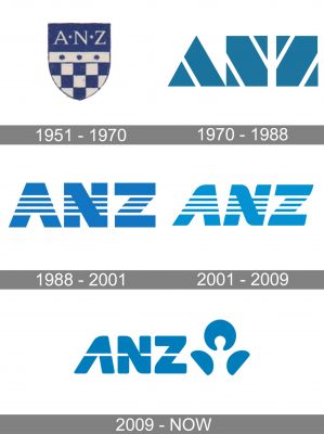
The ANZ visual identity has had several very interesting redesigns throughout the bank’s history, and only the original logo version was traditional and calm, while all the following emblems were all about strength, progress, and individuality.
1951 – 1970
The very first logo for ANZ, created in 1951, was composed of a classy crest in dark blue and white, where the bottom part featured a checkered pattern, and the upper horizontal banner in blue comprised a white elegant lettering in a serif typeface. Between the two parts of the crest the thick white line, outlined in thin blue was located, having three rounded figures in blue in it. It was a simple yet very elegant badge, evoking a sense of professionalism and stability.
1970 – 1988
The redesign of 1970 brought a completely new style and concept to the ANZ logo. It was a modern stylized “ANZ” inscription in sea-blue and white, where the letters were replaced with geometric figures — a triangle and two squares. Each of the figures had white diagonals on it, to create a contour of the needed letter. It was an unusual and brave logo, which made the bank stand out in the list of competitors, showing its progressiveness and determination.
1988 – 2001
In 1988 the logotype was redrawn. The sea-blue shade was changed into a bright blue, reflecting freshness and lightness. And the geometric figures were switched to the bold sans-serif lettering, where the massive shapes featured four thin white stripes, placed horizontally. It was a representation of movement, speed, and dynamics, with which the bank was changing to satisfy its customers’ needs.
2001 – 2009
The logo was redesigned again in 2001. The blue shade became lighter and the typeface of the lettering was switched to a smoother one. The italicized inscription has some angles of its letters rounded, while the others stayed straight. It made the logo more elegant and delicate, showing the reliability, attention, and loyalty of the bank to its clients.
2009 – Today
The four horizontal white lines were replaced by one in 2009. The blue color was elevated again, and the contours of the letters — refined. The most significant change of this year was an emblem, which is now placed on the right from the inscription. The emblem featured the same blue and white color palette and depicts an abstract figure, which resembles a person or a flower — composed of a solid blue circle with a white drop on the bottom and two smooth petals under it.
The 2009 symbol
The brand identity update was meant to emphasize that ANZ is a “super regional” and “people-shaped” bank. The most notable modification included the introduction of a three-part emblem in blue. The lettering “ANZ” now wasn’t italicized, while the four stripes were replaced by a single stripe.


