Amil is Brazil’s largest health insurer and part of UnitedHealth Group. The brand was established in 1978 by Edson Bueno. In 2012, UnitedHealth Group and Amil Participações completed the first phase of their merger. Today, the number of customers of Amil is over 6,2 million, while the number of client companies is more than 363 thousand, according to the insurance company’s official website.
Meaning and history
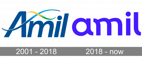
If you compare the Amil logo adopted in 2018 with its predecessor, you will notice the tendency to simpler patterns. The older logo is more detailed and sticks to a calmer palette than the following one.
What is Amil
One of the largest health insurance organizations in Brazil, Amil is owned by UnitedHealth Group, which, in its turn, is the largest healthcare organization in the world with over 140 million customers in more than 130 countries. Amil is headquartered in Rio de Janeiro, Brazil, while its parent company is based in Minnetonka, Minnesota, US.
2001 – 2018
The design is dominated by the wordmark in a muted shade of blue with a pronounced gray admixture. The letters, except the initial, are lowercase. All of them belong to a sans serif typeface with classic proportions. While the type is rather minimalist, you can still notice some variation in the thickness of the lines. There’s hardly anything unique in this type, apart from maybe the connections of the elements in the top part of the “m.”
The emblem, which is placed above, can be described as a pair of crisscrossed waves. While we can suggest many interpretations here, the most obvious one seems to be that that’s a DNA strand. It goes without saying that the waves here don’t in actual fact form a helix, but still, they bear an uncanny resemblance to the way the DNA helix is typically drawn.
The colors of the waves, yellow and green, create a bright accent in the otherwise rather dull (or should we say “serious”?) logo. However, even these typically vivid colors here are softened, to fit the grayish blue of the wordmark.
2018 – present
In terms of the palette, the updated version is in stark contrast to its predecessor. There’s only a single color left, and it is strikingly bright and clean. It’s a mixture of blue and purple often referred to as blurple.
The shape of the Amil logo has been modified, too. The helix is gone, while the wordmark has been redrawn. Now, all the letters are lowercase, and they are softer, more rounded. You can notice it, for instance, in the lower right-hand end of the “a,” at the upper left-hand end of the “m” or the lower end of the “l.”
One of the reasons behind the softer shape could be that the company wanted to “dilute” its seriousness and its business-like style – after all, it’s working with people and deals with a highly specific area, where all of us may feel vulnerable and where we may need support. Also, the rounded details look like links in a cursive script. This makes the wordmark resemble something written by hand, which adds a personal touch. The personal impression is also beneficial when it comes to a healthcare company.
Colors and font
In spite of its simplicity, the typeface is also meaningful as it conveys the message of a personal approach. The vivid color of the Amil logo helps it stand out and catches your eye.


