Following the merger with Fidelity Southern Corporation in 2019, the logo of Ameris Bank was redesigned. The updated brand identity reflects the heritage of both companies.
Meaning and history
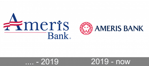
The previous Ameris Bank logo contained two pictorial elements supposed to have symbolical meaning. The first one was a banner replacing the horizontal bar of the initial “A.” Apparently, it was supposed to be a flag and conjure up patriotic associations. The other distinctive feature was the letter “i” that represented a human figure. This meaning appeared because of the two “hands” the letter had.
Also, the logo featured a thin red bar below the word “Ameris.” The palette was inspired by the Flag of the United States.
While the symbolic message behind the two icons was clear and desirable for the bank, the design seemed somewhat cluttered. Probably that was too much to be grasped at a single glance.
…. – 2019

The original long-term logo was mostly the company name written serif letters, although there were quirks. Firstly, ‘Bank’ was written in much smaller letters and directly below the word’s right end. The rest of ‘Ameris’ (or its bottom’s) was emphasized with a thin red line.
The central line in its letter ‘A’ was replaced with a red-white-red ribbon image. The ‘I’ had two unnecessary extensions above, as if it was a capital letter, as well as a lowercase one. It was made so that the letter could look like a little person. Except for the red portions, the logo was completely blue to fit the colors of the American flag.
2019 – Today

The redesigned emblem was developed by Matchstic, a brand identity company based in Atlanta, Georgia. The company was supposed to create a single logo combining those of Ameris Bank and Fidelity Bank.
The old logo of Fidelity Bank featured a lion (a pretty sad one, we should say) and the name of the company in a rather bold serif. The word “Fidelity” was smaller than the word “Bank.” The red color, which was the only one used in the logo, looked darker than that of the Ameris Bancorp logo.
The new design dropped the human “i” and banner of the Ameris emblem. The only pictorial emblem is now the lion. This time, the lion does not look sad. There are fewer details, and the overall impression of the design is more positive. The proportions, the position of the eyes and ears seem more natural.
Colors
The 2019 Ameris Bank logo has preserved the original color scheme inspired by the US flag.


