AirAsia is the name of a low-cost air carrier, which was was founded at the end of 1993 by the Malaysian State Corporation, although the flights of the company started only in 1996. Today AirAsia is the largest airline in Malaysia.
Meaning and history
AirAsia is the largest and the most well-known low coaster in Malaysia, which was established in the middle of the 1990s. AirAsia was for a long time a local carrier and only took on international destinations in 2003. Thailand was the first on the list. In 2004, China, Indonesia, and the Philippines joined the schedule. Then every year a few more countries were added. Today the air carrier flies to 78 destinations in 25 countries,
What is AirAsia?
AirAsia is the largest low-cost air carrier in Malaysia, which was founded in the middle of the 1990s. Today the company has flights to more than 20 countries all over the globe, but still keeps the local destinations as the priority.
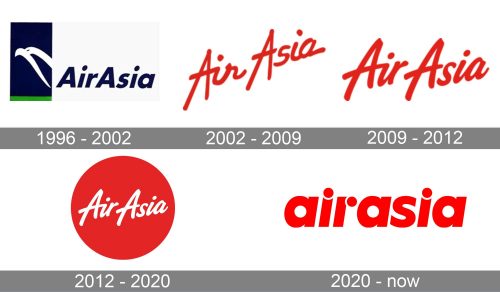
In terms of visual identity, the AirAsia logo has gone through a couple of modifications, but the overall style has remained the same. The company chooses bright colors as the main element of its corporate design.
1996 – 2002
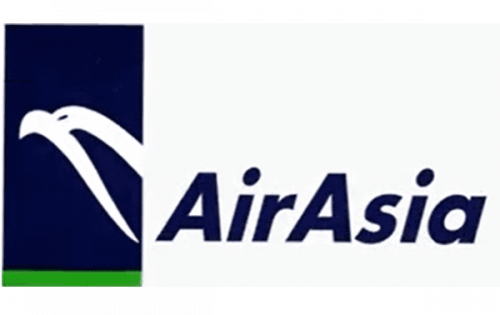
The very first AirAsia logo was designed in 1996 and stayed with the air carrier for a bit more than five years. It was the only badge, not in the red and white color palette. The logo features a combination of a solid blue vertically set rectangular with a thin green line at the bottom and a white contour of a bird on it. The emblem was followed by bold italicized lettering in a simple yet modern sans-serif typeface.
2002 – 2009
The redesign of 2002 introduced a completely new approach to logo design. The new badge of the airlines featured the name of the brand in a handwriting-inspired script, set diagonally in scarlet-red. There were no graphical elements on the logo, and it resembled the iconic Virgin insignia. The badge stayed with AirAsia for six years and became the founder of the new corporate color palette.
2009 – 2012
In 2009 script was slightly modified, although its casual style was preserved. The angle of the lettering was also changed, and now the wordmark was set almost fully horizontally. The bolder lines of the letters and the straight disposition made the badge look more stable and professional, showing the air carrier as a solid and confident company with traditional values.
2012 – 2020
While there have been no notable modifications in the way the words “Air Asia” are written, a new element has appeared in the logo – a large red circle. The solid circle became the background for the white logotype, which was set over it in bold lines, looking more delicate than on the previous version.
2020 – Today
The redesign of 2020 has introduced a completely new badge of the air carrier, with the logotype set in lowercase letters. The custom italicized sans-serif typeface features bold lines and stable shapes, with a few unique details, which make the logo instantly recognizable. The massive dots above both letters “I” are slightly overlapping the vertical bars, creating white “smiles”. The same approach is used with the letter “R”, where the dot overlaps the vertical bar on the right, creating a vertical white arch.
Font and color
The stylish and unique lowercase inscription from the primary badge of AirAsia is set in a custom designer typeface, which is based on a traditional bold sans-serif font. The italicized lettering is decorated by three solid circles, overlapping the main bars of the characters in both “I”s, and the “R”. The closest fonts to the one, used in the AirAsia insignia, are, probably, FF Neuwelt Black Italic, Oceanwide Pro Heavy Titled, or Brother Heavy Italic, but with some modifications of the contours.
As for the color palette of the AirAsia visual identity, it is based on a very intense and bright shade of red, which elevates the dynamic mood, brought to the badge by the slanted letters, making it stand out in the list of competitors, and shows the company as a powerful and progressive one.


