AIA is one of the Asian largest insurance companies, which was established in 1919. Today the corporation, headquartered in Hong Kong, has 18 subsidiaries and operating offices across the region, where provides its customers with not only insurance but financial services as well.
Meaning and history
In 2009, American International Group, the largest U.S. insurance company, decided to spin off AIA Group, a Hong Kong-based life insurer, into a separate company. Already at that time, AIA was serving 20 million customers and managing more than 60 billion USD in assets.
Today the company has almost 24 thousand employees and more than 300 thousand insurance agents, particularly in Australia, China, Hong Kong, India, Indonesia, Malaysia, South Korea, and New Zealand.
What is AIA?
AIA is the name of the Asian division of American International Group Inc, one of the largest insurance companies. AIA was established in 2009 and by today has grown into the second largest insurer by market capitalization in Asia.
1983 – 2008
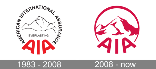
The very first AIA logo was introduced in 1973 and looked pretty much the same as the emblem we all can see today. It was a monochrome abstract image of a mountain peak, executed in black lines on a white background and enclosed into a circular frame formed by a black “American International Assurance” wordmark in bold sans-serif, and an enlarged stylized red “AIA” in smooth thick lines arched along the bottom side of the circle. The “Everlasting” wordmark was set under the mountain image, also in black.
2008 – now
The company’s visual identity is bright and neat, reflecting the essence and principles of the firm. Its logo is composed of a circular emblem with a wordmark placed on it.
The corporate AIA logo is based on the image of the Mount Everest, the highest mountain in the world and a symbol of peace and hope. For the famous brand is it also a reflection of the corporation’s solidity and power.
The current emblem was designed in 2008, modifying the version of 1983, but making it stronger and more modern. The previous version of the logo consisted of a black mountain contour, enclosed in a red circle, with a black wordmark placed above its perimeter and the company’s name in bold red letters on the bottom of the circle.
Today the corporate visual identity is based on a red and white color palette and features a minimalist version of the previous logo. The red circle outline contains a red mountain contour, placed on a white background. The “AIA” lettering is written on the bottom part of a round frame.
The red and white color combination of the emblem is a reflection of power, energy and passion, which evokes a sense of professionalism and progressive approach.
The sleek and confident lines of the company’a visual identity make it timeless and strong, creating a sense of trustworthiness and value of the firm’s customers’ comfort and well being.
Font
The bold custom wordmark in all capitals is executed in a smooth sans-serif typeface with rounded angles and clean lines. The font is very close to Nizzoli Alt Black, but modified — with horizontal bars of both letters “A” arched to the bottom.
The thick soft lines of the inscription make the logo look modern and solid, being a perfect reflection of an influential company and its essence.
Review
AIA is a big and reputable insurance company, which provides life and accident insurance along with health insurance one other product. The company serves individual and corporate customers throughout the Asia-Pacific region.
The group is considered to be the largest independent insurance organization, operating in the region, with about 160 billion USD of assets. The company operates in 18 markets, including Hong Kong, Thailand, Singapore, China, Korea, and Australia, and has almost 30 million individual customers along with more than 15 million group insurance members.
AIA doesn’t its best to meet the needs of individual clients in insurance and saving plans, and also provides corporate assistance including employee benefits, credit life, and pension services.


