Aflac is one of the largest American insurance companies, which was established in 1955 in Georgia. The company is most known for providing supplemental insurance assistance and a wide range of policies available. The group has an annual revenue of around 30 billion USD and more than 10 thousand employees worldwide.
Meaning and history
The Aflac visual identity is friendly and funny. Its instantly recognizable logo consists of a wordmark with a memorable emblem, placed over the lettering.
The famous company’s mascot, the Duck, in order to get more attention and increase the brand’s recognition. The Duck advertisings are friendly and always evoke a smile, creating a kind and happy mood.
The Duck is known to symbolize happiness and fidelity, it also represents resourcefulness and reflects flexibility and success. But the famous today such has not always been on the company’s logo. The Aflac visual identity has not very long, but interesting history of logo designs.
What is Aflac?
Aflac is the name of an American company, which was established in Georgia in the middle of the 1950s, and has been engaged in the provision of insurance services since the first days of its history. Today the company is one of the largest in the United States in its segment.
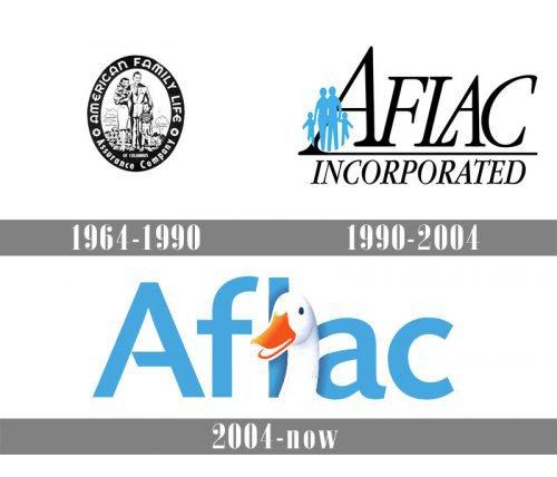
1964 – 1990
Thought the company was organized in 1955, its first logo was lost by today, but more likely it consisted of a simple monochrome wordmark, saying “American Family Life Insurance Company”, as it was the original name of the corporation.
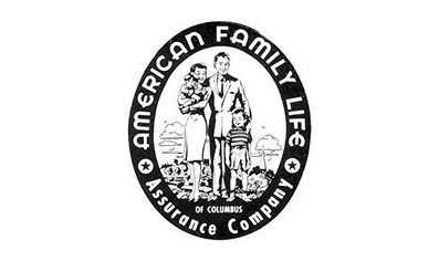
The logo was redesigned in 1964 in order to stand out in the list of the company’s competitors. The logo of those years was composed of an oval emblem with a thick outline and a very detailed image of a happy family with two kids. The wordmark was placed around the outline and contained a full company’s name.
The black and white color scheme of the original emblem reflected professionalism and confidence of the insurer, and the happy smiles of the people on the image added a sense of joy and reliability.
1990 – 2004
The logo was redesigned in 1990, as well as the name of the company was changed to Aflac. It was an abbreviation of the original name, but with “Insurance” replaced by “Assurance”.
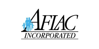
The new logo was executed in a more modern and professional way, depicting a large-sized nameplate in black, with a delicate emblem. The emblem was composed of four silhouettes — a family with two kids — executed in a light blue color and placed over the first letter “A” of the inscription.
It was a pretty simple and laconic example of the visual identity design, which was representing a successful company and its trustworthiness and authority.
The wordmark was executed in a thin and elegant serif typeface, which is very similar to Garamont Amst SB Italic with its distinct serifs elongated and its lines clean and neat.
2004 – Today
The latest redesign of the Aflac’s visual identity was held in 2004. And that is when the iconic mascot appeared.
The Duck was designed by Kaplan Thaler Group in 1999 and first was seen in the advertising, taking its official place on the company’s logo only five years after.
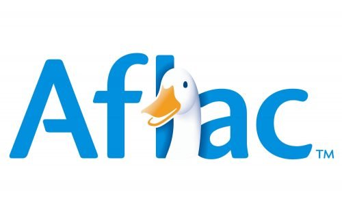
The new logo is composed of a light blue wordmark with a three-dimensional duck’s head placed over the letter “L”. The Duck is drawn half-turn, facing left and looks like it is smiling.
The white and blue color palette of the company’s visual identity with a bright orange accent (the duck beak) adds freshness and vitality to the logo, reflecting a responsible and reliable brand, which values its customer’s life and comfort above all.
Font
The company’s wordmark is executed in a bold sans-serif typeface, which is very similar to Today’s fonts family, but with the letter, “A” modified. It has its horizontal bar cut diagonally on the left, which adds lightness and individuality to the brand’s logo and makes it playful and crispy.
The font featured straight neat lines and distinct contours of the letters with its traditional cuts and rounded shapes. It looks professional and evokes a sense of expertise.
Review
The huge American company has its subsidiary in Japan, which enables it to serve clients in North America and Asia and provide them with the best insurance products.
Started in the 1950s as a small family business, Alfac grew into one of the most influential groups in the United States and took its place in the Fortune500 list. Today the company’s clientele includes not only individuals but also more than 400 thousand commercial organizations in the USA, Japan, and Puerto Rico.
The company works mostly in the supplemental insurance service segment for those, who already have general medical or primary coverage. The corporation’s products include life insurance, accident, and disability plans, cancer, critical illness, and recovery policies, along with short-term disability, sickness and hospital indemnity and intensive care, and various dental plans.
The Alfac Group has its website and mobile application, which provide its customers with all the information needed and makes the process of getting policies easier and faster. The company uses all the innovative technologies in order to improve its services and make its clients’ feel protected.


