While the logotype of the German manufacturer of electrical equipment AEG has always been based on the company’s name, its overall look has changed a lot over its more than 110-year history.
Meaning and history
AEG is an abbreviation of German for Allgemeine Elektricitäts Gesellschaft, which stands for Allgemeine Elektricitäts Gesellschaft. Today, it is a company that specializes in the electric power industry and mechanical engineering. It also became known for its products for the home. Before and during World War I the company was also considered the largest manufacturer of weapons.
The history of AEG begins in 1883. At that time, German engineer Emil Rathenau, who later became the founder of the German industry, bought a license from the American inventor Thomas Edison to manufacture the electric light bulb in Germany. That same year he founded the Deutsche Edison Gesellschaft, the German Edison Company. Two years later DEG builds its first power plant.In 1887 the company was renamed AEG. Allgemeine Elektricitats-Gesellschaft.
Today AEG is known all over the world as one of the most prestigious brands in many European countries. The company produces the widest range of equipment. This includes a variety of household appliances, electrical equipment, water purification equipment, equipment to create an optimal indoor climate, and other equipment, which has found application in a variety of areas of human activity.
What is AEG?
AEG is one of the oldest electron manufacturers in Europe, which was founded in 1883 in Germany. The name is derived from Allgemeine Elektrizitäts-Gesellschaft, which means “General Electric Company.” Today the domestic appliances of AEG are distributed all over the globe.
1896

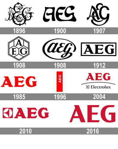
One of the earliest versions of the AEG logo, which was adopted in 1896, featured the letters “AEG” in an intricate vintage script. Charming as it was, the logo was hardly legible. The same problem took place in case of the 1900 and 1908 logotypes, although, unlike their predecessor, they didn’t look like a medieval monogram.
1900 — 1907

The following version was not as intricate, although it was still far from being simple. Here, the multiple curls and flowers disappeared, but the letters still had quite an unusual shape. We should also say they weren’t very legible, especially the “g,” which could have been easily mistaken for the “s.”
1907 — 1908
The logo was redrawn, but it still remained what it was – a monogram with elegant and unusual letters. This time, they were partly overlapping.
Also, we can add that the typography in the previous version had a slightly futuristic touch, while the 1907 version had classic elegance.
1908
The letters of the company’s name were placed over a honeycomb pattern, each glyph in a separate hexagon. The glyphs were block capitals with serifs.
1908 — 1912

The block capitals were replaced by lowercase cursive letters. They were placed inside an ellipse formed by an extended end of the “g.” The design looked refined and more “human” in comparison with its predecessor.
1912 — 1985

The 1912 logo designed by Peter Behrens has been actually the core of all the logotypes used by the company until now, with minor modifications in 1985, 1996, 2004, and 2010.
1985 — 1996
The frame disappeared, while the wordmark became red. It was a very vivid and eye-catching shade.
1996 — 2004
The wordmark was rotated 90 degrees counterclockwise and placed inside a red rectangle standing on its narrow side. The letters became white.
2004 — 2010
Once again, the letters were red and were oriented horizontally. The red rectangle was gone. Below the wordmark, the logo of the parent company, Electrolux, appeared.
2010 — 2016
The name “Electrolux” disappeared, but its emblem stayed next to the AEG wordmark.
2016 — Today

The 2016 redesign brought about a simpler AEG logo. Nothing was left, but the three red letters on the white or charcoal background. It has been the first time when the font has been heavily modified.
Font and Color
The bold and sleek uppercase lettering from the primary AEG logo is set in a fancy custom sans-serif typeface, with some distinctive unique details, which make the short minimalistic inscription look super powerful and memorable: the closest fonts to the one, used in this insignia, are, probably, Gamer Light, or Artica Pro Black, but with some significant modifications of the characters’ contours.
As for the color palette of the AEG visual identity, it is based on a deep and muted shade of red, which stands for strength and excellence, and also adds warmth and passion to the overall image, showing the company as a reliable and professional one.
Unlike the classic 1912 version of the logo featuring a serif typeface, the current one sports a simpler sans serif font resulting in a clearer, more minimalistic wordmark.


