Advance Auto Parts is the name of the American retail company, which was established in 1932 and specialized in selling second-hand automobile parts. Today the company has almost 5 thousand locations across the United States and Canada and has a pretty good reputation on the market.
Meaning and history
1953 – 1955
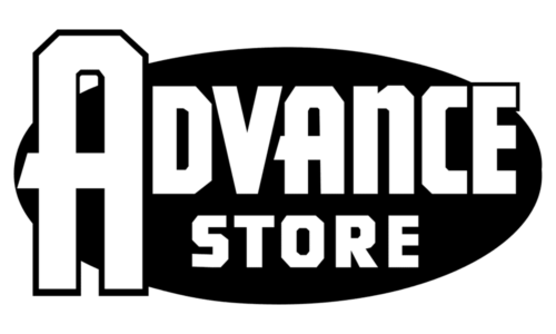
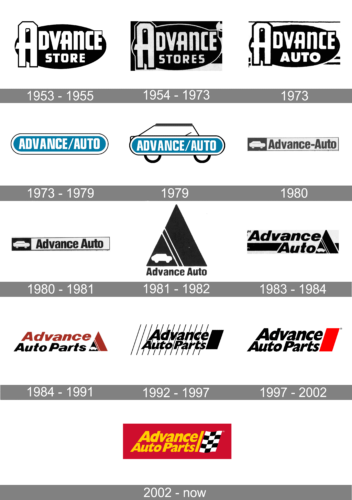
A powerful black and white logo set a strong beginning for the auto parts retailer. The inscription was printed in two lines with the second line featuring smaller font. The use of a bold, geometric typeface further enhanced an image of a serious company. An extra-large ”A” gave the emblem a unique touch.
1954 – 1973
To reflect the fact that the company was expanding, it added an “s” at the end of the word “Store”. All the other elements stayed the same.
1973
The new update made a minor modification to the logo. The word “Stores” was replaced by “Auto”, clarifying what one could buy in the store. Unlike the previous two versions, the second line used a different font. The bold strokes now formed smoother, rounder letters.
1973 – 1979
The very first logo for Advance Auto Parts was introduced in 1974 and featured a simple yet professionally executed banner in blue and white. The horizontally stretched badge had its angles rounded and was outlined in thick white and thin black lines. The white bold lettering in the uppercase was written over the blue background and used a slightly narrowed sans-serif typeface.
1979
The logo used from 1973 until 1979 got a major facelift. The artists drew an automobile silhouette around the previous symbol. The emblem served as the body of the car, so they just added wheels at the bottom and a mirror and roof above it. The resulting logo turned out perfect for a company that deals with automobiles. The designers managed to preserve the recognizable image when creating a new emblem.
1980
Although the new logo featured the same name and even a silhouette of an automobile, it acquired a different look. The whole emblem was a long rectangle with a black frame. On the left, it had a white car on a black background. The majority of it, though, was white and served as a base for the “Advance-Auto” inscription printed in black. The designers changed the font and capitalized only the first letters. The color palette added a touch of professionalism, while a familiar car icon made the new logo recognizable.
1980 – 1981
During the same year the new logo was introduced, the company decided to remove the hyphen sign in the name. All the other elements remained the same.
1981 – 1982
A black rectangle with the familiar car icon in the lower left corner and a double white line resembling a road was the main element of the logo. It resembled a road sign and was a perfect fit for a company that dealt with auto parts. Underneath, the logo specified the name of the business using the same font as in the previous logo to draw a connection between the two brand images.
1983 – 1984
Not long after the last update, the company realized that its name should take the main position in the logo. Thus, it took the triangle element and made placed it on the right of a larger rectangle. The name was printed on the left in large, italicized letters of the same font. A black line running in the back underlined the word “Advance” on the top line. This emblem had a better resemblance to the other versions.
1984 – 1991
The redesign of 1984 completely changed the concept of the logo. First of all, the color palette was switched to red and black on white. Secondly, the lettering was now set in two levels on a plain white background. Thirdly, the graphical element was added to the right side of the logo. It was a red and black triangle with a white car silhouette drawn on its bottom left part. The wordmark of the new logo was set in the title case of an italicized sans-serif font with extended contours of the letters.
1992 – 1997
In 1991 the logo of the company gets redesigned again. The style of the lettering remained almost untouched, just the letters became a bit taller, and changed their color to all-black. The triangles were replaced by a black vertically oriented parallelogram, and the white background gained a thin diagonally striped pattern in black and white.
1997 – 2002

The redesign of 1999 brought back the red color and the plain white background to the Advance Auto apart visual identity. The emblem remained untouched — a vertically oriented parallelogram, slightly slanted to the right — but was now set in scarlet-Ted. As for the logotype, it remained untouched, and the stripes from the background were removed.
2002 – Today
The logo we all can see today was designed in 2002 and is fully based in its previous version. The original logo was composed of an italicized wordmark, set in two levels with a delicate and elegant tagline, and a red parallelogram on the right. The tagline “The Best Part Is Our People” was written in a traditional serif font with smooth and thick lines, while the main wordmark used a soft custom sans-serif. All the lettering featured black color and was placed on a white background, which sometimes gained a striped monochrome pattern, depending on the placement.
The black, white and red color palette was switched to yellow and red with a monochrome checkered flag in 2002. In the same year, the tagline was removed from the official visual identity, and now the insignia looks more balanced and powerful.
The yellow lettering on the red background evokes a sense of progress and passion, while the checkered black and white flag represents the purpose and industry of the company, showing its professionalism and authority.
The Advance Auto Parts logo is very simple and minimalist in terms of concept and composition, but due to the right use of colors, it looks strong and remarkable. The italicized inscription represents speed and energy, while the flag refreshes the logo, adding strictness and solidness, and elevating the automobile associations of the visual identity to the new level.
What is Advance Auto Parts?
Advance Auto Parts is the name of the North America famous retailer of spare vehicle parts and components, which are mainly used but in a good condition. The business started in the 1970th and today has thousands of stores in its region.


