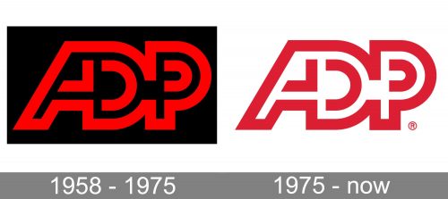
Automatic Data Processing, Inc. has been very consistent in its visual identity throughout the last 45 years. The iconic ADP logo adopted back in 1975 has remained virtually the same ever since.
Meaning and history
Automatic Data Processing began in 1949 as Automatic Payrolls, Inc. The company’s methods and specialization were changing over time. It went public in 1961. In the course of time, it acquired several smaller companies and spread its influence across the Atlantic.
Today, ADP is a well-known US provider of human resources management software and services.
1958 – 1975
In 1958, Henry Taub, Joe Taub, and Frank Lautenberg decided to merge their two companies, Automatic Payrolls and Automatic Tabulating. The new company was named “Automatic Data Processing.” While today it’s just a generic term synonymic with “computing,” it was a wholly new and rarely used phrase in 1958.
The new name required a new logo. Instead of the full name of the company, it featured only the initials, “A,” “D,” and “P” in red on the black background. The glyphs were based on a square shape and had slightly rounded corners. We can’t say that the wordmark was perfectly readable as the letters stood very close to each other and definitely needed some extra space in between. And yet, the ADP logo had a certain “computer” or “database” feel, which could have been partly due to the position of the letters and their shape.
1975 – Today
In the 1970s, the company was focused on extending its geographical reach. Shortly before the new logo was adopted, ADP purchased a minor payroll service firm in the Netherlands. Although it wasn’t a large company, the deal was an important milestone for ADP as it signaled that it had eventually reached across the Atlantic.
As the company was going to take its service even further, the need for a more modern and confident visual identity became obvious. So, in 1975, Frank Lautenberg commissioned a new ADP logo to mark its expansion.
In what way is it different and similar to the previous emblem? Once again, it is based on the red letters “A,” “D,” and “P,” yet this time they seamlessly merge in a single emblem. There’s actually no space between the letters. We can’t say that the insignia is legible enough, and yet, one can “decipher” the meaning, at least from the second glance. The overall design is a combination of red and white lines.
Font
The insignia features massive, bold glyphs based on a square shape. The type used for the wordmark is a custom artwork.
Colors
While the original ADP logo combined red and black, the current emblem replaces black with white creating a lighter and more transparent look.


