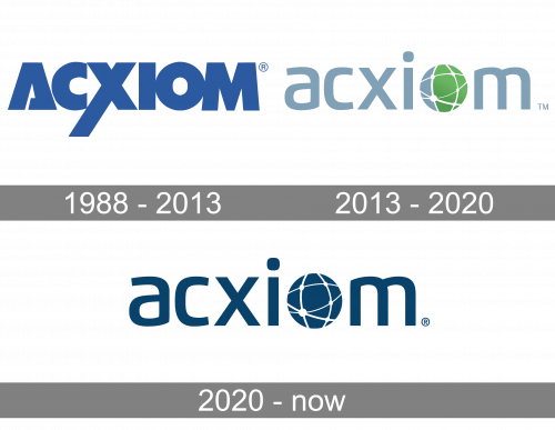
The last time the database marketing company Acxiom updated its logo was in 2013. That was a complete overhaul affecting all the levels of the identity, including both the shape of the elements and the color scheme.
Meaning and history
The company was established in 1969 under the name of Demographics, Inc. It has always been headquartered in Conway, Arkansas. Originally, Demographics specialized in making mailing lists based on phone books, as well as in payroll processing. In 1980, the firm adopted the name Conway Communications Exchange, three years later it was renamed CCX Network, Inc., while the current name appeared in 1988.
1988 – 2013
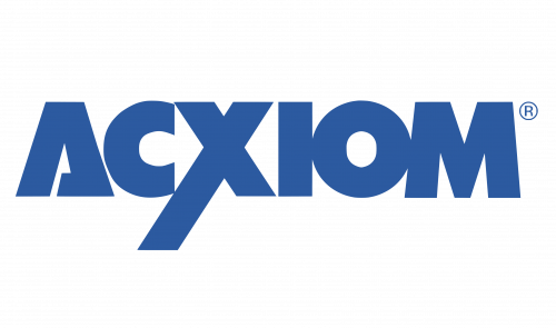
The new name required a new brand identity. The original Acxiom logo featured the name of the company in a custom typeface. Bold, solid lines of the letters created a sense of reliability and strength. The most distinctive letters were probably the initial “A” looking like a triangle with an unfinished line and the “X” with its extended end.
The wordmark didn’t have a professional feel about it, though. At least, the letters “I,” “O,” and “M” were positioned a bit too close to each other and definitely needed a bit more breathing space.
2013 – 2020
The following version of the logo seemed to have resolved the problem. The brand identity was refreshed shortly after Acxiom announced it was collaborating with Facebook. The collaboration let Facebook use Acxiom’s data to target advertisements better.
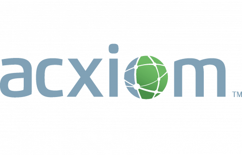
The new Acxiom logo was developed from scratch without any noticeable reference to the previous visual identity. The dark blue block-letter wordmark was replaced by a silver text. The “O” was replaced by a circular graphic, which was the highlight of the design. The circle represented the globe, while the white lines on it symbolized information and data gathered and delivered by Acxiom all around the world. According to the company spokesman Wyatt Jefferies, the new logo reflected their focus on “connecting people, business, and their partners.”
2020 – Today
In 2020, they updated the color scheme. The logo was completely unchanged, but everything turned a dark shade of blue, no exceptions.
Font
The sleek and minimalistic type looks modern and highly readable. All the letters are lowercased, and there’re no serifs. On the whole, the lettering doesn’t seem to have a lot of unique features and, therefore, isn’t really recognizable, except for the “O.”
Colors
The color scheme complements the cool grey with a vivid grassy shade of green. The combination of colors is light and unobtrusive. There’s also a sort of hi-tech or business feel about the Acxiom logo, which is probably due to the metallic quality of grey. And still, the green accents bring something natural. It feels like fresh grass in a pot standing on a window in a bank.


