

![]()
Are you considering a rebrand or starting up a new company? Getting off the ground may take a lot of work—especially in defining who you are and attracting the right customers.
You may be looking for the pixel perfect logo to help strengthen your brand identity. Following these rules will help you achieve that ideal emblem for your company. Below we will walk through the nine steps you should follow when creating your logo.
Why is a Logo Important?
A logo is the first impression your brand typically makes on the average customer. Whether the logo is on your sign, business card, product, website, promotional item or ad, it will be part of the first thing a customer sees and will make a statement of some kind about your brand in general.
A logo will immediately imply crucial information about a brand on a subconscious level for any-one that sees it. From potential brand partners to investors and customers, your logo design might convey:
- Your industry
- Your approach (luxury, discount, designer, etc.)
- Brand characteristics (bold, creative, reliable, eco-friendly, etc.)
- The brand aesthetic
- The company name
From colors to imagery and text, what you include in your logo is going to say a lot about your company from the very start. This is an important part of pinning down your brand identity and carving out a niche space within your industry.
Take note that creating a logo can be a very simple process, using the likes of an online logo maker, or a bit longer process using a freelance designer, a design agency or even designing it yourself. Either way, the rules for a perfect logo applies nonetheless!
9 Rules for a Pixel Perfect Logo
The right logo will encourage purchases and may even help build a following. Here are some im-portant steps to take in order to create a pixel-perfect logo.
1. Aligns with Your Brand Identity
First, you will want a logo that aligns with your brand identity. In order to do that you have to actu-ally know your brand identity. While that may seem obvious, many entrepreneurs want to skip this part and jump into the design.
Before you start creating any imagery, ask yourself:
- What do I want to say with my design?
- What is our primary goal as a company?
- What do we need to communicate immediately?
- How are we different from the competition?
- Who is our audience and what moves them?
- What does our audience want and need from us?
- What do we want to avoid in our messaging?
- What is overdone or played out in our industry?
Write these answers down. You can use them to start creating a mood board that helps you nail down your brand identity and aesthetic.
2. Straightforward, Professional Design
As you start to create concrete designs, remember that less is more. Amateur designers often try to pack in too many elements into the logo, rather than perfecting a simple design that is far more memorable.
Think about the logo designs for Nike, McDonald’s, Venmo, YMCA, Target—regardless of the in-dustry, most national brands have extremely simple and recognizable logos. Try simplifying your logo down to its most basic form and see what comes out.
3. Should Look Great Monochromatic
![]()
![]()
Your logo should be easily changed into a black and white or monochromatic version. The upside is that you can create a one-color logo for special events and holidays (like going all pink for Breast Cancer Awareness Month) or printing a b&w logo when you don’t have the option for color.
While you will have a common form and color pallet, you should have a backup option that just uses one color. For example, Instagram is typically a rainbow gradient, but is easily changed to a monochromatic logo when it’s used to create matching social sharing buttons that include multiple social media icons (the background is just dropped and the camera icon becomes the solid color).
4. Is Easily Scalable
Whether your logo is shown at just 36 pixels for an app icon or blown up to 36” for a sign, your logo should be easily scaled to whatever size you need it. This requires creating your logo in a vector form (photographs are raster-based images) so that it scales without pixelation.
It also means creating a logo that isn’t going to be impossible to see or read when it’s shown in a tiny ratio.
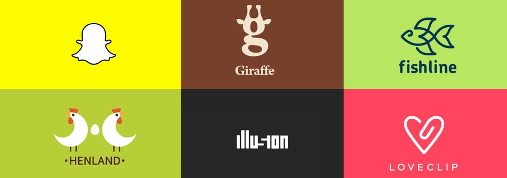
5. Contains No More Than 3 Colors
![]()
There are logos that do use many colors and gradients…however, this is the exception and not the rule. Generally, you want to use no more than three colors in your design.
Remember, amateur design often goes too far with the designs and tries to do too much. With a complex color palette, your design is going to lose the simplicity you want to go for. Multiple colors can also be difficult to print for things like packaging, tags, t-shirts and signs.
If you do go with gradients or a number of colors, make the logo simple enough that it is easily converted to a single color (remember Instagram’s logo), and plan to use both versions regularly.
6. Use a Max of 2 Fonts
There aren’t many exceptions to this rule; fonts can cause a lot of trouble in a logo. Most brands avoid words and opt for initials (Estee Lauder) or single letters (like Beats by Dre). Using words in a logo can make it hard to scale down to smaller sizes and remain readable.
You will want to choose fonts for your logotype that go well with your logo. You might use the same font or a more simple font that plays well with any letters or words used in your logo.
The general rule of thumb is that you can get away with one “loud” font (like a slab serif or script font) and then you will want your secondary font to be much more basic (like an Arial, Helvetica or Times New Roman).
7. Doesn’t Lean on Logo Trends
Trendy logos tend to slip away too quickly. You want your logo to last.
Avoid following trends and go for a classic logo. With the right design, you might not change up your logo for decades. When you do change, you may make small changes to update it rather than have to go back to the drawing board for a completely different look.
Microsoft’s logo is a classic example of this struggle, using a couple of early versions that were far too trendy. The computer brand had to go with a third completely different design in less than 10 years of getting the company off the ground because the trends had already changed multiple times.
8. Is Well Thought Out
![]()
Put a lot of thought into every shape, color and line of your logo. Don’t just go with your first idea.
Most of the time, business owners try to rush through this process, but it is a huge pain to change your logo down the line. Put time and effort into it so it is right the first time and will last you years before you need to do any updating.
That said, it is better to update when needed than to refuse to change and remain stuck in an out-dated look. Be ready to change your logo when it isn’t serving you well anymore because every great brand updates its look a little bit from time to time.
9. Is Wholly Original
Finally, your logo needs to be completely original. Don’t try to copy anyone else’s look, style or imagery. Not only is brand confusion illegal under copyright and trademark laws, you won’t help your brand by being a lookalike wannabe.
This doesn’t just mean you shouldn’t copy. It also means you should know what is out there so you PURPOSELY look completely different. You want to use different colors, different styles and a different look than anyone else in your industry.
It’s fine to look for inspiration, but look at logos that are appealing to your target audience in com-pletely different industries. Look for similarities to find out what attracts and retains that crowd. And then, don’t copy their look, but emulate a similar vibe in your own brand aesthetic.


