Thirty Seconds to Mars is a rock band based in Los Angeles, California, US. It was created in 1998. As of 2020, it includes two members: Jared Leto and Shannon Leto.
Meaning and history
The band’s visual identity has undergone numerous transformations. The musicians have experimented with various emblems and wordmarks, although there has also been a couple of recurrent elements.
Let’s track the changes based on the album covers
30 Seconds to Mars (2002)
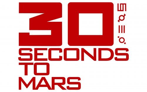
The first album features the 30 Seconds to Mars logo in red. The number “30” dominates the design, while the rest of the band’s name is set in much smaller letters below. The type, though, appears to be the same – the type with squarish basis but slightly rounded corners.
The most unusual part is, of course, the column on the right. It is made up of four symbols looking like ancient runes. Whatever these symbols are, they do not reveal their meaning to the layman. What we know for sure is that they haven’t been confirmed as meaning “30 Seconds to Mars.”
If you take a closer look, you will notice another emblem, the Phoenix. The mythic bird is depicted on the sleeve of the white jacket worn by the boy, who is the main character of the album cover. Of course, you will only notice the bird if you’re familiar with it because it is only half visible.
The boy’s photo on the album cover is black-and-white, so the phoenix is also given using these two colors. Yet, typically, the Phoenix on the 30 Seconds to Mars logo is red. Over its body, you can see the same four “runes” as on the wordmark, only now they are white inside gray circles. The bird has its wings spread wide. It is encircled by the name of the band and their motto “Provhito in Altum” (meaning “Launch forth into the deep” in Latin). The musicians nicknamed the Phoenix logo “Mithra.”
A Beautiful Lie (2005)
The wordmark remains red, although the color grows lighter. The typography is different. The word “Mars” now dominates the design, while the figure “30” has been replaced by the word “thirty.” The squarish font has been replaced by one with traditional oval proportions.
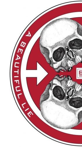
To the right of the wordmark, there is a circle album housing two skulls and one of the “runes,” which is only partly visible.
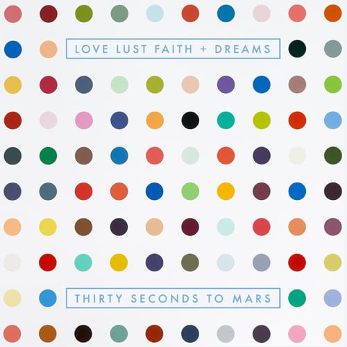
This Is War (2009) and Love, Lust, Faith, and Dreams (2013)
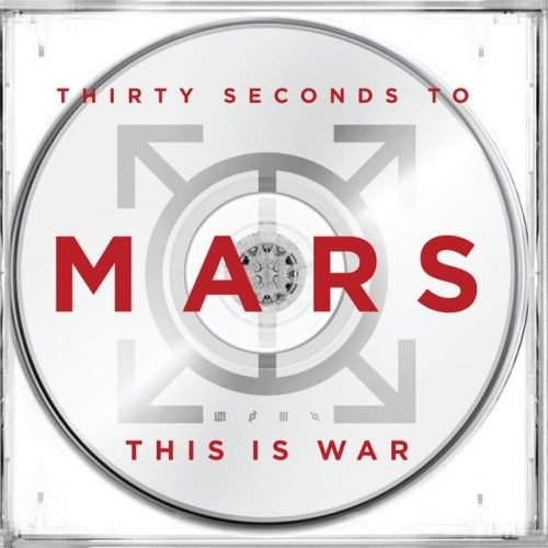
The name of the band is set in a simple, perfectly legible, and generic all-caps sans. The runes are gone.
We should point out, though, that with the release of their 2009 album, the band unveiled a new emblem nicknamed the Triad. Its three sides represent the three members of the group.
America (2018)
This album was released with ten versions of the cover. They share a small yet distinctive emblem. Although it reminds the “rune” emblems from the past album covers, the shape is new. In the center, there is an equilateral triangle. It has an additional horizontal bar parallel to its lower side. Also, there is a long vertical line going through its top, which makes the triangle resemble an arrowhead.
The arrowhead Thirty Seconds to Mars logo is often featured on their merchandise.


