

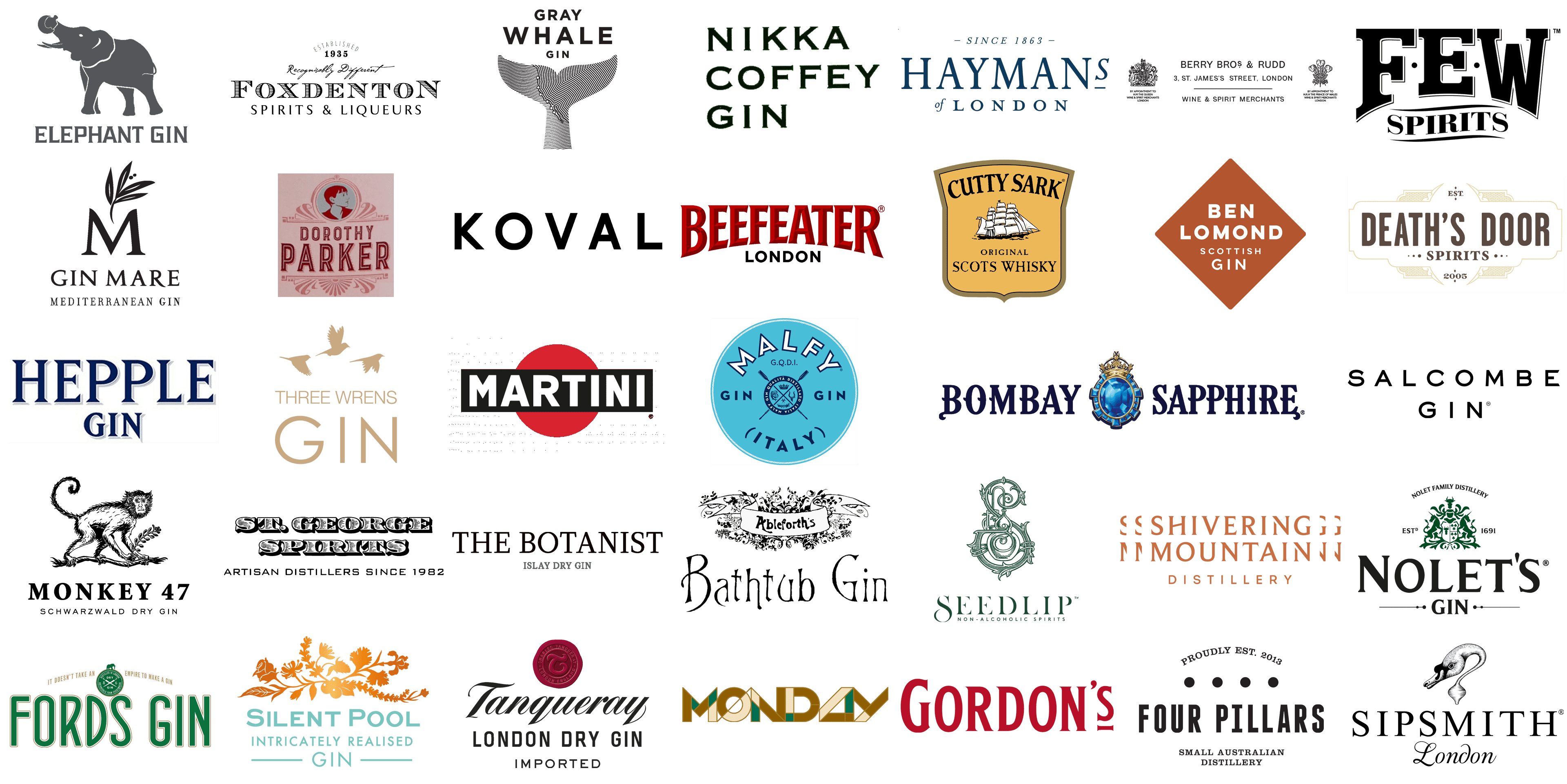
In the realm of spirits, gin stands as a beacon of both tradition and innovation, a liquid canvas where distillers paint their botanical masterpieces. Amidst this intricate dance of flavors and aromas, the identity of a gin brand often hinges on an element just as pivotal as the spirit itself of the logo. A logo is not merely a symbol, it’s the distillation of a brand’s entire story into a single emblematic visual. It’s the first encounter, a silent ambassador that whispers the tales of botanicals, heritage, and craftsmanship.
Each gin logo is a tapestry woven with threads of history, culture, and artistic expression. They range from intricate illustrations that hark back to gin’s rich past, to sleek, modern designs that speak of contemporary craftsmanship. These logos are more than just marketing tools. They are the embodiment of the gin’s essence, a visual language that communicates with consumers, connoisseurs, and casual sippers alike.
In the world of gin, logos serve a dual purpose. They are both guardians of legacy and harbingers of innovation. From the classical elegance of juniper berries and the traditional copper still, to the avant-garde use of abstract art and typography, gin logos encapsulate the spirit of their contents. They tell a story of place and time, of distillers’ visions and the evolution of gin through the ages.
This exploration into the logos of gin brands is not just about appreciating their aesthetic value. It delves into the deeper narrative each logo represents, unraveling the history, the botanicals, the unique distillation processes, and the personal stories behind these iconic symbols. As we journey through the world of gin logos, we uncover how these symbols serve as windows into the soul of the gin, offering a glimpse into the passion, dedication, and artistry that goes into every bottle.
Ableforth’s Bathtub Gin
![]()
The Ableforth’s Bathtub Gin’s visual identity is all about uniqueness. The laconic black-and-white color palette here is compensated by a complicated ornament in the emblem and a designer handwritten typeface for the wordmark. The emblem features a wide classy ribbon with the bold “Ableforth’s” lettering, surrounded by floral patterns. As for the main inscription, it is placed under the graphical part in enlarged title case characters, made of thin sharp lines with creative serifs in some of them.
This exquisite craft spirit stands out with its award-winning profile, meticulously crafted through a cold compounding method. The blend of traditional botanicals, paired with a pioneering approach to gin-making, gifts Ableforth’s Bathtub Gin a flavor richness and smoothness that resonates with aficionados globally. The branding of this gin takes a whimsical turn, with a logo design that harks back to an earlier time, its script akin to hand-written notes from days gone by. Its lettering, irregular yet playful, evokes a sense of bespoke artisanship and echoes the clandestine charm of Prohibition-era speakeasies, perfectly encapsulating the artisanal and unorthodox essence of the gin.
Beefeater
![]()
One of the most recognizable gin logos in the world is, undoubtedly, the Beefeater one. The visual identity of the brand is based solely on lettering, written in two different styles, with no graphical additions. The upper level features a bold voluminous “Beefeater” in a fancy font with small sharp serifs. The wordmark is set in two shades of red and is arched above the straight and strict uppercase “London” in medium-weight black capitals of a geometric sans-serif typeface.
Tracing its roots back to 1863 and named in honor of the Yeomen Warders guarding the Tower of London, Beefeater holds a distinguished place as one of the top-selling gins worldwide. Its standout character comes from a rigorous distillation process that uses nine botanicals, including the likes of juniper, lemon peel, and Seville orange peel, resulting in a crisp and clean gin profile. The brand’s visual identity is marked by a striking logo featuring bold, red lettering that embodies the quintessential British spirit and the resilience of the Tower’s guardians. The sharp serifs in the font convey a sense of tradition and authority, while the inclusion of ‘London’ in the logo firmly roots it in its historic origins.
Ben Lomond Gin
![]()
The visual identity of Ben Lomond Gin has a simple composition but a very interesting choice of main color. The logo of the brand is a solid brown rhombus with four-leveled lettering in white. The two upper lines are set in a bold geometric sans-serif, while the bottom levels feature a lighter-weight of typeface; but the same style. The shade of brown, used for the rhombus is warm and bright, and in combination with white, it looks very stylish and expensive. The less — the better.
Inspired by Scotland’s breathtaking landscapes, Ben Lomond Gin offers a premium gin experience, integrating locally sourced botanicals such as blackcurrants and rowan berries. This creates a vibrant and unique flavor profile that captures the essence of the Scottish Highlands. In contrast, the logo of Ben Lomond Gin leans towards a modern and simplistic aesthetic, utilizing a clean sans-serif font and a diamond shape that symbolizes stability and reliability. The logo’s earthy orange color pays tribute to the natural beauty of Scotland, reflecting the gin’s deep connection to its Scottish origins.
Berry Bros & Rudd
![]()
One of the oldest gin manufacturers in the world, Berry Bros & Rudd has all its heritage and rich history reflected in one elegant yet modest logo. The badge of the brand is set in a black-and-white color palette, with graphical elements and text executed in thin lines. The lettering in the middle, written in a classy medium-weight sans-serif typeface, is accompanied by two heraldic emblems on the sides. Those are the historical crests, granted to the manufacturer by the Queen and the Prince of Wales.
Established in 1698, Berry Bros & Rudd enjoys the reputation of being Britain’s oldest wine and spirit merchant. The company’s rich history is evident in its range of premium spirits, which includes a gin crafted with exceptional skill, embodying centuries of heritage and expertise in selecting and blending the finest ingredients. The logo of Berry Bros & Rudd is distinguished by dual crests that frame a minimalist central design, signifying royal warrants and a legacy of trustworthiness. Its stark black and white color scheme exudes timeless elegance, while the simple typeface reflects the company’s long-standing identity as distinguished wine and spirit merchants.
Bombay Sapphire
![]()
The logo of Bombay Sapphire gin is a combination of fancy uppercase lettering with decorative elements in each character, and a chic voluminous emblem in between the words. The inscription is set in a deep shade of blue, where each vertical bar has a small curvy line coming out of the middle to the left, plus the first and last letters in the name of the brand have curly tails at the bottom. As for the emblem, it is a glossy blue gem, a sapphire, with a small yet chic and ornate golden crown on it.
Renowned for its distinctive blue bottle, Bombay Sapphire embodies a level of sophistication and exoticism in the world of gins. Its unique vapour-infusion distillation process yields a flavor profile marked by subtlety and balance, with juniper, lemon peel, and coriander standing out. The brand’s logo radiates royal elegance, featuring a sapphire encased within a golden crown, symbolizing its status as a jewel among gins. This imagery, combined with the deep blue color and meticulous detailing, mirrors the sophistication and precious stone-like quality suggested by its name.
Cutty Sark
![]()
The logo of Cutty Sark is traditional and quite modest, as is drawn in a calm color palette, composed of three shades of brown and white. The light-brown crest in a wide frame has a drawing of a clipper with white sails as the main element. The image is accompanied by the name of the brand arched above it and the two-leveled tagline with the name of the product. There is nothing bright or too bold in this logo, hence it is very well-balanced and looks neat and professional.
Though primarily celebrated for its Scotch whisky, Cutty Sark’s foray into gin production is marked by a commitment to quality and a fusion of traditional and contemporary botanicals. This approach suits a wide array of tastes. The brand’s logo, which showcases the famous clipper ship on a parchment-styled background, evokes a sense of nautical adventure and historical voyages. The strong, black script contrasts with the warm, amber background, reminiscent of whisky’s rich warmth, reinforcing the brand’s heritage while introducing its gin venture.
Death’s Door
![]()
The logo of this brand with not the most optimistic name is surprisingly sunny and light. It is an elegant white and light gold badge in the Art-Deco style with delicate ornaments and a very thin outline. In the white background of the banner, there is a bold uppercase brown lettering in a softened modern sans-serif typeface with the serif “Spirits” tagline, set between three solid circles of different sizes on each side. The date of the brand’s establishment is written at the very bottom of the logo, in the same brown color as the main lettering.
Death’s Door Gin, originating from Wisconsin, is acclaimed for its elegantly simple botanical mix, combining juniper, coriander, and fennel. This composition offers a modern reinterpretation of classic gin, appealing to both traditionalists and those in search of a novel taste experience. The logo of Death’s Door Spirits blends a vintage aura with modern sensibilities, featuring intricate Art Nouveau-inspired detailing. The intriguing name hints at the legendary passage between Door Peninsula and Washington Island in Wisconsin, adding a layer of mystique to the brand.
Dorothy Parker
![]()
The Dorothy Parker Gin logo is somewhat sleek and vintage. The strong art-deco spirit of the composition can be felt in the outlined geometric typeface, the burgundy and pink color palette of the badge, and, of course, the main element of the brand’s visual identity, the portrait of a famous woman writer, who gave the name to the gin, drawn in burgundy lines over a silvering circular medallion and placed on top of the composition. Both the portrait and the wordmark are decorated by ornaments made of thick lines and creating interesting patterns.
New York Distilling Company’s Dorothy Parker Gin pays homage to the famed American writer through its unique blend of both traditional and modern botanicals, including juniper, elderberries, citrus, and hibiscus petals. This combination results in a gin that is both nuanced and distinctively characterful. The brand’s logo features an elegant silhouette of Dorothy Parker herself, set amidst Art Deco-style motifs, capturing the charm and wit of the Jazz Age. The choice of typography harks back to the era of typewriters, further connecting the spirit to its literary namesake.
Elephant Gin
![]()
The Elephant Gin logo is quite literal but looks very modern and professional. It is composed of an enlarged emblem depicting a gray elephant, turned to the left and holding a bottle of gin with its trunk. The trunk looks up, which is a good sign. The emblem is accompanied by sophisticated uppercase lettering, written in the uppercase of a geometric typeface with the bars flared at their ends, and the softened square as the main shape for the characters. The emblem and the lettering are set in one shade of gray, which looks very calm and at the same time exquisite on a white background.
Elephant Gin, a handcrafted premium gin from Germany, stands out not just for its unique flavor but also for its noble cause. Inspired by the African elephant and its natural habitat, the gin features a blend of rare African botanicals, offering an exotic and distinctive flavor profile. What sets Elephant Gin apart is its philanthropic commitment, with a portion of its profits dedicated to African elephant conservation. The brand’s logo, elegantly depicting the silhouette of an elephant, symbolizes both the African inspiration behind the gin and the brand’s dedication to conservation. The trunk, playfully shaped as if sipping, adds a touch of whimsy, all encapsulated in a clean, contemporary design.
Few Spirits
![]()
The visual identity of the Few Spirits gin manufacturer is quite simple in its composition — the logo is based solely on the lettering, but the two parts of the brand’s name are set in different styles and sizes, which makes the badge interesting. The upper level of the inscription boasts an enlarged black “Few” in the uppercase of a geometric serif typeface with a delicate shadow and two solid black dots placed between the letters. The second level of the logo features a bold “Spirits” in a smaller size and a more elegant serif font. The “Spirits” is enclosed between two horizontal wavy lines.
Few Spirits, hailing from Evanston, Illinois, brings a unique offering to the gin world with its Few Gin. Celebrated for its daring blend of traditional and unconventional botanicals like fennel and grains of paradise, this gin embodies a bold and flavor-rich profile. The FEW Spirits logo mirrors this boldness, blending retro and avant-garde elements. Its blocky, assertive typeface hearkens back to the prohibition era, reflecting the rebellious spirit of the Evanston-based distillery and the pioneering essence of its community.
Fords Gin
![]()
The Fords Gin logo is something you want to explore in detail. First of all, the badge boasts a pleasant green and gold color palette, which evokes a sense of calmness and stability. Secondly, the brand has a very interesting symbol — a sold green roundel with a green silhouette of an elephant on top of it and two white crossed umbrellas in the center. The symbol is enclosed between the two parts of the company’s motto, “It Doesn’t Take an Empire to Make a Gin”, written in thin golden sans-serif characters.
Created in collaboration with bartenders and distilled in London, Fords Gin is celebrated for its versatility and juniper-rich flavor, ideal for cocktail mixing. Its balanced blend of nine botanicals results in a classic, accessible gin, meticulously crafted for any gin-based drink. The logo of Fords Gin features a bold, green, sans-serif typeface, conveying confidence and a contemporary flair. The emblematic elephant on a medallion within the logo symbolizes strength and the global sourcing of its botanicals, while the brand’s commitment to simplicity over grandeur is highlighted in its slogan.
Four Pillars
![]()
The logo of the Four Pillars gin brand is very cool due to its simplicity and minimalistic design. The badge is composed of a bold narrowed logotype in a geometric sans-serif typeface, a two-leveled uppercase serif “Small Australian Distillery” tagline, and the “Proudly EST. 2013” lettering written in the same style as the tagline, but arched on the top of the logo, above the emblem. The emblem is represented by four solid black circles, which are meant to look like four rounded pillars from above.
As an Australian craft gin distillery, Four Pillars has gained recognition for its innovative approach, especially evident in its Rare Dry Gin, which includes unique botanicals like Tasmanian pepperberry and lemon myrtle. The use of a custom-made copper still contributes to the gin’s fresh and zesty profile, earning global acclaim. The logo of Four Pillars, characterized by stark, clean lines and a classic font, pays homage to its roots as a small distillery established in 2013. It encapsulates the essence of its artisanal method and the foundational pillars of its craft.
Foxdenton
![]()
The Foxdenton Gin logo is quite simple compared to other brands in the list. It is a black-and-white badge with the uppercase serif wordmark featuring a horizontally-striped pattern, handwritten cursive lettering above it, and a pretty large “Spirits & Liquors” tagline in a fancy and sleek font with flared and sharpened ends of the lines. The composition is accompanied by a bold “1935” datemark on top of the logo, and a lightweight “Established” arched above it, making up a crown for the whole image.
Foxdenton Estate, a family-operated British company, is renowned for its traditional London Dry Gin and an array of fruit-infused gins, each steeped in authenticity and rich heritage. These gins are celebrated for their balanced and classic flavors, deeply rooted in the English gin-making tradition. The Foxdenton logo skillfully combines a vintage script font with contemporary typography, reflecting its storied history dating back to 1935. This juxtaposition highlights its role as a purveyor of distinct spirits and liqueurs. The tagline “Recognisably Different” beneath the logo underscores the brand’s commitment to uniqueness in the world of spirits.
Gin Mare
![]()
The visual identity of the Gin Mare brand is very elegant yet with a strong modern feel. The gin’s logo is composed of three levels, with the enlarged emblem, made of the capital “M” in a smooth and sleek serif typeface, and a juniper branch drawn above it in medium-weight strokes. Under the emblem, there is the uppercase “Gin Mare” wordmark in the same font, and the bottom level features a lightweight “Mediterranean Gin” tagline in all-caps of a narrowed serif type, more traditional than the one of the other letterings.
Originating from Spain, Gin Mare captures the essence of the Mediterranean in its gin, known for its incorporation of distinctive botanicals like arbequina olive, thyme, basil, and rosemary. This unique blend of flavors reflects an innovative approach to gin-making, embodying the spirit and tastes of the region. The logo of Gin Mare is an elegant mix of typography and imagery, with the ornate ‘M’ adorned with an olive branch, symbolizing its Mediterranean heritage and the unique botanicals that set its flavor apart.
Gordon’s
![]()
The laconic Gordon’s gin logo compensates for its simplicity with the intense red color of the lettering and a memorable typeface. The badge of the brand is just its name, written in one line against a transparent background. The wordmark is set in uppercase, with the first letter enlarged, and the last “S” made smaller and accompanied by a short horizontal underline, which features the same thin and sharp serifs as all the other characters of the inscription.
Since 1769, Gordon’s Gin has been a top-selling London Dry gin, reflecting its enduring popularity and consistent quality over centuries. Its dominant juniper flavor and signature green bottle mark it as a globally recognized brand. The logo, with bold red letters in a classic serif font, conveys Gordon’s rich British heritage. Its simple, unadorned design embodies the traditional essence of London Dry Gin.
Gray Whale Gin
![]()
The visual identity of Gray Whale Gin is not as simple as it may seem at first glance. The badge is composed of three-leveled lettering in the uppercase of a bold and distinctive geometric sans-serif typeface, and the cool monochromatic emblem placed under it. The emblem depicts a stylized tail of a gray whale, with a pattern made of thin black lines all over. The top right part of the drawing has lines in different directions, and they make up a contour of the Californian coast, with six location marks along it. Those marks show the places over the coast, where the botanical elements for the brand’s gin are taken from.
Celebrating the majestic journey of the gray whale, Gray Whale Gin is a Californian craft gin that brings a unique story to the world of spirits. Its ingredients, including juniper and sea kelp, are sourced from the gray whale’s migratory route, offering a distinctive and eco-friendly flavor profile that embodies the essence of the Pacific coast’s terroir. The logo of Gray Whale Gin artistically portrays the whale’s tail using a series of lines, symbolizing the brand’s path along the Pacific Coast. This emblem highlights their dedication to natural, sustainable ingredients and their commitment to environmental preservation.
Hayman’s
![]()
Another example of simple elegance is the logo of the Hayman’s gin. It is the name of the brand, written in a deep and calm shade of blue against the transparent background, with delicate additional lettering. The main part of the wordmark is enlarged and set in a softened serif typeface, in between two lines — the slanted and lightweight “Since 1963” datemark on top, with two short horizontal lines on the sides, and the “of London” tagline, where the first part features an elegant cursive, and the “London” is written in the same font as “Hayman’s”, but with the smaller size of the capitals.
With a heritage stretching back over 150 years, the British family-run business Hayman’s Gin is a beacon in the realm of traditional English gin production. Its renowned London Dry Gin is a testament to its dedication to age-old methods, blending ten botanicals to forge a gin that is both quintessentially classic and remarkably smooth. This timeless flavor is embodied in the Hayman’s logo, which combines an elegant serif font with the historic affirmation “Since 1863”, highlighting its long-standing expertise in London gin creation. Additionally, the “of London” tagline proudly anchors its roots in its place of origin.
Hepple Gin
![]()
The logo of the Hepple Gin brand looks calm due to the use of a blue and gray color palette, but at the same time sharp because of the massive triangular serifs on the ends of the bars. The logo is composed of a wordmark, written in two lines against a white background. The upper, “Hepple” level is enlarged compared to the bottom “Gin”. Both lines are written in the same serif typeface, and the same color palette — the deep blue body of the characters, with a thin white outline, and a thicker light-gray shadow.
In the secluded Moors of Northumberland, Hepple Gin brings a unique touch to gin-making with its groundbreaking three-tier distillation process. This includes advanced high-fidelity distillation and supercritical extraction techniques, capturing the raw purity of botanicals such as wild juniper. The result is a gin that resonates with extraordinary depth and a refreshing character. The Hepple Gin brand identity mirrors the untamed essence of Northumberland, utilizing a sharp, traditional serif font in its logo to represent a harmonious blend of classic distillation methods and cutting-edge technology.
KOVAL
![]()
The KOVAL gin logo is minimalistic and bold. This black-on-white badge is composed of two lettering levels and an additional banner with the brand’s establishment date on top. The main wordmark is enlarged and executed in a heavy geometric sans-serif typeface with a lot of air in between and inside the characters. The “Distilled in Chicago” tagline is set in a lighter version of the same font and uses a smaller size of the characters. As for the top line, in between the two parts of the datemark, you can see four solid six-pointed stars, framed by two horizontal black lines.
KOVAL Gin, a trailblazer in the Chicago craft distillery scene, offers an organic gin distinguished by its grain-to-bottle approach. It skillfully combines unique woodland spices and botanicals, yielding a spirit that is both crisp and clean, melding contemporary flavors with the soul of traditional gin crafting. The simplicity and modernity of KOVAL’s logo, featuring a sleek, modern sans-serif font, encapsulates the brand’s commitment to organic production and its craft distillery ethos.
Malfy Gin
![]()
The color palette of the Malfy Gin visual identity makes the logo of the brand stand out from the list of competitors. It is a circular emblem in a delightful teal, with the brand’s crest drawn in the center. The crest also features a rounded shape, crossed by two long paddles, which are divided into four equal segments. In each segment there is a drawing, connected to the region the gin is made at — a fish, a boat, a crown, and a trident. The name of the brand is arched above the crest, in bold white capitals, and outlined in blue. All the other additional text on the badge is set in blue smaller capitals of the same font.
Malfy Gin, hailing from Italy’s picturesque Amalfi Coast, encapsulates the region’s abundant citrus legacy. Its Con Limone variant stands out, infused with locally sourced sun-kissed lemons and classic Italian botanicals. This gin offers a lively, invigorating taste that transports one to the Italian coastline. The logo of Malfy Gin, with its vivid blue hues and bold typeface, pays homage to its Italian Riviera heritage. The lemon graphics subtly hint at the citrusy heart of the gin, while the encompassing phrase extols its exceptional quality and authentic origins.
Martini
![]()
The iconic Martini logo is known all around the world. The solid red circle is crossed by a black horizontal banner with white uppercase lettering on it. In design psychology, the use of a circle in a logo indicates that the company is stable, conservative, sustainable, and adheres to classic business principles. And the classic color palette of the Martini visual identity only elevates this feeling and adds such qualities and power, passion, and determination to the profile of the brand.
Martini, a brand synonymous with high-quality vermouths, has also ventured into the world of gin, bringing its rich legacy of flavor expertise into this new arena. Martini’s gin is crafted with a focus on blending aromatic botanicals and herbs, harmonizing with its acclaimed range of vermouths. This fusion results in a gin that encapsulates the depth of Italian heritage and flavor mastery. The Martini logo, known for its striking, contrasting colors and bold, sans-serif font encircled in a classic red ring, captures the essence of Italian vibrancy and passion for life, representing the enduring charm and sophistication of the brand.
MONDAY
![]()
The logo of the MONDAY gin is a stylized graphical wordmark, set in a sleek sophisticated color palette, composed of dark gold, deep turquoise, cream, and medium gold for the outline. The uppercase inscription is written in an extra-bold modern sans-serif typeface with clean contours and straight cuts. Each character has a geometric pattern, created by the crossed thin golden lines, and each of the segments, made by them, is set in one of the shades of the color palette. All these effects make the logo look like a super cool Art-Deco image.
In the realm of non-alcoholic spirits, a standout brand is MONDAY Gin. This innovative offering brings to the table the complexity and depth of traditional gin while entirely omitting alcohol. It’s an excellent choice for those who prefer a mindful approach to drinking or seek a sophisticated, non-alcoholic addition to their cocktails. The brand’s logo, with its creative use of geometry and negative space, exudes modern elegance, mirroring the brand’s innovative approach to gin. This design subtly nods to their non-traditional and forward-thinking production techniques.
Monkey 47
![]()
The Monkey 47 gin brand has quite a detailed emblem as the basis of its visual identity. The monkey on a branch with a beautiful leaf in its hand is drawn in black lines, and looks quite realistic, even though the design is flat and pretty laconic. The enlarged emblem is placed above the bold uppercase wordmark in a traditional serif typeface and a “Schwarzwald Dry Gin” tagline in small capitals of a lightweight sans-serif typeface. Overall, it is quite a balanced badge, with a thought-out combination of fonts and styles.
Hailing from Germany, the craft gin Monkey 47 has garnered a devoted following thanks to its distinctive use of 47 botanicals. This selection includes special ingredients from the Black Forest, creating a rich, complex flavor profile that blends traditional gin botanicals with rare local herbs and berries. The logo of Monkey 47, depicting a detailed monkey clutching a sprig, elegantly represents the 47 botanicals that make up this unique Schwarzwald Dry Gin. The classic font used in the logo further accentuates the brand’s commitment to premium craftsmanship.
Nikka Coffey Gin
![]()
The main peculiarity of the Japanese design is a minimalistic approach, and the logo of the Nikka Coffey Gin brand is one of its great examples. The badge of the Asian gin manufacturer is based on three-leveled lettering, written in black bars against a transparent background. All three lines are executed in the same typeface and feature the same size. The font, used by the brand for its logo, is a bold modern serif with full-shaped characters boasting short, thin, and sharp serifs on the ends of the bars.
Nikka, a renowned producer of Japanese whisky, has ventured into the gin market with their Coffey Gin. Made in a Coffey still, this gin combines traditional and Japanese botanicals, such as yuzu and sansho pepper, creating a fusion of Eastern and Western flavors. This results in a gin that is bright, aromatic, and delightfully complex. The logo of Nikka Coffey Gin, with its clean sans-serif font, reflects the modern Japanese twist on a traditional spirit, and the ‘Coffey’ in the name is a homage to the distillation equipment used.
NOLET’s
![]()
The visual identity of the NOLET’s gin manufacturer is all about the brand’s history and heritage. The company was established at the end of the 17th century, hence it is only logical, that it decided to emphasize its roots and experience. The NOLET’s logo is composed of a bold serif wordmark in black, with the “GIN” set under it in small capitals and enclosed between the two thin and long horizontal lines with two solid dots on each of them. The lettering is accompanied by quite a large emblem in the dark shade of green, depicting a historical crest in a bold ornament made of leaves and two creatures on the sides. The “NOLET’s Family Distillery” is arched above the composition in black narrow capitals.
Rooted in a rich Dutch distilling heritage dating back to 1691, NOLET’s offers a gin that is a seamless blend of tradition and modernity, especially evident in their NOLET’s Silver Gin. This gin stands out with its inclusion of distinctive botanicals like Turkish rose, peach, and raspberry, offering a fresh, contemporary flavor profile. The brand’s crest, flanked by mythical creatures, is a nod to the Nolet family’s long-standing distilling legacy. This, coupled with a simple yet elegant typeface, underscores the gin’s timeless charm.
Salcombe Gin
![]()
Another cool and laconic logo on the list is the Salcombe Gin insignia. The design concept of the brand is based solely on the lettering, executed in the minimalistic black-and-white color palette. The name of the brand is written in two levels, with both executed in the same style and size. The main thing here is the font — a cool distinctive sans-serif, with the full-shaped characters, clean contours, and sharpened, slightly elongated ends of some of the bars. This makes the simple lettering very sleek and memorable.
Originating from the historic port town of Salcombe in Devon, UK, Salcombe Gin is renowned for its handcrafted quality and the influence of its coastal origins. Utilizing botanicals inspired by historic seafaring trade routes, the gin achieves a sophisticated, smooth, and perfectly balanced profile. The logo of Salcombe Gin epitomizes modern minimalism. Its bold sans-serif font conveys clarity and premium quality, while its understated elegance is a nod to the brand’s rich coastal heritage.
Seedlip
![]()
The Seedlip gin logo is somewhat with a traditional mood yet modern touches. The main element of the badge is the emblem — a contoured seal, with the stylized ornate “S” inscribed into a complicated composition, showing the classic distillation process. The dark green shade of the emblem is supported by the green of the lettering, written under it in a classy stylized font with triangular serifs and an elongated curved line of the “S”. The tagline is written in small-caps in a modern sans-serif font.
In the innovative domain of non-alcoholic spirits, Seedlip stands as a trailblazer, providing a refined alternative to traditional gin. Their offerings include a variety of complex, botanical-rich blends that are devoid of alcohol, sugar, and calories. This makes Seedlip an ideal choice for those desiring the intricate flavors of gin sans the alcohol. The brand’s logo is a masterwork of design, featuring a detailed, nature-inspired monogram that seamlessly integrates elements symbolic of the earth and distillation. This design not only reflects Seedlip’s avant-garde status in the non-alcoholic spirits arena but also employs a sophisticated palette of greens to emphasize its commitment to natural, earthy elements.
Shivering Mountain
![]()
The Shivering Mountain logo is very unusual, even though it is based just on text. The first cool thing about it is the color palette — orange-brown, which looks super stylish on a white background. The second, and main, feature of the Shivering Mountain badge is that each of the two lettering lines is enclosed between the double halves of the first and last characters — and this creates a sense of vibrating, shivering, and brilliantly depicts the name of the brand. The composition is balanced by a clean “Distillery” tagline in a modern and laconic sans-serif font.
Shivering Mountain Gin, inspired by the scenic beauty of the Peak District, stands out in the craft gin market. This gin is renowned for its unique blend of locally sourced botanicals, offering a genuine taste of the region’s distinct flora. The balance struck between traditional and modern flavors is a hallmark of this brand. The logo of Shivering Mountain Distillery is an embodiment of simplicity and elegance. The wave-like contours on the letters ingeniously hint at the rugged landscape of the Peak District, while the color scheme resonates with the warmth and artisanal quality of their handcrafted gin.
Silent Pool
![]()
The Silent Pool gin visual identity is a combination of a traditional graphical element and modern lettering, executed in a delightful color palette. The emblem is made of a floral ornament, drawn in a glossy gradient orange, with a light accent in the center. The graphical part is accompanied by a three-leveled lettering in light blue, with the top line in a bold sans-serif typeface, the middle one in its lighter version, and the bottom “Gin” set in large capitals and enclosed between the two long horizontal lines of the same color.
Silent Pool Gin, crafted along the serene banks of Surrey’s Silent Pool, is celebrated for its complex and multi-layered flavor profile. Utilizing 24 different botanicals and a unique four-stage distillation process, Silent Pool Gin achieves a rich, clean, and intricate taste that perfectly encapsulates the serene and enigmatic aura of its origin. The logo features a graceful array of botanical illustrations, set against a warm color gradient that symbolizes the rich, natural flavors of the gin. Complementing this is a tranquil aqua shade, reflecting the calmness of the legendary Surrey spring, the Silent Pool.
Sipsmith London Dry
![]()
The Sipsmith London Dry Gin logo is somewhat very memorable and unique. And it’s all because the brand uses a very unusual animal as its symbol. The emblem on the logo depicts the head and neck of a swan, drawn very detailed in thin black strokes. Actually, the “Swan’s Neck” is what one of the pipes in the distillery process is called, hence the choice of the mascot for the company. The emblem is accompanied by a serif uppercase lettering with distinctive contours and sharp elements, and a cursive “London” set under it.
Sipsmith, a vanguard in the contemporary revival of gin, made history by opening the first copper-pot distillery in London in over two centuries. Their flagship product, Sipsmith London Dry Gin, is celebrated for its adherence to traditional recipes and a harmonious blend of botanicals, encapsulating the essence of London’s rich gin legacy. The logo of Sipsmith London is marked by the elegant depiction of a swan’s neck, symbolizing the brand’s grace and sophistication. Accompanied by a classic typeface, the logo pays homage to Sipsmith’s pioneering role in the modern craft gin movement.
St. George Spirits
![]()
The visual identity of the St. George Spirits brand is based on a graphical lettering with a simple medium-weight tagline, executed in a black-and-white color palette. It is a heavy and stable serif inscription in two lines, with an erased horizontally-striped pattern and a thick black shadow of each character. The insignia is underlined by the uppercase “Artisan Distillers Since 1982” in a geometric sans-serif font with softened angles. The contrast of the two different styles makes this logo look very interesting and evokes a sense of confidence and a unique approach.
In the forefront of the American craft distillery revolution, the Californian establishment, St. George Spirits, is renowned for its ingenious approach to crafting gin. It offers a spectrum of gins, each a testament to innovation and skilled artisanship. These gins are imbued with a rich array of botanicals, reflecting the distinctive character of California’s natural environment. The brand’s emblem features a bold, western-style typography, echoing the aesthetics of woodcut prints with its pronounced serifs and a textured fill, creating an aura of heritage and skill. The phrase “ARTISAN DISTILLERS” is a nod to the quality and craft behind their products. “SINCE 1982” at the base of the logo denotes the company’s longstanding expertise in distillation.
Tanqueray Gin
![]()
The visual identity of Tanqueray Gin is based on traditional elements, mixed with the modern minimalistic shapes of the tagline. The main part of the badge is a three-dimensional dark-red wax seal with a cursive “T” in the center and the complete name of the brand written around the perimeter of a circular frame. The seal is accompanied by a cursive “Tanqueray” lettering in a bold and narrowed font with the “T” disconnected from the following characters. The tagline in a geometric sans-serif font adds stability to the composition and makes up a perfect underline.
Tanqueray, established in 1830, enjoys global acclaim as a gin brand, known for its clear, juniper-centric flavor and iconic green bottle. Gin enthusiasts and bars worldwide favor it. The brand’s emblem features “Tanqueray” in an elegant, flowing cursive script, symbolizing sophistication and a classic approach to gin crafting. A bold, crimson seal with a stylized “T” and ornamental flourish, likely representing the founder’s initial or quality, sits above the script. The words “LONDON DRY GIN” in a straightforward, sans-serif font below the script indicate the spirit’s style and origin. “IMPORTED” inscribed smaller underneath highlights the brand’s global appeal, blending British heritage with premium allure.
The Botanist
![]()
The Botanist is, probably, the most modest brand in the list in terms of visual identity. The logo of the company is composed of an enlarged wordmark in a medium-weight serif typeface with long serifs on the ends of the distinctive lines. The characters are perfectly balanced and spaced, creating an airy yet stable image, and the underline with the gray “Islay Dry Gin” in small-caps of the same font, completes the minimalistic design idea and adds a final delicate touch to the badge.
Originating from the Isle of Islay in Scotland, The Botanist distinguishes itself with a sustainable and artisanal approach to gin-making. It incorporates 22 hand-foraged local botanicals, creating a gin that is both smooth and complex, mirroring the rich diversity of its island habitat. The logo adopts a minimalist, modern style, utilizing a sleek, sans-serif font. The evenly spaced letters contribute to its contemporary, upscale feel. “THE BOTANIST” is prominently displayed at the top in a larger font, establishing the brand’s identity. Below, in a smaller font, “ISLAY DRY GIN” serves as a succinct, descriptive subtitle, indicating its geographic origin and spirit type.
Three Wrens Gin
![]()
The logo of the Three Wrens Gin is set in a smooth and delightful golden color palette, with the three flying birds, the wrens, depicted on top of the composition. The wrens, flying to the right, have their wings in three different positions, which creates a feeling of motion. The emblem is drawn above the two-leveled lettering, with the “Three Wrens” in small capitals of a lightweight sans-serif typeface, and the enlarged emboldened “GIN” at the very bottom. The graphical image and color palette soften the size and distinction of the text and make the whole badge look airy and elegant.
Three Wrens Gin, from the picturesque county of Cheshire in England, prides itself on producing distinctive gins with original flavors, like Bison Grass Gin and Apple Crumble Edition, each embodying the founder’s love for nature and inventive spirit in gin crafting. The logo features an artistic depiction of nature with three birds, symbolizing the spirit’s freedom and lightness. “THREE WRENS” is elegantly written in a serif font, blending modern and classical gin-making values. “GIN” appears in a bold, large, sans-serif font, emphasizing the product’s identity. The logo’s monochromatic color scheme has a golden tint, suggesting premium quality and flavor richness.
Conclusion
In the intricate world of spirits, gin stands out for its versatility and rich history, appealing to a wide array of palates. Among the best-selling gin brands, each brings a unique twist to the classic spirit, whether through the infusion of exotic botanicals or the adherence to traditional distilling methods. Plymouth Gin, with its soft and rich botanical profile, and Hendricks, renowned for its infusion of cucumber and rose, exemplify the innovation within the industry. Aviation Gin and the Botanist Islay Dry further showcase the diversity of flavors, from the floral notes inspired by the Scottish isles to the crisp and refreshing taste that has made Aviation a favorite among gin drinkers.
The exploration of gin would not be complete without delving into the various types of gin, such as Old Tom Gin, known for its slightly sweeter profile, and Navy Strength Gin, which packs a more potent punch. These variations cater to different preferences, ensuring there’s a gin out there for every type of gin drinker. The inclusion of unique botanicals like Japanese Sencha, Sakura leaf, and Sakura flower in some brands introduces a delicate balance of flavors, blending tradition with a modern twist.
Gin’s compatibility with mixers like tonic opens up a canvas for creativity. The classic gin and tonic, enhanced with botanicals like cardamom, angelica root, and black pepper, transforms a simple drink into an aromatic experience, highlighting the gin’s complexity.
As we savor the botanical richness of gins like the Botanist Islay and the distinctive profiles of brands like Plymouth and Hendricks, it’s clear that the journey through the world of gin is one of continuous discovery. The best-selling gin brands not only honor the spirit’s storied past but also push the boundaries of flavor, inviting both connoisseurs and casual enthusiasts to explore the depth and breadth of gin. In this ever-evolving landscape, the fusion of traditional elements with innovative botanicals ensures that the allure of gin remains timeless, captivating the hearts of gin drinkers around the globe.


