Verily, an offshoot of Google’s parent entity, Alphabet Inc., is at the vanguard of health and life sciences research. It strives to meld advanced tech with scientific acumen to fathom and manage health intricacies. Primarily steering its focus on research, interventions, and platforms, Verily addresses challenges spanning from neurology to immunology. Current endeavors encompass wearable tech for health tracking, surgical robots, and more. Its main markets include the U.S., with expansions elsewhere. Owned by Alphabet, Verily operates semi-independently, upholding its mission to make health data insightful and actionable for global users.
Meaning and history
Verily’s inception traces back to 2015 as Google Life Sciences within Google X, Google’s moonshot factory. Amidst a broader restructuring, Google became a subsidiary of Alphabet Inc., a new conglomerate. Subsequently, Google Life Sciences rebranded to “Verily Life Sciences.”
While Alphabet’s tentacles stretch across diverse sectors, Verily anchored its identity in health and biology. Initially, the aim was harnessing technological innovation to redefine healthcare paradigms. Projects like smart contact lenses with Novartis for glucose monitoring and baseline studies to understand human health landmarks cemented Verily’s commitment to groundbreaking research.
As it navigated the healthcare realm, Verily’s portfolio burgeoned. The Study Watch, an FDA-approved wearable, showcased the union of tech and health. Collaborations flourished, as seen with Johnson & Johnson in forming Verb Surgical, a venture for robotic surgery enhancements.
Ownership remained consistent under Alphabet’s aegis. However, Verily, always on a quest for excellence, attracted external investments. In 2019, a funding round saw external stakeholders like Silver Lake, Ontario Teachers’ Pension Plan, and others backing Verily’s vision.
Production arenas also evolved. From initial research projects, Verily transitioned to real-world applications. OneHealth, a tech-driven platform for chronic disease management, and Debug, an endeavor to reduce disease-spreading mosquitoes, showcased the company’s diverse operational spectrum.
Navigating a complex medical world, Verily remained steadfast, fusing Alphabet’s tech expertise with a novel health approach. This journey, though relatively young, reiterates Verily’s pledge to reshape health landscapes leveraging advanced tech, ensuring a healthier future for all.
2015
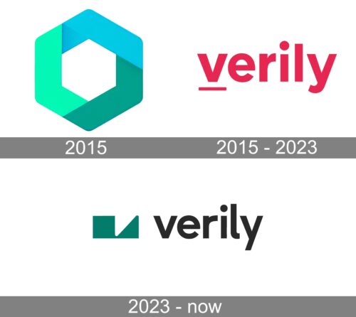
The logo is a captivating blend of geometric symmetry and vivid gradients. A hexagon, reminiscent of a futuristic portal, forms the outer boundary. Within its confines lies a white diamond, placed with precision. The encompassing hexagon fades from a rich aqua at one corner, seamlessly transitioning to a deeper shade of teal, giving a three-dimensional effect. The entire design evokes a sense of modernity, innovation, and depth, offering a glimpse into a brand that’s both grounded in its foundations and forward-thinking in its aspirations. The juxtaposition of shapes and colors creates an emblem that’s both straightforward and intriguingly multifaceted.
2015 – 2013
The emblem features the word “verily” rendered in bold, passionate crimson. It’s a modern typeface, with clean lines and sharp edges. The “v” is prominent, starting the sequence with a definitive stance. The “e” is almost circular, complementing the dot above the “i”, which sits higher than usual. A distinctive horizontal line underscores the name, grounding the design. The “y” extends downwards in a fluid motion, rounding off the word. The overall appearance is both sophisticated and fresh, capturing attention with its minimalistic yet striking design.
2023 – Today
Verily’s emblem seamlessly blends minimalism with intricate detailing. At its core, the logo boasts crisp, two-dimensional typography rendered in bold, lowercase strokes with a stark black hue. Yet, it’s the emblematic iconography that infuses a layer of complexity. Featuring an interplay between a square and a triangle, both cloaked in a rich, dark shade, they offer an inviting gateway into the brand’s intricate essence. These forms cleverly mimic alphabetic characters, with layers almost intertwining. The letter “v” prominently emerges, intriguingly depicted twice: once as an upside-down triangle and next as an indented space. This juxtaposition of simplicity and depth captures the brand’s essence, portraying both its clarity of mission and the depth of its innovation.


