Vanish is a brand of stain removing products. While the brand is based in the Netherlands, you can buy the products in many European countries, as well as in India, Australia, Russia, South Africa, and Latin America. The brand belongs to Reckitt Benckiser.
Meaning and history
Today the brand, established in the Netherlands at the beginning of the 1980s, sells its products in the supermarkets of more than 60 countries, mainly in Europe and Asia. The stain removers of Vanish are known for their quality and affordability.
Vanish has become one of the world’s leaders in the production of stain-removing and laundry products in literally no time. The company was acquired by Ecolab in 1986 and became a part of the Reckitt Benckiser Group in 1987.
What is Vanish?
Vanish is the name of a brand, specializing in the production of stain-removing products. The company was established in the Netherlands at the beginning of 1983. Today Vanish is owned by Reckitt Benckiser Group and sells its products across several European and Asian countries and Australia.
The history of the brand started in 1983.
1992 — 1999
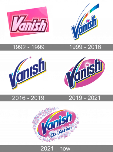
The oldest Vanish logo on the list bears something in common with the current one. Similar to the current logo, it has a prominent capital initial, while all the other letters are lowercase. The type is a simple, rather bold, legible sans. The letters have shades and trim adding some depth.
The signature pink background is already there.
1999 — present
The angle at which the wordmark is positioned has changed, which added a more optimistic touch. There is more motion in this logo, due to the dynamic shape of the “V” and the multiple swooshed. The rainbow symbolizes the company’s promise to preserve the original color of the clothing.
2016 — present
In some markets, a different version is used. Here, the rainbow is shorter and less prominent. The “dot,” which should have been positioned above the “i,” has moved up and is now placed at the ends of the “V.” Due to its position and shape, it gets an additional symbolic meaning – it is now a “magic” small particle that removes stains from the clothing.
Also, in this version, the blue is darker, while the shape of the letters is more rounded.
2019 — 2021
The Vanish wordmark is placed over a pink ellipse. The purple “dot” has grown larger (to stand out over the background of the same color) and has been moved lower, to its traditional place above the “i.” It has a “shiny” quality now.
2021 — Today
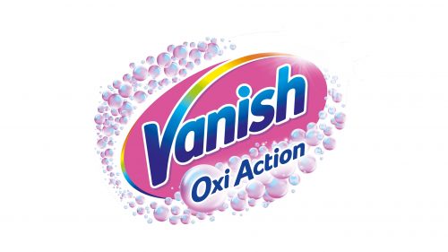
The redesign of 2021 has introduced the most ornate and full of details logo for the brand. The pink plate with the blue lettering on it got enclosed into a gradient white-to-pink frame, formed by dozens of bubbles, and the “Oxi Action” tagline, written in blue letters diagonally, along the bottom line of the badge. As for the bold Vanish logotype, it got flattened and simplified, with the yellow shadow completely removed, and the contours of the letters softened and cleaned. The dot above the “I” is now set in the same style as the lettering, with no color accents.
Font
The type is highly legible and not overloaded with details. The “V” introduces the dynamic theme, while the streamlined shape of the letters with their rounded ends supports it.
Color
Pink has been the brand’s signature color starting from the 1993 Vanish logo. In 1999, the rainbow element was added, to represent the promise that the liquid will remove the stains without removing the colors. Also, the wordmark is blue, which symbolizes water and (therefore) cleanness.


