 University of Rochester Logo PNG
University of Rochester, being an American privately owned academic institution, offers a number of educational services to its students. The university carries hundreds of undergraduate and postgraduate programs with a researching incline. UR authority comprises humanitarian and technical studies. In numerous colleges and schools, more than 3000 professors, with their students, explore multiple disciplines, such as those related to business, philosophy, physics, engineering and others. There are also 200+ centers, labs and other points of university’s presence.
Meaning and history
The university derives from the Baptist Education Society of the State of New York, founded in 1796. This charitable institution was a training school for Baptist priests. Soon, BUS created a separate division to grant more degrees. In 1846, it became independent and turned its name to Madison University. The students and professors claimed the university to be moved to Rochester, New York, but the government disallowed to do that.
It resulted in a mass departure of students and professors from New York to Rochester and formation of the University of Rochester in 1851 led by Asahel C. Kendrick. For the following years to come, the university has advanced its operations, secured its financial position by multiple grants from the rich men, and started to provide degrees in the fields of humanities and technical sciences. In the same 1851, they’ve adopted the university’s official seal.
What is University of Rochester?
University of Rochester provides knowledge to the students from across the United States. Located in the state of New York, this educational organization offers multiple degree programs comprising various directions of humanities and technical studies. UR is an all-people available researching facility. More than 3000 professors give you a professional preparation, specializing in business, economics, history and many others. They have many laboratories, specific colleges and schools, as well as scientific centers, located across the state of New York.
1851 – 1852
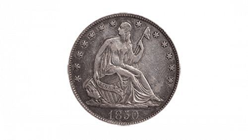
The very first seal of the University of Rochester was a circle drafted of multiple stars serving as a contouring pattern. The year of the organization’s foundation was at the bottom. The picture of the Seated Liberty was placed at the center. It was taken from the tails side of the American half dollar coin of that time.
1852 – 1928
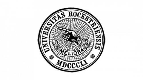
The university’s next seal displayed an outer frame with the university’s Latin name and the Roman spelling of ‘1851’ number. Deeper in the seal, they had pictured a closed palm with the index finger pointing at somewhere. Below it, they placed a note with the ‘Meliora’ slogan, translating ‘Ever Better’. This whole combination was placed over many lines, flocking to the center.
1928 – 1986
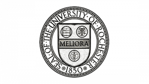
The 1928 revision reflected a shield having a central bar with ‘Meliora’ word. The two marks above the line showed a book with ‘Arts et Scientia’ scribbles to the left and a harp to the right. The circle at the bottom of the shield featured the caduceus, a symbol of medicine composed of a snake intertwining a sword. The shield had been incorporated into a frame with the ‘Seal of The University of Rochester 1850’ inscription. The date was changed from the de-jure 1851 to the de-facto 1850.
1986 – today
The modifications of the 1926 seal brought in 1986 feature two major elements. First, the lines and ornaments became less bold than previously. Second, the inscription was changed. Now it’s ‘University of Rochester Official Seal 1850’, with the ‘Rochester’ word placed centrally at the top and ‘1850’ at the bottom.
2007 – today
The official logotype of 2007 has been adapted from the university seal.
To the left, we can find a shield with a double contour. At the top of the shield, there is the date of the university’s formation. The central paper-styled line features the motto – ‘Meliora’. The bottom medallion depicts the familiar caduceus, while the two other marks placed at the top show the book to the right and the harp to the left, respectively.
To the right, there is a university’s nameplate, written in two lines. The ‘Rochester’ word is written prominently below.
Font
For the 1986 sigil, they’ve chosen a serif script with all capitals. The letters have sharp and thin lines, which make them look eye-catching. This font has been used for the name and slogan. For the words on the medallions, they’ve taken a bold yet thin typeface with small serifs. The same fonts have been used to describe the logotype inscriptions, but the words are a bit bolder. The ‘Rochester’ word is enlarged. It also has the first ‘R’ character, bigger than the following ones. Also, the ‘of’ word has a handwritten lowercase script.
Color
Traditionally, the seals were black and white, whereas black lines and words occupy the space on the white circle. The logotype is fully blue, but the shield has a yellow bar and a double yellow contour.


