Of the search engines available on the Global Network there are some whose logos can be singled out as the best ones. The main criterion is not the popularity of this or that search engine, but the design of the logo itself. Some of the identity marks are controversial and for this reason noteworthy. Here are the top 10 logos belonging to search engines.
Google Logo
Google has identified itself with several logos since its inception. They have always been multicolored and playful, yet strikingly simple. The hint is that it is equally simple to use the search engine, while the playfulness points to the positive user experience offered by the search giant.
The current Google logo adopted in 2015 keeps the color palette of the previous logos, though a bit softer. But the typeface is totally different. Now it is tailor-made Product Sans, a modern sans-serif geometric face. Due to the new features the logo is capable of working across multiple devices.
Ask.com Logo
The website featuring this logo used to be on the list of top 10 US websites, according to Nielsen ratings. The logo still deserves to be included on the list of the best search engines logos.
The Ask.com logo has always been consistent in the shape, the color palette and the wordmark. The only difference between the three versions of the signature mark is the presence or absence of drop shadows, lights and gradients. Following the latest trends in logo designing the company created the logo that attracts attention with its original simplicity and the striking combination of red and white.
Baidu Logo
The equivalent of the Google logo for the Chinese-speaking population of the world is the Baidu logo. The largest search engine in China has the logo that is a dog’s paw print. The choice of the image was not accidental. In China the word “Google” is often mispronounced and sounds similar to the Chinese for “dog”.
The logo is in two languages ‒ English and Chinese. The typeface is a round sans-serif. The color palette is a combination of red, blue and white, which is typical of commercial web logos. The prevailing color is red, which is not surprising, as it is the color of the national flag of China.
Bing Logo
While in 2009 Brand New ranked the first Bing logo as the worst logo, the current one is among the best.
When in 2016 Microsoft introduced a new version of the emblem for Bing, its search engine, the goal was to make it look good on all Windows devices. The changes to the previous logo were minimal but significant. Thus, they switched from yellow to green because green is better perceived than yellow. They also made the lowercase “b” uppercase, which was to improve the look of the logo. The “b” symbol underwent some modifications as well, but its right part looks like a flying boomerang as before.
Yahoo Logo
When Yahoo unveiled its new logo in 2013, the public was disappointed. The company had kept the Internet in suspense for a month trying to bring back the public’s awareness Yahoo used to have in its early days. But the logo turned out to be practically the same.
The purple color and the exclamation point have become iconic for the brand, and the current Yahoo logo features them. It is of a darker shade of purple, the letters look less jumbled, but the most essential change was the introduction of a sans-serif typeface. What the company really succeeded in was preserving fun and showcasing evolution.
AOL Logo
Brand New ranked this logo the first in the 2009 Awards. The abbreviation in the AOL logo stands for “America Online”, the previous name of the company. Six syllables were too many for a dynamic logo, which forced initials. Since 2009 the lettering has been appearing against different backgrounds suggesting the breadth of the company’s content. The logo looks awesome on the company’s homepage where the background changes as soon as the page is refreshed.
The full stop in the logo implies “confidence and completeness”. The lowercase letters serve the purpose of establishing identity.
DuckDuckGo Logo
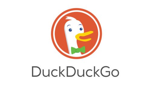
The search engine that provides its users with serious services has a childlike logo. To some people it may seem ridiculous. Yet, the majority of users find it beautiful.
The logo’s appearance is in line with the name of the search engine which was borrowed from the children’s game “Duck, duck, goose”. There is no secret message hidden behind this name. The man who launched the site just liked how it sounded. Dax, the goose in the DuckDuckGo logo, looks friendly and smart due to the bow tie he is wearing. The color palette consisting of red, white, yellow, green and blue is appealing.
Yandex Logo
The largest search engine in Russian owns a modern minimalist logo too. It is a typography based logo featuring the custom sans-serif typeface called Yandex Sans. The previous logo was adjusted to the new font and the result was a more harmonious and balanced signature mark. There is no special meaning behind it, but the name means “Yet another indexer”.
The Yandex logo is available in two versions ‒ in Russian and in English. The version in Russian is declinable according to the rules of the Russian language not only in speech, but also graphically.
Qwant Logo
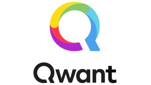
The visual identity for the search engine Qwant consists of the stylized letter “Q” and the wordmark “Qwant” below it. The “Q” symbol is in fact a magnifying glass which is a sign of search.
The combination of the colors in the “Q” symbol shouldn’t be viewed as messy and meaningless. The spectrum symbolizes the variety of the search results the search engine offers. Instead of representing the color palette literally, the company preferred to build the Qwant logo around light spots of three colors ‒ red, green and blue. When combined, they can produce an unlimited number of colors.
Shenma Logo
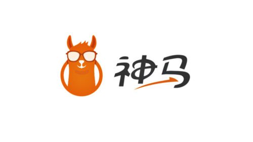
The Chinese mobile search engine greets users with an attractive logo. The head of a friendly looking horse (“shenma” is the Mandarin for a “sacred horse”) is arising out of a circle. It is logical to assume that the circle stands for a magnifying glass, a symbol traditionally used in search engines to symbolize search. The horse is wearing glasses that serve the same purpose as the circle.
The arrow below the wordmark points to a great variety if search results users can get with the help of this service. The orange color palette of the Shenma logo is prepossessing and inviting.
Conclusion
In this article, we’ve embarked on a fascinating journey through the dynamic world of the most popular search engines, examining their logos and brands with great ease. Each icon, a testament to the brand’s identity, has been meticulously designed to convey useful information and capture the essence of the company it represents. The integration of AI technologies has significantly enhanced the capabilities of these platforms, allowing users to filter through vast amounts of data with just a simple click. The precision of pixel manipulation in the logo design process underscores the importance of visual appeal in the digital age.
As we delved into the browser-based repositories of brands of the world, we encountered an array of vector graphics and illustrations that speak volumes about the creativity and strategic thinking behind logo creation. The logo critique community and websites offering the ability to download vector logos stand as pillars supporting the ethos of collaboration and attribution in the design world. These resources, along with free logo maker tools, provide startups and small businesses the foundation to create their own logo, transforming a sketch into a professional emblem that’s ready for social media, business cards, and print materials.
The discussion on the cookie policy and privacy considerations reminds us of the digital footprint left by our online queries, highlighting the ongoing balance between personalization and user privacy. Through the lens of artificial intelligence, we see a future where search engines offer not just unlimited logos but a personalized experience that respects user privacy while delivering the perfect search logo.
Merchandise adorned with a company logo goes beyond mere branding; it serves as a mobile billboard that extends the reach of web design into the physical realm. The support team behind each free logo generator ensures that from scratch, anyone can bring their logo ideas to life, fostering an environment where creativity meets functionality.
The significance of layout in logo design cannot be overstated, with each element from the vector graphics to the typography working in harmony to create a coherent and memorable brand image. This synergy is crucial for businesses aiming to stand at the top of the page in the digital marketplace.
As we conclude, it’s clear that the journey to craft the perfect search logo involves more than just artistic endeavor; it requires a deep understanding of the brand’s core values, the target audience, and the technological tools at our disposal. From artificial intelligence to the community’s support, every aspect plays a role in shaping the brands of the world. Whether you’re a startup looking to make your mark or a seasoned business exploring new avenues for your digital presence, the insights shared here serve as a guide to navigate the expansive world of search engine logos and branding with confidence.


