

If you are a beginner designer, this article might be useful to you, as here we would like to talk about creating a logo, and give some tips, which will make the process easier and more effective. If you are an entrepreneur, a startup, a blogger and have decided to create a logo on your own, this article will also be useful to you. Here you will find all the information you need about logo design. Let’s get started.
![]()
Learn the principles of logo design
The difference between an effective logo and an ineffective one is that it is practical, appropriate, simple in form and content, and conveys a targeted message.
In its simplest form, a logo’s purpose is to identify a brand but to do so, it must follow the basic principles of logo design:
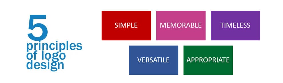
The logo must be simple. A simple logo is easy to recognize, this allows the logo to be versatile and memorable. Effective logos have something unexpected or unique, but they are not overloaded with detail. The simpler the logo, the more memorable it is.
The logo should be memorable. An effective logo should be recognizable, and this is achieved through simplicity and relevance.
The logo should be durable. An effective logo must stand the test of time, in other words, it has to be “timeless,” which means it must be effective in 10, 20, 50+ years.
The logo should be versatile. The logo should look great in different environments and on different surfaces – on a website, business card, employee clothing, etc.
The logo should be appropriate. The way you position the logo should be appropriate for its purpose.
Avoid clichés
Electric light bulbs for the “idea” image, clouds for “discussion,” globes for the concept of “international,” etc. These are the ideas that come to mind when brainstorming and for the same reason we should discard them first. How can your design be unique if the same idea is present in other logos? Avoid such visual clichés and come up with an original idea and design.
As mentioned, don’t steal, copy or borrow designs from others. Although it does happen quite often. The designer sees an idea he likes, quickly mirrors it, slightly changes contours and colors, replaces words, and calls the idea his own. Not only is this unethical, illegal, and stupid, but you’re sure to get caught at it sooner or later. Don’t use stock icons or cliparts — the main point of a logo is uniqueness, as it is created to reflect your brand’s essence.
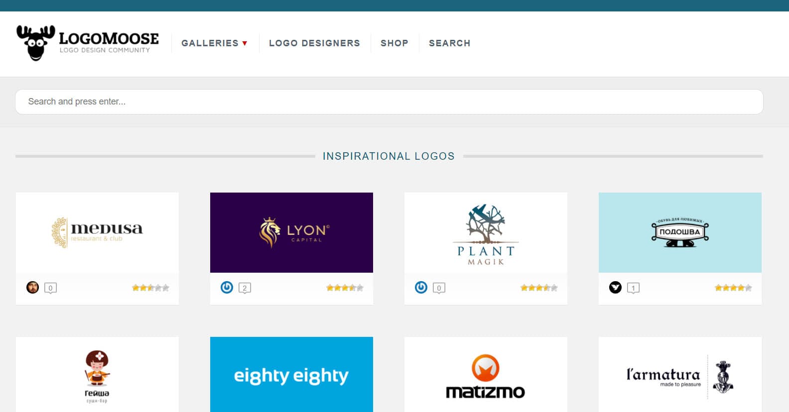
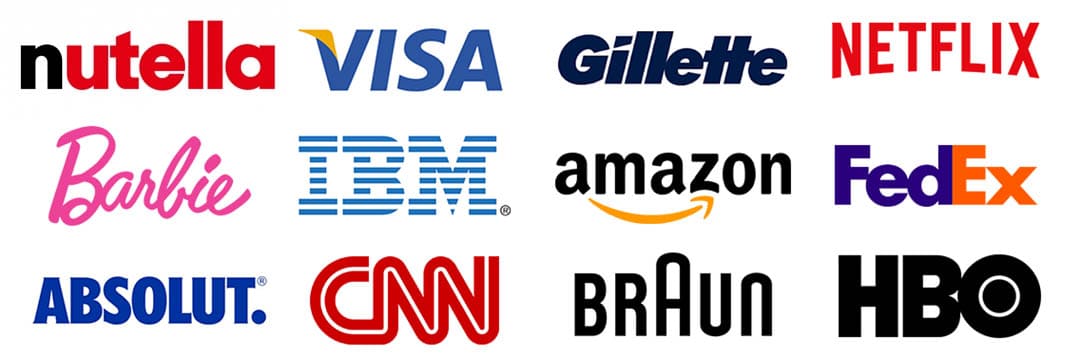
Logo galleries are not the only source of inspiration
Logo Moose and Logo Gala are two great starting points for exploring and finding inspiration. However, it’s always important to know when to stop. It’s better to see what worked and didn’t work out of 10 relevant logos than to get lost among 50-100 original insignias.
If you’re having trouble with ideas, try looking up keywords in a dictionary or thesaurus, or google images for inspiration. And if you have a sketchbook, you can look at your previous drawings — you probably have interesting ideas from previous projects, which you haven’t used, and you may already have the perfect solution, as we talked about earlier.
Logo shape psychology
![]()
Like color psychology, the shape of a logo also has a psychological impact on perception.
Understanding the psychology of shapes will benefit you no matter what your logo is based on – circles, triangles, etc.
Do not imitate
We all have design idols and sometimes we admire them so much that we want to imitate their style. Indeed, as they say, imitation is the sincerest form of flattery. In the real world, however, it is simply the laziest way to solve a creative problem.
Create mind maps
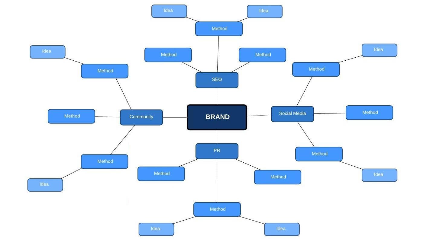
Use the associative map technique to organize your thoughts into something more coherent. That way you can sort out your thoughts and make them work for you. Play around with keywords and synonyms, and gather inspiration material from different sources on one board to see how they fit together.
Don’t go overboard with maths grids
This is a perfect example of an overly rationalized logo and how using mathematical consistency doesn’t always result in the best design.
Choose your logo font style carefully
Typography is very important to a good logo. You have two basic options: create your custom font or adapt an existing font, whether in its original or stylized form.
When creating your font, try not to make it too fancy, because it can quickly become outdated. Keep it simple and easy to read.
Adapt an existing font
You do not have to create your unique font to stand out or add originality to your logo. It’s not an easy process that requires a lot of time and resources. So as an option, think about the possibility of adapting an existing font.
Deleting, enlarging, or attaching some of the letters can be enough to make the logo font original and your design unique. Contours can be slightly modified, as well as the length of the lines and cuts of the tails.
Don’t use more than two fonts in a logo
![]()
There will always be exceptions to this rule. But as a general principle, limiting yourself to just one or two fonts is a good idea if you want your logo to be crisp and concise, the “the less the better” principle works for everything. Let’s take, for example, the WritingCheap website logo, which is simple and uses just a single font, but when you hover over the logo, it changes the color of the font, drawing attention to itself.
Avoid handwritten fonts with curls
Don’t be tempted to make your logo stand out with elaborate fonts with swirls. They do not look expensive or professional, making the logo look amateurish, and that’s the reason why most of them are complimentary. Out of sheer professionalism, you need to avoid them at all costs. Most fonts with curls are too pretentious, too thin, and likely used (poorly) on hundreds of different cheap business cards right now. When it comes to logo design, choose a classic and simple font, avoid excessive embellishment.
Consider shades and colors
Logos should work in both black-and-white as well as color options. If your logo design uses multiple colors, think about how you can keep conveying meaning by using only 1 or 2 primary colors.
Get rid of the unnecessary as much as possible
![]()
Getting rid of the superfluous is a great method for avoiding redundancy in any creative and artistic activity. If you can’t find a justification for why you should use a particular element as a part of your logo design, you should probably remove it from the insignia. When your logo is at its simplest, this is probably the strongest option.
Stay on top of trends
Paying attention to current logo design trends doesn’t mean blindly following them. Perhaps you should sometimes break the rules and go outside the box (or start a new trend) to get your customers’ attention.
Pay attention to hidden meanings
Often after creating a logo, there may be images or associations that were not intended to be used in the logo design. Here are a few examples.
![]()
Of course, such images will not be useful and will not add originality to your logo.
Therefore, it is very important to check whether all the elements of the logo are properly perceived after its creation.


