Tiens Group is a multinational conglomerate and multi-level marketing company. Its headquarters is located in Tianjin, China.
Meaning and history
Established in 1995, the company started working in the international market two years later. Its founder is Li Jinyuan.
In 2008, the company claimed it had 12 million MLM distributors worldwide. Also, they claimed they had 40 million clients. In 2014, they claimed to have 200,000 distributors in Uganda.
Old logo
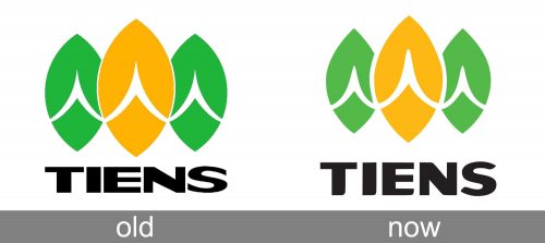
The previous version looked almost exactly like the current one, with the exception of a couple of minor details.
If you take a closer look at the wordmark, you will notice that the breathing space between the letters was scarce in the old logo. Also, the shape of the letters appeared slightly flatter. Eventually, the ends of the letters were angular, while in the current logo, many of them have been rounded.
Current logo
In the Tiens logo, you can see three shapes – one of them is at the forefront, while the other two are slightly behind. Each shape can be described as an eye (or lemon) standing on one of its sharp ends. There is a white swoosh going across each of the “lemons.”
While the lemon shape is far from the shape of the human, you can’t help thinking that the figures represent human beings with their hands forming a traditional oriental gesture of respect (when the two palms are placed together, facing each other, in front of one’s chest).
In this interpretation, the logo may symbolize a group of three people greeting you politely and respectfully. This makes perfect sense, taking into consideration the multi-level marketing model the company uses – respect and personal approach play a major role in its work.
Also, the shapes resemble grains or seeds, as well as buds. Taking into consideration the company’s profile (dietary supplements), this allusion to healthy food and natural growth also makes sense.
Font
The wordmark is given in a bold and highly legible sans. Some of the angles have been rounded, to add a friendly touch. The way sharp ends combine with rounded ones slightly echoes the lemons above. And yet, we can’t say that the type perfectly merges with the emblem.
Color
The optimistic, youthful, and cheerful yellow color is combined with the darker, yet still positive shade of green. In the old Tiens logo, the yellow was brighter, while the green was darker.


