

Monopoly is one of the oldest and best-known board games in the world. It was first released in 1935 by creators Lizzie Magie and Charles Darrow and is an adaption of “The Landlord’s Game”, which was created by Magie in 1903.
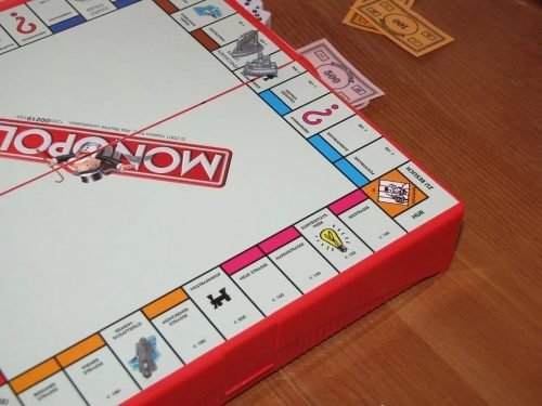
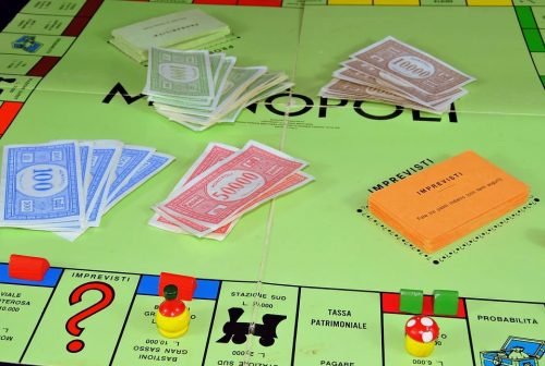
The game requires players to move around the board, buying property and charging their opponents rent whenever they land on something they own. Additional elements of luck are added to the game with the community chest and chance cards, which can reward sums of money to the player, or impose fines or fees.
The aim is to drive your opponents into bankruptcy, with the winner of the game being the player left when others are bankrupt.
Magie invented the game as a tool to demonstrate the mechanics of economics, and to show that a system where monopolies are allowed are not as good as systems that reward wealth creation.
International Success
The game was an instant hit, with Monopoly being released in more than 103 countries and 37 different languages. The original features many landmarks in Atlantic City, including the Boardward and Pennsylvania Avenue.
It was licensed to John Waddington Ltd in the UK, with the British version featuring many famous landmarks in London, including Mayfair and Trafalgar Square.
In 1991, Hasbro acquired Parker Bros. the company that owned the rights to the game. It quickly began creating new versions of the game for release.
Nowadays, the Monopoly brand can be seen in many different places. The game has been made into many different regional versions, and several special editions including a Rick & Morty version, a Pokemon edition, and “The 80’s (opoly)” that featured many famous things from the 1980s. There are also video game versions like Monopoly Streets and Monopoly Live.
Development of the Logo
Naturally, a game that is approaching its 100th birthday that has been translated into 37 languages, distributed to 2013 countries, with at least 1144 variations, is going to have had several logos over its time.
However, the Monopoly logo has not changed much at all, with only minor tweaks over the years.
Original Monopoly Logo – 1935 to 1985
![]()
For the first 50 years of its history, the Monopoly logo was simply a red rectangle with black text. According to Font Meme, the text was written in Kabel Heavy, a typeface created by Rudolf Koch in Germany in 1927.
The typeface has had some other famous uses, including being used in the wordmark for the Toronto Maple Leafs between 1970 and 2016, and as the opening credits for Yellow Submarine, a British film inspired by the Beatles song. It continues to be used as the typeface for the logo of the British Metro newspaper.
Three New Versions – 1985 to 2008
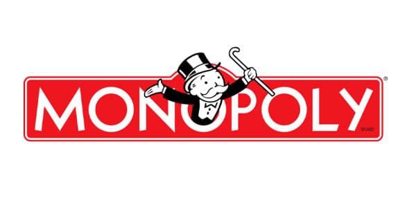
In 1985, the 50 year old logo was replaced with three versions. The main logo was now a red rectangle with rounded edges, white text, and the Monopoly Man, with his top and cane.
A wordmark only version was also created, using the same rounded rectangle, white border and white text.
A 3D version of the logo was also created, although in the same style as the others. In this version, the Monopoly man is in full color as opposed to black and white in the original version.
In all three versions, the same Kabel typeface is used, creating consistency between them all.
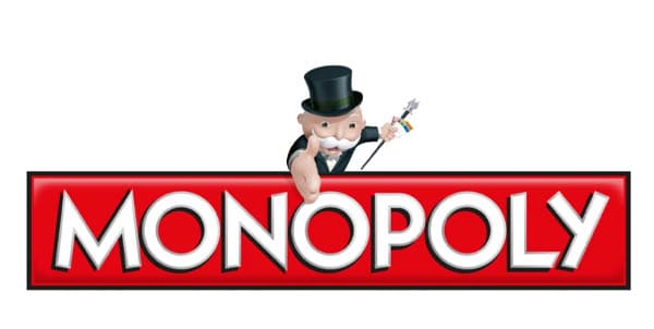
Evolution – 2008 to 2013
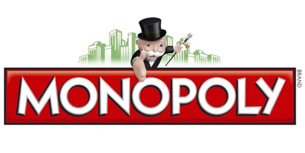
New versions were created in 2008. Between 2008 and 2013 the main logo moved the 3D Monopoly Man from inside the center O to above the rectangle. He was also changed so that he was offering out his hand, either as a handshake or as though he is offering to help someone up.
The rectangle was squared off, and the white border swapped to black. A 3D shadow effect was also added to the text.
A wordmark version without the Monopoly Man, and a flat wordmark version that used a white border but also with squared edges were also created.
Removed Background – 2013 to 2017
In 2013, a minor revision removed some green skyscrapers from behind the Monopoly Man in the main version of the logo. The flat wordmark was also removed.
Current Logo – 2017 to Present
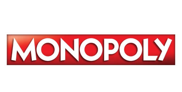
The Monopoly man was removed completely in 2017.The black border was narrowed, and a glass 3D effect added to the logo. The white text continues to have a 3D shadow effect, and remains in the original Kabel Heavy typeface.


