TD Bank is a North American banking company, which was established in the middle of the 19th century in the USA. Today the bank is owned by Toronto Dominion Bank and is in the top 10 American banks by both assets and deposits.
Meaning and history
TD Bank in the form we know today was formed only in 2009, before that it was called “Commerce Bancorp” and featured a completely different badge with its mood and color palette. After the acquisition of the company by Toronto Dominion Bank, the whole visual concept of the label was rethought and changed.
What is TD Bank?
TD Bank is the name of the Toronto-Dominion Canadian bank, which operates in the United States and takes the leading position on the local market. Today the bank has more than a thousand locations all over the USA.
1973 – 2009
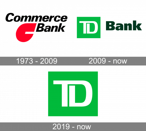
The logo for Commerce Bancorp was created in 1973 and stayed untouched for more than three decades. It was a pretty modern and memorable composition executed in a classy and bright red, black and white color palette, which is considered to be a visual representation of power and professionalism. The logo featured two levels of lettering in an italicized sans-serif typeface with both lines in a title case. The “Bank” line was moved a bit to the right, leaving some space for an abstract red emblem of the bank. The emblem boasted a thick solid red element, which looked like a stylized letter “C” with the upper line featuring a square cut, and the bottom one — arched and sharp.
2009 – Today
In 2009 the bank was renamed TD Bank and the new logo was created in the same year. First of all, the color palette was changed to two shades of green and white. The emblem in bright green and white was set on the left from the “Bank” in dark moss green, executed in an extra-bold sans-serif typeface in a title case. The emblem featured a lively green square with a stylized white “TD” lettering in smooth lines. The letters on the emblem are connected and look soft yet progressive and modern at the same time.
2019 – Today

This secondary logo of the bank is just the green emblem taken from the previous design without the wordmark.


