Each year, a college football bowl game operated by Gator Bowl Sports is held in Jacksonville, Florida. It was first played in 1946 at Gator Bowl Stadium, while today it is played at TIAA Bank Field. Since 2012, its sponsor has been TaxSlayer.com. In 2018, the bowl game was officially renamed the TaxSlayer Gator Bowl instead of the TaxSlayer Bowl.
Meaning and history
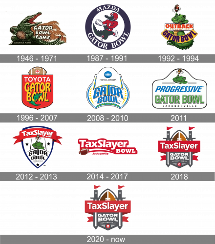
The TaxSlayer Gator Bowl logo of 2019 plays with symbols having multiple interpretations. For instance, the football depicted in the middle also looks like part of a castle. The two posts with flags on both sides remind sabers. What leaves no doubt is that the logo is dominated by the lettering “TaxSlayer” written across a red banner.
What is TaxSlayer Gator Bowl?
TaxSlayer Gator Bowl is the intercollegiate football bowl game, which was first played in 1947, and since then has been held annually at the TIAA Bank Field Stadium in Jacksonville, Florida. The bowl is affiliated with the SEC, ACC, and Big Ten Conferences.
1946 – 1971
The very first logo for the TaxSlayer Gator Bowl was designed in 1946 and stayed untouched for more than two decades. It was a detailed and pretty realistic drawing of an alligator, a calm orange palm-tree ornament on the background, and a bold white uppercase “Gator Bowl Game” inscription set in three levels of a massive rounded sans-serif typeface with each letter outlined in black.
1987 – 1991
In 1987 the logo gets redesigned in a more modern and clean manner. Now it was a caricature of an alligator in a red and white uniform and a helmet with white and blue stripes. The animal in white sneakers was running with a white rugby ball in its hands. The drawing was set on a white background and enclosed in a thick solid blue circular frame with a bold white “Mazda Gator Bowl” lettering written around its perimeter in the uppercase of a sleek and smooth serif typeface.
1992 – 1994
The redesign of 1992 introduced a new bright and funny version of the Gator Bowl logo; with the gradient green caricature of an alligator, placed behind two banners with the lettering: the upper one horizontally stretched rectangular badge in white with the bold red “Outback Steakhouse” Insignia, and the yellow banner arched from the center with a massive geometric “Gator Bowl” in purple. The alligator looked playful and funny and was spinning a brown rugby ball on its finger.
1996 – 2007
The logo with the new sponsor of the Gator Bowl was introduced in 1996. The new concept is built around a solid red crest with the brown rugby ball set horizontally on its top, replacing a traditional crown. The new sponsor of the bowl was Toyota, so its emblem in white and red was set in the rugby ball, and its logotype in white was written along the top border of the crest. The main lettering was written in heavy yellow capitals of a custom sans-serif, with each letter shadowed in black. The “O” of the “Bowl” had a green alligator peeking out of it.
2008 – 2010
Konica Minolta became a sponsor of the Bowl in 2008. The new badge was completely different from all the previous versions: it was a code banner with rounded sides, executed in a white, light blue, and yellow color palette, with the black sponsor’s logotype in small capitals, decorated by a circular blue and white emblem of the brand. The main inscription was set in stylized blue and yellow capitals under the sponsor’s segment of the crest. The sides of the badge featured an interesting geometric ornament in yellow and blue, while the bottom line had a square-spiked line in green and blue.
2011
The alligator spinning the ball on its finger came back to the Bowl’s logo designed in 2011. It was a white horizontally extended badge with the drawing of the mascot on top, the uppercase “Gator Bowl” in square sans-serif set in green and white under the blue italicized “Progressive” logotype in a modern and smooth font, and the straight serif “Jacksonville” underline in the uppercase.
2012 – 2013
TaxSlayer became the main sponsor of the Bowl in 2012, and this is when the new badge was introduced too. It was a classic crest shape with a white background and a blue outline, accompanied by a wide solid red ribbon with the white bold sponsor logotype, set on top of the logo. The body of the crest depicted a green alligator image with a spinning rugby ball. The mascot was drawn above the black arched inscription, enclosed between two solid black five-pointed stars on the sides. The third star was set at the bottom of the crest, under the delicate black “Jacksonville” in small capitals.
2014 – 2017
The logo of the bowl was simplified to a horizontally stretched banner its the bold white inscription set on a solid red background, and decorated by a voluminous image of a brown rugby ball, placed in its bottom left corner, with a white arched line coming out of it to the right. The red “Jacksonville” tagline was set in the title case of a heavy sans-serif typeface, under the red and white arch, formed by the trace of the flying ball.
2018

In 2018 the bowl gets a new badge, with a complicated structure, composed of many elements. It was a classic crest with the top made up of a vertically placed rugby ball in two shades of brown, the sides replaced by two vertically located swords, with their handles decorated by two triangular red flags, which made the swords look like castle towers. The straight horizontal banner in red with the “Taxaslayer” lettering was set on top of the crest. And the “Gator Bowl” in the white and gray set under it.
2020 – Today
The redesign of 2020 kept the structure and style of the previous badge, but slightly softened the color contrast of the crest, muting the shade of red. Nothing else changed, but with the calmer and a bit “dusty” shade of the banner with the “TaxSlayer” lettering, the whole badge started looking more professional and confident.


