Sleek and simple, the T-Mobile logo manages to stay recognizable, and it also gives a hint as to what field the company specializes in.
Meaning and history
T-Mobile is a group of companies operating in the field of mobile communications, which are owned by the German telecommunications holding company Deutsche Telekom. These companies operate GSM networks in Europe and the United States. The letter “T” is part of the word “Telekom.” Many of Deutsche Telekom’s divisions have names beginning with “T-“.
Also, T-Mobile has its share of ownership in some Eastern European mobile operators. In total, T-Mobile now has about 109 million subscribers, making it the 4th largest cellular operator in the world.
The name T-Mobile International AG belongs to the holding company of Deutsche Telekom AG’s various cell phone subsidiaries outside Germany. Based in Bonn, Germany, the subsidiaries operate GSM, UMTS, and LTE-based cellular networks in Europe, the US, Puerto Rico, and the US Virgin Islands.
What is T-Mobile?
T-Mobile is the name of a European mobile network provider, which was established in Germany in 1996, and today operates in four countries, including Czechia, The Netherlands, Poland, and the United States. The brand is owned by Deutsche Telecom.
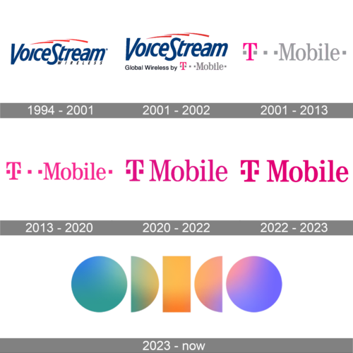
1994 – 2001

The predecessor of T-Mobile US is the VoiceStream Wireless PCS established in 1994. Its logo featured the lettering “VoiceStream” in dark blue with three red waves above and the writing “wireless” below.
2001 – 2002
In 2001 the tagline on the VoiceStream logo was changed. Now it was saying “Global Wireless by T-Mobile”, where the first part was set in a standard black sans-serif font, and the “T-Mobile” — in a bold serif typeface, with the “T” on bright pink, and the “Mobile” in light gray.
2001 – 2013
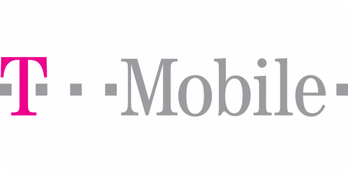
The very first logo featuring the current name of the company was a wordmark. It was a modern, tech-looking logo. Its only similarity to the previous versions is the magenta color for the letter “T”.
In this version, a sleek serif typeface is used, where only two letters are capitalized. The letter “T” is bold, while all the other characters are standard.
What makes the logo recognizable? We cannot but mention those simple grey squares: one from either side of the wordmark plus three between the “T” and “Mobile”. The squares emphasize the impression that all the elements of the logo are interconnected and in a way introduce the idea that the company has to do with telecommunications.
2013 – 2020
The pink and gray “T-Mobile” icon from the previous badge has changed its color palette in 2013, and was used by the company until 2020 with no changes. The pink “T” was now placed between two pink squares in the left part of the composition, and followed by two more squares, accompanied by the pink “Mobile” in serif, with one last pink square on the right. No gray elements were left.
2020 – 2022
The design grew simpler and better legible. The number of squares was reduced (there are now two of them). The wordmark is now colored magenta.
2022 – 2023
The redesign of 2022 has emboldened the contours of the T-Mobile lettering and intensified the shade of pink, used in the logo. The recognizable badge started to look more stable and bright, keeping the iconic style and reflecting the progressiveness of the company.
2023 – now
In 2023 the T-Mobile company was renamed into Odido, and the logo was changed accordingly. The new concept is completely different. It is based on a massive stylized inscription with uppercase characters drawn as solid geometric shapes — two circles, two half-circles, and a vertically oriented rectangle in the middle. The badge is set in a cool color palette, based on gradient shades of blue, green, orange and purple.
Audio symbol
T-Mobile is one of the companies having not only a graphic logo, but also an audio one. It consists of only five notes, yet is truly recognizable. Its author is Lance Massey, who created it in 1999 for the song promoting DT’s Tour de France bicycle team.
Font and Color
The narrowed-back bold title case lettering from the T-Mobile badge is set in a modern and sleek serif typeface. The closest fonts to the one, used in this insignia, are, probably, URW Antiqua Regular Extra Narrow, or Schotis Text Semi Bold, but with the characters slightly condensed.
As for the color palette of the T-Mobile visual identity, it uses bright and intense shades of pink as the main color and accompanied it with a plain white background for better contrast and visibility. Pink is the color of joy and passion, which looks memorable and makes the logo of the company stand out in the list of its competitors.


