SolidWorks is a Microsoft modeling software, which was released in 1995. Today is one of the most popular programs in its segment with over two million users worldwide.
Meaning and history
1995 – Today
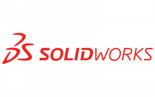
The SolidWorks text-based logo looks simple and light, yet pretty modern and elegant. Composed of a wordmark with an emblem on its left, the logo uses only one color in its palette and three different typefaces.
The SolidWorks nameplate in all the capitals is visually divided into two parts — bold and modern font for “Solid” with smooth “S” and opened “D” and thin lines of “Works”, which makes the logo lighter and more dynamic.
The abstract SolidWorks emblem is composed of three curved lines, which form the “3DS” sign. Hand drawn in sleek smooth lines, the icon looks like a hieroglyph and is a sophisticated and fine insignia.
The red color of the SolidWorks visual identity is a reflection of the software’s progressiveness and energy, it’s the development and moving with the latest innovations.
The SolidWorks logo is simple and modest, yet the different thickness of its lines, which are perfectly balanced, makes it unique and recognizable.


