Since 1973, Siemens has had a simple wordmark logo. However, for most of its history, the company used a more intricate symbol.
Meaning and history
The history of Siemens’s visual identity is not very intense, considering the fact the first logo for the brand was designed in 1899, and since that time there only three major redesigns, and all other changes made to the emblem throughout the years were minor.
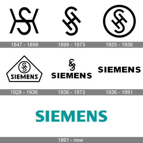
1847 – 1899
In its early years, the company used a simple monogram that featured the first initials of the founders. The initials are characterized by clean strokes and straight cuts. The “H” had the vertical lines coming at an angle, which made it look almost like an “X”. The “S” was centered, creating a symmetrical and balanced logo image. The black color of the emblem gave it a strong and sophisticated feel. The logo turned out to be a perfect base for the future variations of Siemens logos.
1899 – 1973
The initial logo of the company featured an intertwined monogram, consisting of two first letters of the founders’ surnames — Siemens and Halske, “S” and “H”. The “S” was enlarged and vertically stretched, while the “H” had a square shape and was placed diagonally, inclined to the left.
1925 – 1936
The monogram was enclosed in a circular frame in 1925. The outline of the emblem featured the same thickness as the letters, so the logo looked very balanced and laconic in its monochrome color palette.
1928 – 1936
The redesign of 1928 adopted two new elements, which were the bold black wordmark in all capitals, placed under the circular emblem, and geometric framing, in a pentagon shape, with the peak on top. Though now the logo featured four components, it still looked modest and minimalist, due to the simplicity of the lines and their black-and-white execution.
1936 – 1973
Both frames were removed in 1936, and now the “SH” monogram was placed above the “Siemens” inscription without any additional lines and decorations. The typeface of the new wordmark was cleaner and more modern than the one from the previous version, and letters gained more space between each other. This version of the logo stayed with the brand for almost forty years.
1936 – 1991
Another logo version, which was in use by the brand since 1936, featured only the “Siemens” logotype, written in all capitals and executed in a modern and bold sans-serif typeface, with thick lines and a lot of air. Each of the letters looked serious and confident, which gave a special mood to the whole logo.
1991 – Today
The redesign of 1991 refined the logo, introduced in 1936, cleaning its lines and strengthening them. The wordmark of the new version is executed in a modern yet simple sans-serif typeface, which is very similar to such fonts as Dialog Pro Extra Bold and Lucida Grande Black.
As for the color palette of the Siemens visual identity, there are three options of using its logotype: tender and light turquoise, which is the main color of the brand, evoking a sense of safety, reliability, and calmness; light gray, which stands for confidence and seriousness, and black, which is the color of power and elegance.
Symbol
In 1925 the symbol was placed in a circle. Three years later, the circle, in its turn, was placed into a bigger diamond-shaped logo. It was the first time when a wordmark was added to the official emblem. It was also placed inside the diamond, right under the interlacing letters “S” and “H”.
Emblem
In 1936 the emblem grew cleaner and simpler, the diamond and circle shapes being removed from it. By 1973, however, it became obvious that the logo was excessive, so the company decided to get rid of the symbol, leaving only the wordmark. The following update came in 1991 and included the change of the color.
Font
Some of the typefaces that resemble the one used in the Siemens wordmark are Frutiger Black and Colaborate Bold.
Color
The only color featured in the current Siemens logo is cyan. It was adopted in 1991, while earlier emblems were black-and-white.


