Ring of Honor (ROH) is primarily a professional wrestling promotion, renowned for its dedication to showcasing pure wrestling talent and its unique Code of Honor. Established in 2002, this Maryland-based company was eventually acquired by Sinclair Broadcast Group in 2011. ROH stages its thrilling events across the United States, enthralling audiences with high-octane matches and cultivating a fervent fanbase. Its roster boasts both emerging stars and seasoned veterans, solidifying its reputation as a prime destination for professional wrestling enthusiasts.
Meaning and history
Founded in 2002, Ring of Honor (ROH) quickly positioned itself as a significant player in the realm of professional wrestling. Created by Rob Feinstein, its emergence filled a niche for those desiring athletic and pure wrestling showcases. Over the years, ROH has achieved notable milestones; from fostering talents that became global sensations to hosting events with record attendances. Their commitment to the unique Code of Honor distinguishes them from other promotions. Acquired by the Sinclair Broadcast Group in 2011, ROH’s influence has since expanded. The company continues to thrive, hosting events nationwide and cementing its legacy in the wrestling industry.
What is Ring of Honor?
Ring of Honor (ROH) is a professional wrestling promotion founded in 2002. Renowned for its emphasis on athletic showcases and its unique Code of Honor, it has become a major entity in the wrestling world, hosting events across the U.S. and nurturing numerous top talents.
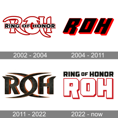
2002 – 2004
This emblematic “Ring Of Honor” logo, saturated in a fiery red, boldly combines intertwining elements to evoke the spirit of passion and combat. The interplay between the letters “R” and “H” creates an arresting visual tension, embodying the constant clashes and resolutions found in the ring. The words “Ring Of Honor” in a robust block font are nestled within, reinforcing the brand’s strength and authority. The cohesive design captures the essence of honor, tenacity, and valor that are paramount in the wrestling world.
2004 – 2011
The “ROH” abbreviation stands prominently in this logo with a striking blend of black and red, symbolizing strength and ferocity. The angular design of the letters gives the logo a modern and aggressive touch, reminiscent of the sharp moves and strategic play in wrestling. The thin red outlines further highlight and define the logo’s structure, ensuring it makes a strong statement and leaves a lasting impression.
2011 – 2022
Drenched in a rich, dark shade, this “ROH” badge is an amalgamation of sophistication and strength. The sleek metallic texture and the subtle gold outlines bring forth an aura of regality, setting the brand apart. The symmetrical design, with the ornate curves merging into the sharp edges of the letters, speaks of a harmonious balance between elegance and power. This logo is a testament to the brand’s commitment to honoring the art of wrestling while maintaining a grandeur presence.
2022 – now
This rendition of the “Ring Of Honor” logo marries simplicity with strength. The use of bold block letters, enclosed within uniquely designed geometric shapes, brings forth a sense of structure and fortitude. The distinctive red outlines encapsulating the “ROH” provide a burst of energy and dynamism, aligning with the thrilling nature of wrestling matches. The overall design solidifies the brand’s presence, signaling its prowess and dedication to the sport.


