 Raiffeisen Bank International Logo PNG
While the roots of this logo go back to ancient European folk traditions, it has a meaning that is highly relevant today.
Meaning and history
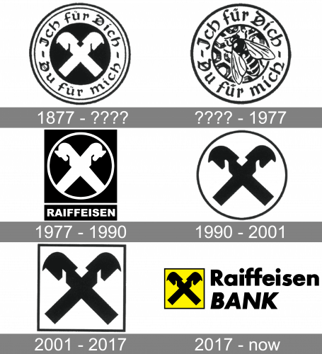
The Raiffeisen Bank logo features a gable cross in black inside a bright yellow square with thin black trim. The gable cross is made up of two crisscrossed horse heads attached to a house gable.
The gable cross is used as a symbol of protection. Historically, people placed the roof gables on their houses to show that the house was protected. This symbol was believed to protect people inside against any external danger and to ward off evil. This belief has its roots in ancient European folk traditions.
As an emblem of Raiffeisen, the gable cross has a transformed meaning: it stands for “the protection and security” the members of the Raiffeisen banks have due to their “self-determined cooperation” (according to the brand’s website).
We can also add that the value of the brand was estimated at € 1.93 billion by the European Brand Institute in 2018, which makes it one of Austria’s most valuable brands.
1877 – ????
The gable cross was adopted as the symbol of the bank in 1877 when Friedrich Wilhelm Raiffeisen was still alive.
???? – 1977
Also, the company’s official website features an older version combining a bee with the same tagline. We can say that the “honey” theme started by this logo is in a way reflected in the current version through the use of the yellow color.
1977 – 1990
Another version featured the gable cross in white inside a black circle. There was also a tagline.
1990 – 2001
The way it looked has slightly changed over time. You can come across an older version where the design was placed inside a circle, and there was no yellow.
2001 – 2017
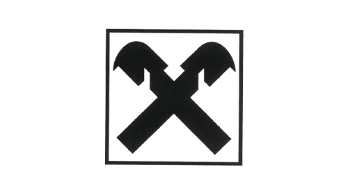
In 2001, they replaced the circular frame they had before with a square one, and that’s it.
2017 – Today
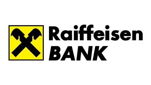
Further on, the white innards of this new square logo were filled with yellow. That’s also when they added the big ‘Raiffeisen Bank’ inscription made with thick black letters on the emblem’s immediate right.
Font
The Raiffeisen Bank logo is based on the Futura font family (one of the bold versions). This font was developed by designer Paul Renner and published by the Linotype type foundry.
The font is pretty bold, which helps to create an impression of something stable and reliable. Also, many of the letters remain rounded, which supports the “protection” theme.
Company overview
Raiffeisen Bank International A.G. (RBI) is based in Vienna, Austria. In its current form, it was founded in 2017 after the merger with its parent company, RZB Group (Raiffeisen Zentralbank Österreich). The history of the brand, however, can be traced back to 1927 and even earlier.


