The annual American college football bowl game, which is played in the Miami metropolitan area, was first held in 1935.
Meaning and history
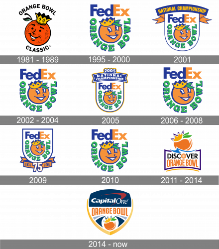 Both the Orange Bowl game and its logo can boast a long and interesting history.
What is Orange Bowl?
Orange Bowl is the intercollegiate American football bowl game, which is played annually since 1935. The games of the bowl, which is a part of Division I of NCAA, are held on the Hard Rock a stadium, in Miami, Florida.
1981 – 1989
 One of the earliest logotypes (1981-1989) featured a cartoonish orange king wearing a crown.
1995 – 2000
With the FedEx sponsorship, the logo of the Orange Bowl was redesigned in 1995, and the emblem created in that year has been in use for almost two decades. It was a simple white crest with rounded bottom and straight top parts. The crest featured a thick blue outline, had a happy orange caricature in the center, and two inscriptions. The upper part of the badge was taken by the blue and orange FedEx logotype, while the “Orange Bowl” lettering was arched under the orange, executed in bold green square serif style.
2001
The redesign of 2001 adds some decorations to the Orange Bowl logo, and refined its contours, cleaning and strengthening them. The composition of the badge remained untouched, just a blue and orange ribbon was now placed on top of the logo and had a bold “National Championship” inscription in the uppercase of a narrowed sans-serif typeface written over it in a light orange shade.
2002 – 2004

In 2002 both the ribbon and the framing of the logo were removed, and now the happy smiling orange, with the square serif lettering in green and the FedEx logotype above it, was set on a white background with no other ornaments. All the elements of the logo were enlarged, compared to the previous versions, and started looking more confident and professional, with the blue outline adding some power and freshness.
2005
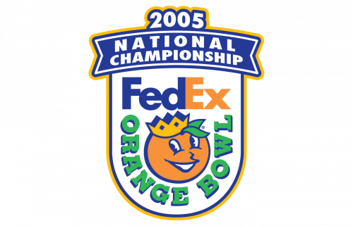
The rounded crest frame returned to the Orange Bowl visual identity in 2005, for the National Championship. It was a thin blue and yellow outline, which was accompanied by a slightly arched wide blue ribbon set on top of the crest. The ribbon featured two-leveled lettering in massive white capitals, and the “2005” with white numerals in blue and yellow outline, set above it like a crown.
2006 – 2008

The logo from 2002 come back as the official one in 2006 after the National Championship has finished. It was still the same orange, green lettering arched under it, and a massive and clean FedEx logotype in blue and orange. No framing or additional banners with text on this version.
2009

To celebrate the 75th anniversary of the Bowl the logo was redesigned again in 2009. The iconic composition was again enclosed into a blue rounded crest frame and had a wide orange and blue ribbon under it. The central part in the new element was an enlarged “75” with white numerals outlined in orange and blue. As for the ribbon, it had a date mark set on it in blue, the “1935” on the left from the central element, and “2009” on the right.
2010
In 2010 the Bowl comes back to its unframed version of the logo, with all elements keeping their original size, style, and colors. It was the last season the Bowl was using its iconic logo, as with the redesign of 2011 a completely new concept was introduced.
2011 – 2014
 In 2011, the anthropomorphized orange was replaced by a simpler design.
2014

The image of the orange from the previous version was kept after the redesign of 2014. It was slightly enlarged and placed on the left part of the new logo, being overlapped by the new stylized inscription. The lettering in the title case was executed in a sleek narrowed sans-serif typeface, with the first part in orange, and the second one — in dark blue. Where the text was overlapping the emblem letters were outlined in white, which looked balancing and airy considering the white color of the overall background.
2014 – Today
A few months later the logo was redesigned again, and this is when the crest shape came back to the bowl’s visual identity. This time the crest was sharper and more modern, being outlined in two shades of yellow from the sides. The central part was executed in blue and white, with the orange emblem placed on the bottom part, surrounded by contrasting elements in blue and gray. The upper blue part of the logo featured a “CapitalOne” logotype with a dark red swoosh, the logo of the sponsor. As for the “Orange Bowl” lettering, it was set in all capitals of a modern and bold sans-serif typeface, on a white background, with its bottom border arched from the center.


