Optus — is the second largest telecommunication player on the Australian market, and the largest provider of satellite services, which include Internet, television, radio, and communications. The company was founded in 1981 and has been steadily growing, reaching the top of the ratings.
Meaning and history
Optus was established in 1981 as AUSSAT, which is an abbreviation for Australia Satellite. The name of the company was changed to Optus Communications at the very beginning of the 1990s, and this is when the first official logo of the company was introduced.
In 2001 Optus was acquired by Singtel, already the largest telecommunication provider in Singapore. Since that merger, Optus began acquiring its smaller competitors, which led to the company becoming the second-largest telecommunication company in Australia.
What is Optus?
Optus is the name of Australia’s second-largest telecommunications company, which was founded in 1971. Today, Optus not only provides Internet access and mobile communications but is also a manufacturer of multimedia equipment and gadgets.
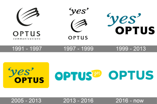
In terms of visual identity, Optus had quite an intense history, with several major redesigns of its logo, reflecting the main stages of the company and its development. Although, the color appeared on the Optus logo only after the refinement of 2005.
1991 – 1997
The logo, designed for the Optus company in 1991, featured a very elegant composition of a minimalistic graphical emblem and uppercase lettering in an elegant serif font, accompanied by the lowercase “Communications” tagline in a slanted font. The emblem comprised three sharp lines, enclosed into a frame of an arched line, making up an open circle. The whole composition was set in black-and-white.
1997 – 1999
The redesign of 1997 has slightly modified the Optus badge, created in 1991, removing the lowercase tagline, but adding the “Yes” lettering to the upper part of the logo. Even though, the new part of the identity was also set in lowercase, it featured the largest size than the capitalized “Optus”. The color palette of the badge was still based on the monochrome.
1999 – 2013
In 1999 the Optus logo gets another redesign, with the graphical part being completely removed from the composition. The new concept is based on two wordmarks — the cursive “Yes” in the lowercase of an elegant font, set in a dark turquoise color, and a bold uppercase “Optus” in a stable font with small sharp serifs on the end of the heavy bars, set in black.
2005 – 2013
The redesign of 2005 has placed the logo, created in 1999, on a solid yellow rectangle, which was oriented horizontally and has its corners softened. In the new color palette, the badge of the company started looking more up-to-date and evoked a feeling of a free young spirit, showing the ability of Optus to adapt to the needs of its customers.
2013 – 2016
In 2013 the concept of the Optus logo was completely changed. The new badge featured a combination of the enlarged rounded “Optus” wordmark in the uppercase of a stylized sans-serif font, set in a bright turquoise shade, accompanied by a white cursive “Yes”, written on a solid yellow dialogue bubble, in the upper right corner of the badge.
2016 – Today
The redesign of 2016 has introduced quite a minimalistic logo for the company, with only one element — the uppercase wordmark in a calm medium-dark shade of turquoise, without any additional colors or elements. The new badge looks confident, laconic, and professional.
Font and color
The bold and stable lettering from the primary Optus logo is set in the uppercase of a modern geometric sans-serif typeface with the contours of the letters and their angles slightly softened. The closest fonts to the one, used in this insignia, are, probably, Metcon Bold, or Brushability Sans Black.
As for the color palette of the Optus visual identity, it is based on a calm yet still bright and eye-catching shade of turquoise, which looks fresh, energetic, and very young.


