 Old Dominion Athletic Conference Logo PNG
Old Dominion Athletic Conference is a sports organization, which was created in 1975 under the name Virginia College Conference. Today the organization has 14 members from schools and colleges across Virginia and North Carolina.
Meaning and history
Old Dominion Athletic Conference is a part of the NCAA Division III, with 14 schools-members. And although the league was established in 1975, the first championships were held only a year after, for the season of 1976 — 1977. Today in the ODAC (the name was changed a few months after the established end of the league) the men’s and women’s teams compete in 15 sports disciplines, including Baseball, Basketball, Tennis, Field Hockey and many more.
What is Old Dominion Athletic Conference?
Old Dominion Athletic Conference is the American intercollegiate league, established in 1975, and today consisting of 14 members, which all attend schools in Virginia and North Carolina. The league is part of the NCAA Division III.
As for the visual identity, the logo design of the Old Dominion Athletic Conference looks solid and sharp, with an obviously powerful and brutal mood, reflecting the fighting spirit, and willingness to win.
2000 – 2010
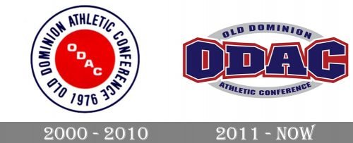
The lettering “ODAC” was placed inside a red circle and looked pretty small and illegible at smaller sizes. It was encircled by the full name of the conference featuring glyphs of almost the same size. The dark blue uppercase inscription was executed in a modern narrowed sans-serif typeface, which is pretty close to such fonts as Metafora Black and Cadmium Compressed Bold, with come of the contours modified and softened.
2011 – Today
After the redesign of 2011, the Old a dominion Athletic Conference logo became more complicated and strong, and at the same time, more logical for the organization, connected to sports. The centerpiece of the current version is the abbreviation “ODAC” in blue with red and white trim. The proportions of the letters have been distorted to give the impression that the lettering is slightly concave, which adds dimension. The highlights serve the same purpose.
As for the full lettering, it is set on a narrow gray framing, which created two arches, above and under the bold blue abbreviation. The lettering is set in an extra-bold blue capitals of a massive geometric sans-serif typeface with angular contours and straight bars.


