The New England Women’s and Men’s Athletic Conference (NEWMAC) stands as a collective entity, orchestrating intercollegiate sports competitions. Unlike a conventional business with a single proprietor, NEWMAC is collaboratively governed by its member colleges and universities. This conference is dedicated to fostering athletic contests among these educational institutions, with its sphere of influence predominantly situated in the New England area of the United States. NEWMAC’s role is pivotal in ensuring that athletic activities are in harmony with the educational missions of its member entities.
Meaning and history
Rooted in the legacy of the New England Women’s 8 Conference established in 1985, the New England Women’s and Men’s Athletic Conference emerged in 1998, marking a new chapter in its developmental saga. This evolution signified a leap towards inclusivity and expansion in its athletic endeavors. NEWMAC’s narrative is rich with achievements, notably in harmonizing athletic prowess with academic integrity and advocating for equitable opportunities in sports across genders. Presently, NEWMAC upholds its reputation as a beacon of collegiate athletics, skillfully balancing scholastic dedication with sporting excellence. The conference is celebrated for its role in nurturing student-athletes, affirming a commitment to academic and athletic balance, and its continuous pursuit of excellence in college sports.
What is NEWMAC?
It represents a coalition of New England’s higher education institutions, focused on orchestrating intercollegiate sports. NEWMAC stands out for its commitment to maintaining a synergy between athletic competition and academic values, while also championing gender equality in sports. This conference is lauded for its unique approach to integrating sportsmanship with scholarly pursuits.
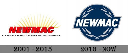
2001 – 2015

The first Newmac logo was introduced in 2001 and stayed unchanged for almost 14 years. It was a simple yet bright composition, with the bold italicized sans-serif “NEWMAC” logotype in bright red, with each letter outlined in black. Behind the inscription, there was a light yellow image, composed of numerous sharp rays coming from the center to the sides. The badge was underlined by a black uppercase “New England Women’s and Men’s Athletic Conference” in a simple yet strong sans-serif typeface.
2016 – Today
The current New England Women’s and Men’s Athletic Conference logo is rather placid and relaxed for a sports emblem. Although the italicized lettering adds dynamism, the very choice of color does not suggest aggressiveness or excessive energy.
Even the laurel wreath, which is one of the most universal symbols of sports and victory, looks somewhat placid here reminding about the peacefulness of nature. The sharp ends add some sportiness, though.


