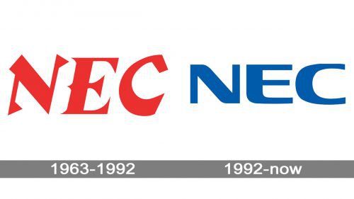
While the NEC logotype has almost always featured nothing but the company name, it doesn’t mean that it has always remained the same.
Meaning and history
NEC Corporation is a Tokyo-based provider of information technology services and products. It dates its history to the Nippon Electric Limited Partnership founded in 1898.
1963 — 1992

The sharp design elements resembling thorns make the letters unusual. The wordmark existed in two colors: red and black.
1992 — Today

At first glance, the wordmark doesn’t appear as unique as its predecessor. Yet, if you take a closer look, you’ll definitely notice that actually, the wordmark became cleaner without losing its uniqueness. The rounded corner on the letter “E” creates a perfect harmony with the curve of the “C,” while the smooth shape of the “N” emphasizes the overall effect. The emblem was developed by Landor Associates in Japan.
Font
The NEC logo features the namesake type. It is a display font designed by Julio Garay.


