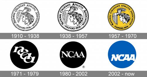
NCAA is an abbreviation standing for the National Collegiate Athletic Association, an American organization, established in 1906 for regulation sports life of colleges and universities all over the country try, and organizing competitions and championships. Today the institution works not only in the USA but also in Canada and supports almost half a million young athletes.
Meaning and history
The visual identity of the association has come through several redesigns during more than a century of its existence, turning from a classic medallion into a bold and modern badge, with lots of character and power in it.
1910 – 1938
The very first logo for the National Collegiate Athletic Association was drawn in 1910 and stayed with NCAA for almost 30 years. It was a circular medallion emblem, with the portrait of two young athletes, a woman and a man drawn in profile and being crowned with a leaf wreath by two hands from the left part of the medallion. The full inscription was written from the inside of the coin, around its perimeter.
1938 – 1957
The redesign of 1938 was all about strengthening and emboldening the original NCAA medallion. The contours were refined and cleaned, the faces and letters became more visible and bold, and the logo got a more confident and strong look. The central drawing on the logo got an extra outline from the inside of the badge. It was formed by numerous contoured dots, balancing the main shape of the badge.
1957 – 1970
With the redesign of 1957, the classic and delicate medallion gains an intense yellow background. Though the main elements of the badge, the faces, wreath, and hands kept the white and black color palette. The contouring and lettering on the logo were modernized, even more, getting the lines stronger and cleaner. Now the badge looked more professional and vivid, which was more than suitable for the organization, specialized in supporting Young athletes. The yellow added youth, freshness, and dynamics.
1971 – 1979
Although the previous design concept was not bad at all and started being instantly recognizable, NCAA decides to completely redesign its logo in 1971. It was a minimalistic yet sleek badge in a monochrome color palette with nothing but the lettering on a solid black circle. The “NCAA” abbreviation was written in the lowercase of an elegant serif typeface, with smooth and bold letters placed diagonally from the upper left to the bottom right part of the circle, and the tails of the bars overlapping each other.
1980 – 2002
Even a simpler and more laconic approach was adopted for the new NCAA logo, introduced in 1980. The black-and-white color palette from the previous design remained, as well as the main heroes — a solid black circle and a white inscription. But the inscription was now set in all capitals of a classy serif font, with all the letters written in one horizontal line, with only of pace in and between them. It was strong, confident, and very usual.
2002 – Today
After more than twenty years of using a pretty boring badge, NCAA introduces a new bright banner in 2002. The solid circle is now colored blue, a color, evoking a sense of professionalism and reliability. As for the lettering, still set in white,!85 was moved from the center of the logo to the bottom part, and changed its traditional serif font to a custom extra-bold one, with massive serifs on top of the letters. The inscription is slanted to the right, while the serifs are oriented to the left, and this creates a sense of speed and movement.


