In 2008, MTS was named the most valuable brand in Russia – it was the only brand that was included in the list of 100 most influential brands in the world according to the Financial Times. In 2010, the Interbrand rating also recognized it as the most expensive Russian brand. After the new logo, there was a scandal, according to the artist from Belarus, the idea was stolen from him.
According to numerous reviews, the quality of communication is very low.
Meaning and history
MTS is a large Russian company that provides mobile communication services and all types of television: digital, mobile, satellite, and cable. The geography of the company’s activities is very extensive. It and its subsidiaries provide services in several countries. The list includes Russia, Armenia, Uzbekistan, Belarus, Turkmenistan. The abbreviation of the brand stands for “Mobile Telecommunication Systems”.
Today the company, established in 1993, is considered one of the most valuable Russian brands. The company owns a large retail network of more than 5 thousand phone stores across the country and beyond. They sell cell phones and provide financial services.Together with its subsidiaries, the company serves more than 85 million subscribers.
What is MTS?
MTS is one of the largest mobile operators in Russia, which was established in 1993 as a CJSC by several Russian and German companies, including MGTS, Deutsche Telecom, and Siemens. Today one of the big three brands in the segment serves dozens of millions of clients across Russia. MYS is owned by Sistema Corporation.
1993 – 2002
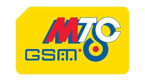
The original MTS logo was pretty cluttered. There was the red “M” with blue shade paired with the letters “TC” in blue and white (which is “TS” in the Russian alphabet). There was the lettering “GSM” below and a strange red, blue, and white loop (or a bullseye).
2002 – 2006
The design was now featured over a yellow SIM card, which only made it even more cluttered.
2006 – 2010
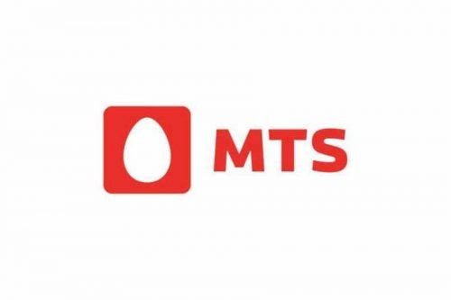
This is when the now-iconic egg logo was introduced. The new brand identity was part of the rebranding strategy of JSFC Sistema, the parent company of MTS.
The logo now consisted of two red squares placed next to each other. The left square housed a white egg representing simplicity and genius. The right square housed the lettering “MTC.” There was also an English version where the name of the company was “MTS.” The same structure of the logo was used by other JSFC Sistema’s telecom subsidiaries, although the colors were different.
After the new logo, there was a scandal, according to the artist from Belarus, the idea was stolen from him.
2010 – 2015

The previous logo was given a stylish upgrade. First of all, the square with the egg was done in a gradient, which gave it volume, and had a frame as well as rounded corners. The egg also appeared to be protruding from the shape. The initials were now printed in red since there was no more square background. the letters were made larger to create a balanced image.
2010 – 2019
In 2010, MTS purchased Sistema Telecom, the owners of the “egg” emblem. As a result, it became the only owner of the logo.
The design was slightly updated. The corners of the left square were rounded while the right square disappeared leaving only the lettering “MTC” in red. The type was slightly modified, too.
There was also a 3D version, where white highlights were added around the egg.
2015 – 2019
A large red patch was added behind the emblem.
2018 – 2019

A bright red rectangle served as the base of a new logo. There was no more egg shape and it held only the initials of the company. These were printed in white sing a new font style and aligned right. Although there were no serifs it looked very different since the top of the letter “M” seemed to be cut off, while both ends of the letter “C”, which now looked like a sideways “U”, reached the border of the shape. Thanks to its unordinary design, the emblem turned out great.
2019 – 2023
Both the red patch and the square have disappeared. Now, the MTS logo features only the egg and the name of the company, which is given in a slightly different type than before.
2023 – now

A very interesting design caught attention due to the unconventional arrangement of the letters. It featured a red square with white lettering. Both elements have already been closely linked to the company. To make this version unique and grab the viewer’s attention, they placed the three letters in corners, leaving the left bottom corner empty. When it comes to the font, the emblem had a sans-serif font similar to the one seen in the 2006 logo but using thinner strokes.
Font and Color
The heavy and stable uppercase lettering from the logo of MTS is set in a bold geometric sans-serif typeface, with brutal characters and clean contours. The closest fonts to the one, used in this insignia, are, probably, Distance Rider Bold, or Vast XXL Extra Bold, with some minor modifications of the letter shapes.
As for the color palette of the MTS visual identity, it is based on an intense and bright shade f red; which stands for power, passion, and motion, at the same time representing the professionalism and progressiveness of the company, and evoking such senses as reliability, stability, and expertise.


