

![]() Mr. Clean Logo PNG
Mr. Clean Logo PNG
The Mr. Clean brand belongs to the world-famous Procter & Gamble Company and specializes in the production of household cleaners. The brand was actively promoted in 1958. Each country in which the brand appeared localized its name while retaining its original meaning and making sure to include a word associated with cleanliness.
Meaning and history
![]()
The history of the Mr. Clean brand began in 1958. It was invented by Linwood Burton, a businessman who was engaged in cleaning ships. His main task was to create a cleaning agent, effective, on the one hand, and on the other – minimally harmful to people who work with it. A year later, all the rights to this product were bought by Procter & Gamble, and from that moment began to build one of the most powerful and recognizable brands in the world.
Almost every country has a different name for the product: in Canada and the USA it is Mr. Clean, in Germany — Meister Proper, in France —Monsieur Propre, in Mexico and Latin America — Maestro Limpio, and in Italy, it is Mastro Lindo. There is its name for the brand in the UK and Ireland too, without the “Mister” part, just Flash.
Mr. Clean brand produces cleaning products in the budget price category. This brand has long been known on the market for its high quality and wide range of products, which is constantly replenished.
The choice of Mr. Clean household chemicals is quite diverse. Universal cleaning powders for washing clothes contain special active particles that can cope with even the most difficult and stubborn stains of various etymologies. Bleaching powders not only cleans well but also brightens various surfaces. The universal products are suitable for all materials, including the most delicate ones.
What is Mr. Clean?
Mr. Clean is the name of a global brand of household cleaning products owned by the American company Procter & Gamble since 1958. Over the years, the brand has become synonymous with household chemicals in principle. Mr. Clean products are used by millions of housewives all over the world.
The image of a sturdy bald man with an earring in his left ear on every package and in advertisements remains a constant companion of every Mr. Clean product. Initially, the character was conceived as an experienced sailor, capable of cleaning with one left hand, but customers perceived him as a fairy-tale genie, flying out of the bottle by magic and helping around the house. In 1998 he was recognized as “the sexiest man” by the British People Magazine.
1958 – 1997
![]()
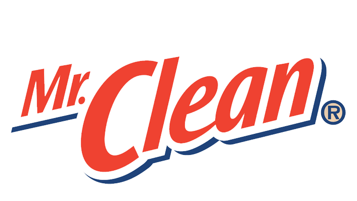
The original Mr. Clean logo, created in 1958, has stayed with the brand for almost forty years. The main part of the logo was an emblem depicting an animated muscular man with white eyebrows, a bald head, and an earring in his ear. The image was supplemented with a bold red lettering set in two levels against a white background and executed in a massive geometric sans-serif typeface.
1997 – 2002
![]()
The redesign of 1997 has modernized the logo of the brand, rewriting the wordmark in a more distinctive typeface and placing it diagonally right under a refined emblem. Both elements were now outlined in blue, which made it look brighter on a clean white background.
2002 – 2006
![]()
In 2002 the Mr. Clean logo was updated again. This time it was only about the lettering part. The wordmark was rewritten in a more lightweight and elegant typeface, with the red characters placed on a white banner and accompanied by only a couple of blue strokes for shadowing. In this style, the banner looked more airy and fresh.
2006 – 2008
![]()
Another version of the Mr. Clean logo was introduced in 2006, with the refined emblem where the symbol of the brand was redrawn in a more modern way, and the graphical part enlarged. The banner with the wordmark also got larger and now overlapped the emblem even more. The style of the inscription remained the same, but the shade of red got a bit lighter.
2008 – 2010
![]()
In 2008 the banner with the lettering got significantly smaller than on the previous badge and was now placed right under the arms of Mister Clean, which kept his recognizable design unchanged. This version of the logo stayed active for another two years.
2010 – 2014
![]()
The redesign of 2010 has removed the blue outline from the Mr. Clean logo elements, slightly blurring the edges of the emblem, which made them look glowing. The brand’s mascot image was refined, as well as the lettering, which was now set in a bold geometric sans-serif typeface, in a dark shade of red.
2014 – Today
![]()
In 2014 the lettering on the Mr. Clean logo was changed again. This time the colors of the wordmark became lighter and gained gradient shades, making up a more voluminous image. Also, the typeface got more brutal, with the massive and stable characters and straight cuts of the bars.
Font and color
The bold title case lettering from the primary logo of the Mr. Clean brand is set in a modern geometric sans-serif typeface, which looks quite close to such commercial types as TT Lakes Neue, Tactic Sanstrade, or Eurostilereg but with some visible modifications of the contours.
As for the color palette of Mr. Clean visual identity, it is based on the combination of white and blue, the mix, which is most often associated with freshness and cleanliness. White is also used as a symbol of freedom and confidence, which is relevant for a product intended for cleaning. Red is associated with strength, love, and professionalism.


