

Today there are hundreds of thousands of representatives of this profession in the world. Naturally, among them, there are various kinds of competitions or evaluations of popularity according to certain criteria. The art of DJ-ing is to create an emotional mood in a person, stimulating him to dance and the ability to manage this emotional mood. No one has yet managed to create an infallible system for assessing the level of human emotion, and therefore the assessment of professionalism of DJs is subjective. Nevertheless, in the press and on the pages of the Internet regularly printed lists of DJs who are awarded the title of “best” DJ according to certain criteria.
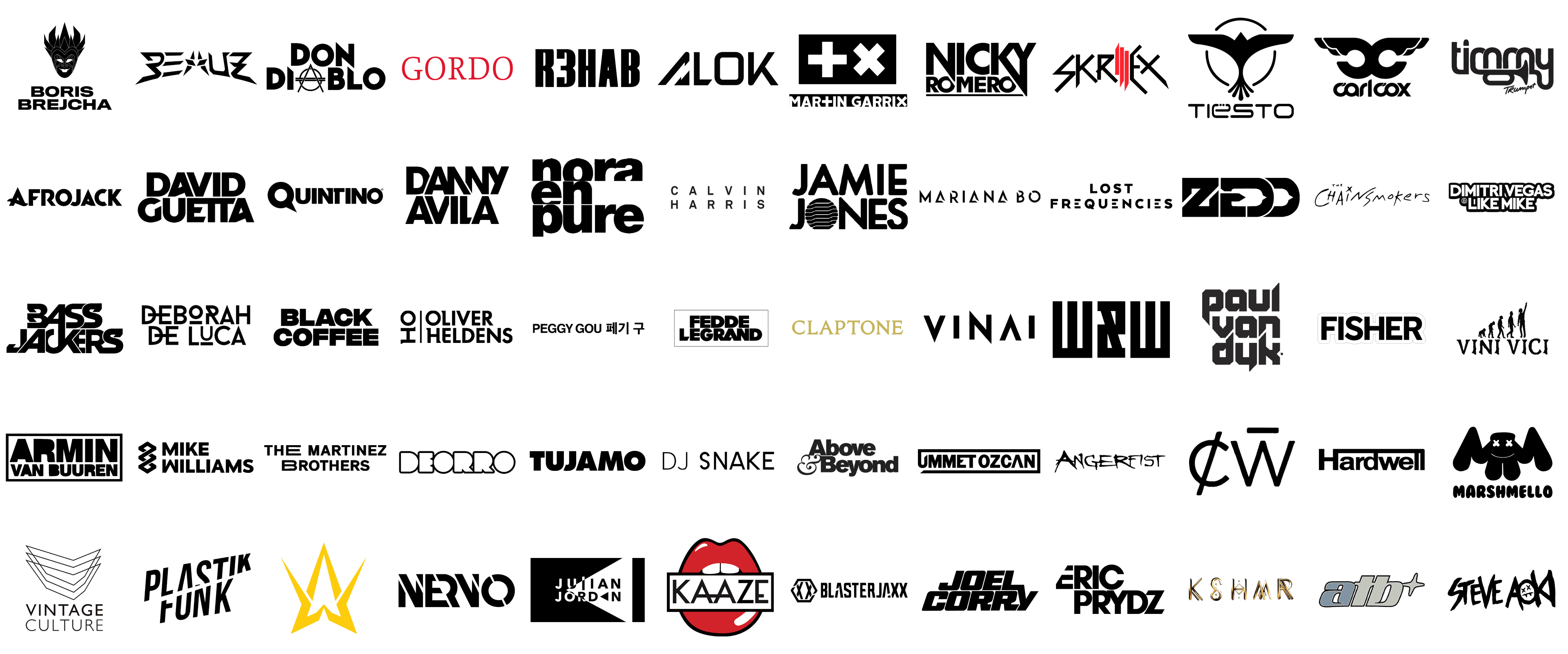
For example, DJ MAG regularly publishes its top 10 and top 100 best DJs in the world, which in the last few years has consistently included such outstanding personalities in the world of electronic music as Martin Garrix, David Guetta, and Armin Van Buuren. We also have our ratings, but the evaluation criteria are different – visual identity. So, today we bring to your attention a list of the coolest DJ Logos, in each of which you can find something interesting. Let’s watch and evaluate!
Armin Van Buuren
![]()
The logo of the famous Dutch DJ and music producer Armin Van Buuren is all about strength and simplicity. The badge consists of a two leveled lettering with the name of the musician, and a minimalistic rectangular frame it is inscribed into. The black wordmark has its upper, “Armin” part enlarged”, yet both levels are executed in one typeface — an extra-heavy geometric sans-serif typeface with distinctive contours of the characters and straight cuts of the bars. Overall the image represents the style and confidence of the musician.
David Guetta
![]()
The David Guetta logo evokes a sense of confidence and luxury. The simple black-and-white badge is executed with high style and attention to detail. The only element on the logo is the name of the musician, written in two lines against a transparent background. The inscription is set in the uppercase of a custom sans-serif typeface with massive characters written in thick sleek bars and interesting straight and diagonal cuts of the lines. Both “A”s feature diagonal bars, and the “E”, and two “T”s in “Guetta” share one upper horizontal bar, while all the characters in “David” are separate.
Martin Garrix
![]()
The visual identity of Martin Garrix is definitely one of the most recognizable among all DJs, and it doesn’t need to be drawn in a multicolor palette, nor does it have to include ornate graphical elements. Everything here is strict, straight, and laconic. The super popular DJ boasts a logo that consists not only of a wordmark but also of an emblem. The Garrix emblem consists of two white crosses (straight and x-shaped) drawn on a solid black rectangle. The same symbols you can see in the wordmark — with the plus-shaped replacing the “T” and the second one — the “X”.
Skrillex
![]()
The Skrillex logo is sharp and brutal and looks more like an insignia for a hard rock or metal band. The badge, executed in a black and red color palette, has something dramatic and even aggressive in it. It is a stylized uppercase inscription in a designer sans-serif typeface with straight elongated lines, creating the lighting bolt type of the characters. Most of the letters in the wordmark are drawn in plain black, except for the “ILL” part, which is written in three vertical lines with sharp diagonal cuts, in scarlet red. The “I” has its top end pointed, while the double “L” — is the bottom one.
Tiësto
![]()
The visual identity of the famous musician from the Netherlands, DJ Tiesto, is known in all corners of the world. The badge is composed of quite a delicate and elegant graphical part and a futuristic medium-weight logotype, which perfectly represents the music genre the DJ is known for. The Tiesto emblem is a stylized bird, drawn in flat black, flying upwards with its wings wide. The tail of the bird has five smooth feathers, which cut the circular outline of the emblem, just like the bird’s wings. The emblem is accompanied by an uppercase inscription, executed in a medium-weight sans-serif typeface with softened angles and elongated bars. The two dots above the “ë” are moved directly onto the vertical bar of the character.
Alan Walker
![]()
The Alan Walker logo, representing the world-renowned British-Norwegian DJ and record producer, features a sleek and modern design with a strong emphasis on symmetry and minimalism. The emblem consists of two interlocking letters, “A” and “W,” which form a sharp, angular shape that resembles a stylized star or a crown. The use of bold, clean lines and sharp angles conveys a sense of precision and high energy, reflecting Walker’s electronic dance music style. The logo’s simplicity and geometric structure make it easily recognizable and versatile for various media, embodying the DJ’s brand identity with elegance and clarity.
Marshmello
![]()
Marshmello’s logo is as distinctive and playful as the DJ and electronic music producer himself. The design features a simple, bold depiction of a marshmallow with a smiley face, characterized by its iconic crossed-out eyes and a wide, cheerful grin. This minimalist yet memorable logo is rendered in solid black, creating a stark, eye-catching contrast against any background. The whimsical and approachable nature of the logo mirrors Marshmello’s stage persona and music style, which often blends fun, upbeat tunes with a universal appeal. The text “Marshmello” underneath the logo is set in a rounded, playful typeface, reinforcing the friendly and lighthearted brand image.
Boris Brejcha
![]()
The logo of Boris Brejcha, a prominent figure in the techno music scene, is both striking and enigmatic, much like his music and on-stage presence. It features a stylized, almost tribal mask design, with intricate patterns and sharp, angular shapes that give it a bold and mysterious aura. The mask, which is a signature element of Brejcha’s performances, is rendered in black and white, emphasizing contrast and adding to its dramatic effect. Below the mask, the name “Boris Brejcha” is written in a clean, sans-serif font, balancing the ornate design above with a modern, straightforward typeface. This combination of elements encapsulates the DJ’s unique blend of complexity and clarity in his music.
Kaaze
![]()
Kaaze’s logo stands out with its bold and vibrant design, featuring a pair of red lips with a white rectangular bar across them, inscribed with the name “Kaaze” in a striking black font. The design is playful yet provocative, drawing immediate attention with its bright colors and graphic simplicity. The lips, slightly parted to reveal a white space, add a touch of sensuality and rock ‘n’ roll attitude, while the clean, sans-serif typeface used for the name suggests modernity and confidence. This logo perfectly captures the energetic and dynamic essence of Kaaze’s music and personality, making it both memorable and iconic.
Eric Prydz
![]()
Eric Prydz’s logo is a testament to the DJ’s sleek and modern musical style. It features his name in a bold, uppercase typeface, with each letter meticulously aligned to create a sense of uniformity and precision. The black-and-white color scheme enhances the logo’s clean and professional appearance, reflecting Prydz’s polished production values and sophisticated sound. The simplicity of the design allows it to be versatile and easily recognizable, whether on album covers, promotional materials, or stage visuals. This straightforward yet powerful logo embodies the essence of Eric Prydz’s brand, conveying a sense of clarity, focus, and excellence.
Nervo
![]()
The Nervo logo, representing the Australian DJ duo, is characterized by its modern and edgy typography. The design uses a bold, sans-serif font with sharp angles and dynamic cuts, giving it a sense of movement and energy. The letters “N” and “O” at the beginning and end of the name are slightly larger and more stylized, adding a unique touch to the overall composition. Rendered in black, the logo maintains a sleek and professional look, which is both striking and versatile. This design effectively captures the vibrant and dynamic spirit of Nervo’s music, making it a strong visual representation of their brand.
Bassjackers
![]()
The Bassjackers logo is a powerful and bold representation of the Dutch DJ duo. It features the name “Bassjackers” in a custom, all-uppercase typeface with thick, geometric lines and sharp angles. The design is predominantly black, emphasizing its strong, commanding presence. The overlapping and interlocking letters create a sense of unity and cohesion, reflecting the collaborative nature of the duo. This logo’s robust and dynamic appearance mirrors the high-energy and bass-heavy music that Bassjackers are known for, making it an effective and memorable visual identity.
Gordo
![]()
The Gordo logo is marked by its simplicity and elegance, featuring the DJ’s name in a classic, serif typeface rendered in a bold red color. The choice of font and color conveys a sense of sophistication and strength, while the minimalist design ensures it is easily recognizable and versatile across various media. The straightforwardness of the logo reflects the artist’s confidence and clarity in his musical vision, making it a fitting representation of Gordo’s brand. This design, with its clean lines and impactful color, effectively captures the essence of the DJ’s style and presence.
BEAUZ
![]()
The BEAUZ logo is a striking and modern representation that captures the duo’s innovative and energetic spirit. The logo features bold, angular typography that conveys a sense of movement and dynamism. The stylized letterforms are sharp and edgy, reflecting the futuristic and cutting-edge nature of their music. The centerpiece of the logo is the stylized letter “A,” which is designed to resemble a star, symbolizing their rising status in the music industry and their aspiration to shine brightly. The black and white color scheme adds a timeless and classic touch, ensuring the logo is both versatile and visually impactful. Overall, the BEAUZ logo is a perfect encapsulation of their unique blend of creativity and modernity.
Don Diablo
![]()
The Don Diablo logo is a sleek and iconic emblem that perfectly embodies the artist’s futuristic and innovative style. The logo features bold, geometric typography that is both modern and distinctive. The most notable element is the “A” in “DIABLO,” which is creatively transformed into a stylized triangle with horizontal bars, giving it a unique and instantly recognizable look. This design choice reflects Don Diablo’s affinity for technology and his forward-thinking approach to music. The black and white color palette adds a touch of elegance and sophistication, ensuring the logo stands out in various contexts. The circular element behind the “A” further emphasizes the sense of infinity and timelessness, aligning with Don Diablo’s enduring presence in the electronic music scene.
Tujamo
![]()
The Tujamo logo is a testament to simplicity and impact, reflecting the artist’s straightforward yet powerful approach to music. The logo features clean, bold typography that is both modern and timeless. The use of an all-caps sans-serif typeface conveys strength and confidence, making it easily recognizable and memorable. The absence of any additional symbols or embellishments puts the focus squarely on the name, emphasizing Tujamo’s strong brand identity. The black and white color scheme adds a touch of sophistication and versatility, ensuring the logo can be effectively used across various mediums and backgrounds. Overall, the Tujamo logo is a perfect representation of the artist’s powerful and unadorned musical style.
The Martinez Brothers
![]()
The Martinez Brothers logo is a refined and elegant design that reflects the duo’s sophisticated approach to music. The logo features a clean, sans-serif typeface in all caps, giving it a modern and professional appearance. The subtle play with the “R” in “BROTHERS,” where the vertical bar is slightly extended, adds a unique and memorable touch to the otherwise straightforward design. The simplicity of the logo, with its black and white color scheme, ensures it is versatile and timeless, suitable for various applications. This minimalist design effectively captures the essence of The Martinez Brothers’ brand—focused, polished, and effortlessly cool.
Mike Williams
![]()
The Mike Williams logo is a modern and stylish representation that captures the essence of the artist’s energetic and contemporary music. The logo features bold, geometric typography that is both eye-catching and distinctive. The stylized “W” in “WILLIAMS” is particularly notable, with its interlocking design that adds a dynamic and innovative touch. The logo’s clean lines and balanced proportions reflect Mike Williams’ polished and professional image. The black and white color scheme ensures versatility and timelessness, making the logo suitable for various contexts. Overall, the Mike Williams logo is a perfect blend of modernity and sophistication, embodying the artist’s forward-thinking approach to music.
Blasterjaxx
![]()
The Blasterjaxx logo is a powerful and dynamic emblem that perfectly encapsulates the duo’s high-energy and impactful music style. The logo features bold, angular typography that conveys strength and intensity. The most striking element is the stylized “XX” within a hexagon, symbolizing the duo’s unity and collaborative spirit. This geometric design element adds a futuristic and tech-inspired touch, aligning with Blasterjaxx’s innovative approach to electronic music. The black and white color palette enhances the logo’s boldness and ensures it stands out in various applications. Overall, the Blasterjaxx logo is a perfect representation of their energetic and boundary-pushing music.
KSHMR
![]()
The KSHMR logo is a unique and elegant design that reflects the artist’s eclectic and culturally rich musical style. The logo features a custom typeface with distinctive, stylized letterforms that are both modern and timeless. Each letter has been carefully crafted to create a cohesive and visually appealing design. The gold color adds a touch of luxury and sophistication, symbolizing KSHMR’s high-quality production and artistic excellence. The intricate details in the letterforms reflect the artist’s attention to detail and commitment to creating unique and memorable music. Overall, the KSHMR logo is a perfect blend of modernity and tradition, embodying the artist’s diverse and innovative musical approach.
Timmy Trumpet
![]()
The Timmy Trumpet logo is a playful and dynamic design that captures the artist’s vibrant and energetic persona. The logo features bold, rounded typography that is both modern and approachable. The most distinctive element is the stylized trumpet integrated into the “T” of “Timmy,” symbolizing the artist’s signature instrument and his unique blend of live trumpet performances with electronic music. This clever design choice adds a fun and memorable touch to the logo. The black and white color scheme ensures versatility and timelessness, making the logo suitable for various contexts. Overall, the Timmy Trumpet logo perfectly reflects the artist’s lively and innovative approach to music.
Deborah De Luca
![]()
The Deborah De Luca logo is a captivating and modern representation that embodies the DJ’s unique style and artistic vision. The logo features a bold, geometric typeface that is both distinctive and memorable. Each letter is designed with a blend of sharp angles and smooth curves, giving it a dynamic and sophisticated look. The use of horizontal bars in the “D” and “L” adds a unique touch, creating a sense of balance and symmetry. The black and white color scheme enhances the logo’s versatility, ensuring it stands out in various contexts. Overall, the Deborah De Luca logo perfectly captures the essence of her innovative and stylish approach to electronic music.
Deorro
![]()
The Deorro logo is a bold and playful representation that perfectly reflects the DJ’s energetic and vibrant musical style. The logo features a custom typeface with rounded, bubble-like characters that convey a sense of fun and creativity. The thick black outlines and the unique design of the letters, with some featuring playful cutouts, add a dynamic and eye-catching element to the logo. The simplicity of the black and white color scheme ensures that the logo is versatile and easily recognizable. Overall, the Deorro logo is a perfect embodiment of the artist’s lively and imaginative approach to music.
Ummet Ozcan
![]()
The Ummet Ozcan logo is a sleek and modern design that reflects the DJ’s innovative and forward-thinking approach to electronic music. The logo features a custom typeface with clean, bold lines and a strong geometric structure. The use of a rectangular frame around the name adds a sense of order and precision, highlighting the artist’s meticulous attention to detail. The letter “O” is particularly notable, with its unique, stylized design that adds a distinctive touch to the logo. The black and white color scheme enhances the logo’s versatility and timeless appeal. Overall, the Ummet Ozcan logo perfectly captures the artist’s contemporary and cutting-edge style.
Nicky Romero
![]()
The Nicky Romero logo is a striking and dynamic representation that embodies the DJ’s high-energy and innovative approach to music. The logo features bold, angular typography that conveys a sense of movement and excitement. The use of sharp, geometric lines and the integration of a triangle in the “A” of “ROMERO” add a unique and memorable touch to the design. The black and white color scheme ensures the logo is versatile and impactful, suitable for various applications. Overall, the Nicky Romero logo perfectly captures the artist’s vibrant and modern musical style, making it instantly recognizable and memorable.
Carl Cox
![]()
The Carl Cox logo is a powerful and iconic design that reflects the DJ’s legendary status in the electronic music scene. The logo features bold, rounded typography with a distinctive double “C” symbol that resembles wings, symbolizing freedom and flight. This unique emblem is both memorable and visually striking, capturing the essence of Carl Cox’s dynamic and influential presence in the music industry. The black and white color palette enhances the logo’s timeless and versatile appeal, ensuring it stands out in various contexts. Overall, the Carl Cox logo perfectly encapsulates the artist’s pioneering spirit and enduring impact on electronic music.
DJ Snake
![]()
The DJ Snake logo is a minimalist and elegant design that reflects the DJ’s sleek and modern approach to music. The logo features clean, simple typography with a sans-serif typeface that exudes sophistication and professionalism. The use of all caps and the evenly spaced letters create a balanced and harmonious appearance. The black and white color scheme enhances the logo’s versatility and timeless appeal, making it suitable for various applications. The simplicity of the design ensures that the focus remains on the name, highlighting DJ Snake’s strong brand identity. Overall, the DJ Snake logo perfectly captures the artist’s refined and contemporary style.
Vini Vici
![]()
The Vini Vici logo is a creative and symbolic representation that reflects the duo’s unique approach to psychedelic trance music. The logo features a stylized evolution graphic, depicting the progression from an ape to a modern human, symbolizing growth and transformation. This clever design choice aligns with Vini Vici’s evolutionary and forward-thinking approach to music. The bold, serif typeface used for the name adds a touch of classical elegance, contrasting beautifully with the playful graphic above. The black and white color scheme ensures the logo is versatile and impactful. Overall, the Vini Vici logo is a perfect blend of creativity and sophistication, embodying the duo’s innovative spirit.
Jamie Jones
![]()
The Jamie Jones logo is a sleek and modern design that captures the DJ’s innovative and forward-thinking approach to music. The logo features bold, uppercase typography that is both clean and striking. The most distinctive element is the circular graphic with horizontal lines, symbolizing sound waves or grooves, which adds a unique and memorable touch to the design. The black and white color scheme enhances the logo’s versatility and timeless appeal, making it suitable for various applications. Overall, the Jamie Jones logo perfectly reflects the artist’s contemporary and cutting-edge style, making it instantly recognizable and memorable.
Zedd
![]()
The Zedd logo is a bold and innovative design that perfectly encapsulates the DJ’s futuristic and cutting-edge approach to music. The logo features a custom typeface with sharp, geometric lines and a distinct arrow motif integrated into the letters. This design element adds a sense of direction and momentum, reflecting Zedd’s dynamic and forward-thinking musical style. The black and white color scheme enhances the logo’s versatility and timeless appeal, ensuring it stands out in various contexts. Overall, the Zedd logo is a striking representation of the artist’s modernity and creativity, making it instantly recognizable and memorable.
Oliver Heldens
![]()
The Oliver Heldens logo is a sleek and contemporary design that reflects the DJ’s innovative and forward-thinking approach to music. The logo features clean, bold typography with a geometric twist, creating a sense of modernity and sophistication. The unique symbols on either side of the name add a distinctive touch, setting it apart from conventional designs. The black and white color palette ensures the logo’s versatility and timelessness, making it suitable for various applications. Overall, the Oliver Heldens logo perfectly captures the essence of the artist’s stylish and cutting-edge musical style.
Lost Frequencies
![]()
The Lost Frequencies logo is a minimalist and elegant design that embodies the artist’s refined and sophisticated approach to electronic music. The logo features clean, simple typography with a unique twist—the use of horizontal lines within certain letters. This design element adds a subtle, yet distinctive touch that makes the logo stand out. The black and white color scheme enhances its versatility and timeless appeal, ensuring it looks good across different mediums and contexts. Overall, the Lost Frequencies logo perfectly reflects the artist’s modern and polished musical style, making it both memorable and recognizable.
Mariana BO
![]()
The Mariana BO logo is a sleek and modern representation that captures the DJ’s energetic and contemporary musical style. The logo features bold, geometric typography with sharp, angular lines that convey a sense of movement and dynamism. The integration of triangles within the letters adds a unique and distinctive touch, symbolizing strength and precision. The black and white color scheme enhances the logo’s versatility and timeless appeal, ensuring it stands out in various contexts. Overall, the Mariana BO logo perfectly embodies the artist’s innovative and powerful approach to electronic music.
Dimitri Vegas & Like Mike
![]()
The Dimitri Vegas & Like Mike logo is a bold and dynamic design that reflects the duo’s high-energy and impactful musical style. The logo features a clean, sans-serif typeface with strong, angular lines that convey strength and confidence. The star integrated into the letter “A” in “Vegas” adds a unique and memorable touch, symbolizing their star power and influence in the electronic music scene. The subtle shadow effect gives the logo a sense of depth and dimension. The black and white color scheme ensures versatility and timelessness, making the logo suitable for various applications. Overall, the Dimitri Vegas & Like Mike logo is a perfect representation of their powerful and commanding presence in the music industry.
Claptone
![]()
The Claptone logo is an elegant and sophisticated design that reflects the artist’s mysterious and refined musical persona. The logo features a classic serif typeface in a luxurious gold color, symbolizing opulence and quality. The clean and simple typography exudes professionalism and timelessness, making it easily recognizable and memorable. The gold color adds a touch of luxury and exclusivity, aligning with Claptone’s high-quality productions and enigmatic image. Overall, the Claptone logo perfectly captures the essence of the artist’s sophisticated and intriguing musical style, making it a standout in the electronic music scene.
W&W
![]()
The W&W logo is a powerful and bold representation that perfectly reflects the duo’s high-energy and impactful musical style. The logo features a custom typeface with thick, blocky letters that convey strength and intensity. The unique design of the letters, with their angular cuts and geometric shapes, adds a modern and distinctive touch. The black and white color scheme enhances the logo’s versatility and timeless appeal, ensuring it stands out in various contexts. Overall, the W&W logo is a perfect embodiment of the duo’s dynamic and powerful approach to electronic music, making it instantly recognizable and memorable.
The Chainsmokers
![]()
The Chainsmokers logo is a playful and distinctive design that captures the duo’s vibrant and eclectic musical style. The logo features a handwritten typeface with quirky, irregular lines that convey a sense of fun and spontaneity. The integration of a small star above the letter “I” in “Chainsmokers” adds a unique and memorable touch. The black and white color scheme ensures the logo’s versatility and timeless appeal, making it suitable for various applications. Overall, the Chainsmokers logo perfectly reflects the duo’s energetic and innovative approach to music, making it both recognizable and memorable.
Above & Beyond
![]()
The logo of the renowned British electronic music group Above & Beyond perfectly encapsulates their brand’s ethos of going above and beyond musical boundaries. The design features the group’s name split into two lines, with “Above” placed atop “& Beyond”. The ampersand symbol is stylized with an elegant and curvaceous flourish, adding a touch of sophistication and fluidity to the overall design. The bold, black typeface used for the words “Above” and “Beyond” is modern and robust, conveying strength and stability. This typeface choice, combined with the balanced layout, projects an image of professionalism and excellence. The stark black-and-white color scheme further enhances the logo’s timeless appeal and versatility, making it easily recognizable and memorable. The simplicity of the design allows it to be effective across various mediums, whether it’s on album covers, merchandise, or digital platforms, symbolizing the group’s commitment to delivering high-quality and impactful musical experiences.
Fedde Le Grand
![]()
The logo of the eminent Dutch DJ and music producer Fedde Le Grand exudes a sense of power and clarity. Featuring a bold, black, sans-serif typeface, the design is both modern and impactful. The name “Fedde Le Grand” is split into two lines, with “Fedde” on top and “Le Grand” beneath it, all within a rectangular frame. This structured layout enhances the readability and prominence of the name. The characters are uniformly thick and substantial, reflecting a sense of stability and confidence. The minimalist color scheme of black on white further amplifies the logo’s visual impact, making it versatile across various platforms, from album covers to digital media. Overall, the design symbolizes Fedde Le Grand’s robust presence in the electronic music scene, highlighting his straightforward yet powerful approach to music production and performance.
Fisher
![]()
The logo of Australian DJ and producer Fisher is a testament to simplicity and effectiveness. Utilizing a bold, black, sans-serif typeface, the design is straightforward yet striking. The name “Fisher” is presented in uppercase letters, ensuring maximum visibility and impact. The clean lines and uniform thickness of the characters convey a sense of modernity and professionalism. The black-and-white color scheme enhances the logo’s versatility, allowing it to stand out across various backgrounds and mediums. This minimalist approach reflects Fisher’s no-nonsense attitude and energetic style, making it instantly recognizable and memorable. The simplicity of the logo ensures that it can be easily adapted for different uses, from promotional materials to merchandise, reinforcing Fisher’s brand identity as a leading figure in the electronic music industry.
Hardwell
![]()
The logo of the celebrated Dutch DJ and producer Hardwell is a masterclass in modern design and brand identity. Featuring a bold, black, sans-serif typeface, the name “Hardwell” is presented in a single line with a unique twist—the “H” and “l” are connected by a horizontal line that runs across the top of the logo, creating a cohesive and balanced look. This distinctive element not only adds a visual flair but also symbolizes the connection and unity in Hardwell’s music. The black color of the text against a white background provides a strong contrast, ensuring the logo is both eye-catching and easily readable. This minimalist yet innovative design captures the essence of Hardwell’s dynamic and pioneering approach to electronic music, making it a perfect representation of his brand.
Joel Corry
![]()
The logo of British DJ and producer Joel Corry is a striking example of bold and modern design. Featuring a robust, black, sans-serif typeface, the name “Joel Corry” is split into two lines, with “Joel” on top and “Corry” beneath it. Each letter is thick and substantial, projecting a sense of strength and stability. The slight slant of the characters adds a dynamic and forward-moving feel, reflecting Joel Corry’s energetic and progressive style in music. The black-and-white color scheme ensures versatility and clarity across various platforms, from digital media to physical merchandise. This clean and impactful design effectively captures Joel Corry’s bold presence in the electronic music scene, making it easily recognizable and memorable.
Julian Jordan
![]()
The logo of Dutch DJ and producer Julian Jordan is a perfect blend of modernity and sophistication. The design features his name split into two lines, “Julian” on top and “Jordan” beneath, set in a bold, black, sans-serif typeface. The unique aspect of this logo is the interplay of negative space and geometric shapes, creating a visually intriguing effect. The black-and-white color scheme enhances its versatility and timeless appeal. The minimalist yet innovative design reflects Julian Jordan’s cutting-edge approach to electronic music, symbolizing both his creativity and his commitment to pushing boundaries. This logo stands out for its distinctive style, making it a strong and memorable representation of Julian Jordan’s brand.
Nora En Pure
![]()
The logo of Swiss-South African DJ and producer Nora En Pure is a study in simplicity and elegance. The name is split into three lines, with “Nora” on top, “En” in the middle, and “Pure” at the bottom, all set in a bold, black, sans-serif typeface. The uniform thickness and clean lines of the characters convey a sense of modernity and professionalism. The minimalist color scheme of black on white ensures versatility and clarity, making the logo effective across various mediums. This design reflects Nora En Pure’s refined and sophisticated style, capturing the essence of her deep house and indie dance music. The logo’s simplicity allows it to be easily recognizable and memorable, reinforcing her brand identity in the electronic music scene.
Paul van Dyk
![]()
The logo of iconic German DJ and producer Paul van Dyk is a perfect representation of his pioneering status in the electronic music industry. Featuring a bold, geometric typeface, the name “Paul van Dyk” is split into three lines, with each word stacked vertically. The angular and blocky design of the characters conveys a sense of strength and modernity. The black color scheme enhances the logo’s versatility and timeless appeal, ensuring it stands out across various platforms. This minimalist yet powerful design reflects Paul van Dyk’s innovative and cutting-edge approach to music, symbolizing his enduring influence and prominence in the electronic music world. The logo’s distinctive style makes it easily recognizable and memorable, reinforcing his brand identity.
Peggy Gou
![]()
The logo of South Korean DJ and producer Peggy Gou is a blend of simplicity and cultural uniqueness. Featuring her name in a bold, black, sans-serif typeface, the design is both modern and impactful. The addition of her name in Hangul (Korean script) beneath the Roman letters adds a distinctive cultural touch, highlighting her South Korean heritage. The clean lines and uniform thickness of the characters convey a sense of professionalism and modernity. The black-and-white color scheme ensures versatility and clarity, making the logo effective across various platforms. This minimalist design reflects Peggy Gou’s straightforward yet innovative style, capturing the essence of her eclectic and vibrant approach to electronic music. The logo’s cultural fusion and simplicity make it easily recognizable and memorable, reinforcing her unique brand identity.
Danny Avila
![]()
The logo of Spanish DJ and producer Danny Avila stands out with its bold and dynamic design. Featuring his name split into two lines, “Danny” on top and “Avila” below, the logo uses a geometric sans-serif typeface that emphasizes sharp angles and clean lines. The unique cuts and angles within the letters, particularly the slanted “A” and the inverted “V,” create a sense of movement and energy, perfectly reflecting Avila’s vibrant and high-energy music style. The black color of the text against a white background ensures high contrast and visibility, making the logo adaptable across various mediums, from promotional materials to digital platforms. This distinctive and powerful design encapsulates Danny Avila’s forward-thinking and energetic approach to the electronic music scene, making it easily recognizable and memorable.
Alok
![]()
The logo of Brazilian DJ and producer Alok is a masterclass in modern simplicity and sophistication. Featuring his name in a bold, black, sans-serif typeface, the design is both sleek and impactful. The unique characteristic of the logo is the stylized “A” that resembles a mountain peak or an arrow, symbolizing upward movement and ambition. This geometric and minimalistic approach conveys a sense of modernity and elegance, perfectly aligning with Alok’s innovative and progressive musical style. The black-and-white color scheme ensures versatility and high contrast, making the logo effective across various platforms, from digital media to event branding. This minimalist yet distinctive design captures Alok’s essence as a leading figure in the electronic music world, making it easily recognizable and memorable.
Angerfist
![]()
The logo of Dutch hardcore DJ and producer Angerfist is a raw and powerful representation of his intense music style. Featuring his name in a jagged, graffiti-like typeface, the design exudes a sense of rebellion and aggression. The uneven, sharp edges of the letters convey a chaotic and energetic feel, perfectly aligning with Angerfist’s hardcore and intense musical identity. The black color of the text against a white background ensures high contrast and visibility, making the logo stand out across various mediums, from album covers to merchandise. This edgy and striking design captures the essence of Angerfist’s hard-hitting and uncompromising approach to music, making it a perfect visual representation of his brand.
Black Coffee
![]()
The logo of South African DJ and producer Black Coffee is a perfect blend of simplicity and boldness. Featuring his name in a solid, black, sans-serif typeface, the design is both modern and impactful. The text is split into two lines, with “Black” on top and “Coffee” beneath, ensuring a balanced and structured layout. The uniform thickness and clean lines of the characters convey a sense of professionalism and stability, perfectly reflecting Black Coffee’s sophisticated and refined approach to house music. The minimalist black-and-white color scheme ensures versatility and high contrast, making the logo effective across various platforms, from digital media to event branding. This clean and powerful design encapsulates Black Coffee’s essence, making it easily recognizable and memorable.
Charlotte de Witte
![]()
The logo of Belgian DJ and producer Charlotte de Witte is a striking representation of modernity and minimalism. Featuring her initials “C” and “W” in a bold, black, sans-serif typeface, the design is both sleek and impactful. The characters are stylized with unique geometric cuts and angles, creating a sense of movement and dynamism. The black color of the text against a white background ensures high contrast and visibility, making the logo adaptable across various mediums, from promotional materials to digital platforms. This minimalist yet distinctive design captures Charlotte de Witte’s innovative and cutting-edge approach to techno music, symbolizing her forward-thinking and influential presence in the electronic music scene.
Quintino
![]()
The logo of Dutch DJ and producer Quintino is a testament to simplicity and modernity. Featuring his name in a bold, black, sans-serif typeface, the design is straightforward yet impactful. The unique element of the logo is the stylized “Q” that forms a speech bubble, adding a playful and engaging touch. The clean lines and uniform thickness of the characters convey a sense of professionalism and modernity. The black-and-white color scheme ensures versatility and high contrast, making the logo effective across various platforms, from digital media to merchandise. This minimalist yet distinctive design reflects Quintino’s energetic and dynamic style, making it easily recognizable and memorable.
Vinai
![]()
The logo of Italian DJ duo Vinai is a perfect blend of simplicity and boldness. Featuring their name in a sleek, black, sans-serif typeface, the design is both modern and impactful. The characters are stylized with sharp angles and clean lines, creating a sense of movement and energy. The black color of the text against a white background ensures high contrast and visibility, making the logo adaptable across various mediums, from promotional materials to digital platforms. This minimalist yet distinctive design captures Vinai’s energetic and dynamic approach to electronic dance music, symbolizing their forward-thinking and influential presence in the music scene. The logo’s clean and powerful style makes it easily recognizable and memorable, reinforcing their brand identity.
Calvin Harris
![]()
The logo of Scottish DJ and producer Calvin Harris is a masterclass in minimalist design. Featuring his name in a simple, black, sans-serif typeface, the design is both sleek and modern. The characters are evenly spaced and set in uppercase, conveying a sense of sophistication and clarity. The black color of the text against a white background ensures high contrast and visibility, making the logo effective across various platforms, from digital media to event branding. This minimalist yet elegant design reflects Calvin Harris’s refined and professional approach to music production and performance, capturing the essence of his brand. The clean and straightforward style of the logo makes it easily recognizable and memorable, reinforcing his identity as a leading figure in the electronic music industry.
Vintage Culture
![]()
The logo of the renowned DJ Vintage Culture is a striking representation of minimalism and modern design. It features a series of five layered, inverted V shapes that create a sense of depth and movement. The lines are clean and sharp, symbolizing precision and contemporary aesthetics. Below the geometric design, the name “VINTAGE CULTURE” is written in a bold, uppercase sans-serif font, adding to the logo’s strong and authoritative presence. The simplicity of the design, combined with its intricate layering, reflects the DJ’s innovative approach to music and his ability to blend traditional and modern elements seamlessly. This logo encapsulates the essence of Vintage Culture’s brand, emphasizing his dynamic and evolving style in the electronic music scene.
Afrojack
![]()
The logo of Afrojack, a globally recognized DJ, is a masterclass in bold and impactful design. It features the name “AFROJACK” in a striking black font that exudes strength and modernity. The distinctive element of this logo is the stylized letter “A,” which appears as a combination of a regular uppercase “A” and an arrow pointing downwards, symbolizing direction and movement. This clever design choice not only makes the logo memorable but also reflects Afrojack’s forward-thinking approach to music. The simplicity and power of the typography highlight his brand’s confidence and energy, making it instantly recognizable. This logo perfectly captures Afrojack’s identity as a leading figure in the electronic dance music industry, known for his innovative beats and dynamic performances.
Plastik Funk
![]()
The Plastik Funk logo is a bold and dynamic representation of the DJ duo’s energetic and modern style. The logo consists of the name “PLASTIK FUNK” written in an uppercase, sans-serif font that is both contemporary and edgy. The letters are arranged in a staggered manner, creating a sense of movement and rhythm that mirrors the pulsating beats of their music. The word “PLASTIK” is tilted slightly to the left, while “FUNK” is tilted to the right, adding a playful and unconventional touch to the design. The use of black color for the text reinforces the logo’s boldness and visibility, making it stand out in any setting. This design perfectly encapsulates Plastik Funk’s vibrant and innovative approach to music, emphasizing their ability to bring fresh and exciting sounds to the electronic dance music scene.
R3HAB
![]()
The logo of R3HAB, one of the most prominent Dutch DJs and music producers, captures attention with its bold, minimalist design. The logo features the name “R3HAB” in all capital letters, rendered in a heavy, blocky sans-serif typeface. The distinctive feature of this logo is the use of the numeral “3” instead of the letter “E”, adding a unique and modern twist that reflects the DJ’s innovative approach to music. The stark black lettering against a white background creates a strong visual impact, symbolizing the power and intensity of R3HAB’s electronic dance music. The uniform thickness and clean lines of the characters convey a sense of stability and precision, while the overall design maintains a contemporary and edgy feel. This logo effectively embodies R3HAB’s brand, emphasizing his energetic style and forward-thinking mindset in the world of electronic music.
ATB
![]()
The logo of ATB, the renowned German DJ, musician, and producer, is a sleek and stylish representation of his musical identity. It features the letters “atb” in a lowercase, italicized font, giving a sense of motion and fluidity that mirrors the dynamic nature of his trance and electronic music. The letters are intertwined slightly, creating a cohesive and unified look, while the subtle gradient from blue to grey adds depth and sophistication to the design. The star-shaped symbol following the “b” introduces a playful and aspirational element, suggesting excellence and a star quality that ATB brings to his performances. The smooth, rounded edges of the typeface soften the logo, making it approachable and friendly, yet the overall design maintains a modern and professional aesthetic. This logo encapsulates ATB’s brand, reflecting his ability to blend emotional depth with high-energy beats in his music.
Steve Aoki
![]()
The logo of Steve Aoki, the internationally acclaimed DJ and music producer, is a striking and unconventional design that captures his energetic and rebellious spirit. The logo features his name in a hand-drawn, graffiti-style font, with each letter appearing as if it were hastily brushed with thick, bold strokes. This gives the logo a raw, edgy feel, reflecting Aoki’s vibrant personality and his dynamic performances. A unique element of this logo is the inclusion of a cartoonish face within the letter “O” in “Aoki,” featuring crossed-out eyes and a frowning mouth, reminiscent of punk rock iconography. This face adds a playful yet rebellious touch, symbolizing Aoki’s irreverent attitude and his knack for pushing boundaries in the music industry. The black and white color scheme maintains a simple yet impactful visual, allowing the bold typography and distinctive face to stand out. Overall, the Steve Aoki logo effectively conveys the artist’s brand, blending high energy, creativity, and a touch of rebelliousness.
Conclusion
Style, aesthetics, and musical identity all come together in a logo. In addition to great music, musicians also need album covers, merch, a website, and other marketing and promotional materials. A good way to ensure that their design is consistent is to design a cool logo.
The logo becomes the foundation and starting point for promoting the musician, reaching a wider audience, and building a strong association with the music. Often people have an idea of what style or genre an artist is working in before they even hear their music. As you have noticed from the list above, most of the world-famous DJs prefer black-and-white color palettes for their logos, and bold geometric figures and shapes. These elements most often are associated with progressiveness, and it makes sense more than anything else.


