Morgan Stanley is a US investment bank and financial services company based in New York City. It has offices in almost 42 countries and over 57,000 employees.
Meaning and history
Morgan Stanley, established by Henry Sturgis Morgan and Harold Stanley in 1935, emerged in the wake of the Glass-Steagall Act, which mandated the separation of commercial and investment banking. This pivotal moment in financial history led to the birth of a new entity, distinct from J.P. Morgan & Co., with a vision to become a leader in investment banking. Throughout its history, Morgan Stanley has been at the forefront of financial innovation and success. Notably, it played a significant role in the development of the initial public offering (IPO) market, helping launch numerous companies into the public domain. It also expanded its services beyond investment banking, delving into wealth management and institutional securities.
The 21st century saw Morgan Stanley navigating through the challenges of the global financial crisis, emerging stronger with a reinvigorated focus on sustainable growth and client-centric solutions. Today, Morgan Stanley stands as a testament to resilience and innovation in the ever-evolving world of finance. It has not only maintained its position as a top-tier investment bank but has also expanded its influence in wealth and asset management, emphasizing the importance of sustainable and responsible investing. The company’s current position in the global financial market is a reflection of its enduring commitment to excellence, client service, and adaptability in a complex and dynamic economic environment.
What is Morgan Stanley?
It is a global financial powerhouse specializing in investment banking, securities, wealth management, and investment management. With a rich history and a broad range of services, it serves a diverse clientele, shaping the financial landscape worldwide.
1997 – 2000
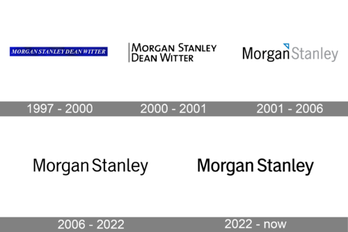
The bank was known as Morgan Stanley Dean Witter, so it was only natural that this name was reflected in the old Morgan Stanley logo. The name was given in an italicized all-caps sans serif. The white lettering was placed inside a long rectangle featuring a vivid and deep shade of blue.
2000 – 2001
The logo became completely different, although the company name did not change. The lettering was now black over the white background. The designers opted for an austere sans serif type. While all the letters were capitalized, the initials were larger than all the other letters. Also, there was a gray vertical line to the left.
2001 – 2006
The lettering was reduced to “Morgan Stanley,” although legally the company was still known under its old name. The first word was black, while the second word was gray. In between, there was a right triangle. It was white with a light blue trim. The company stated it was a “directional triangle” that “pointed toward the northeast, the general direction of financial success.”
The type was completely different from the previous one.
2006 – 2022
In September 2009, the company quietly rolled out its new logo. It was not radically different.
While the font was definitely inspired by the previous one, it looked somewhat flatter. More importantly, the light blue triangle disappeared. Both the words now were black. According to the company’s spokeswoman, the new design reflected the “ongoing evolution of the brand and a rebranding under John Mack.”
2022 – Today
The logo in the image presents a clear and straightforward design, consisting of two words: “Morgan Stanley.” The font used is sans-serif, which is characterized by its clean and modern look, lacking any decorative flairs or serifs at the ends of the strokes. The letters are all capitalized, suggesting a sense of formality and professionalism.
The color of the text appears to be a solid black, which stands out against the plain white background, providing a strong contrast that makes the logo easily legible from a distance. The choice of black and white in logo design symbolizes clarity, sophistication, and neutrality.
There is a notable absence of any graphic elements or icons accompanying the text, which implies that the brand’s identity leans heavily on its name recognition rather than imagery. This minimalist approach to logo design can indicate a company’s confidence in its established reputation and its focus on simplicity and directness in communication. The spacing between the letters is consistent, contributing to the overall balanced and orderly appearance of the design. This type of logo, often referred to as a wordmark, relies entirely on text to convey the brand’s identity and is a common choice for companies in industries such as finance and law, where trust and integrity are paramount.
Colors
 The palette of the 1997 Morgan Stanley logo featuring a saturated shade of blue was the most remarkable one. In 2001, the colored surface was very small, while eventually, the logo went black and white.


