 Minnesota Intercollegiate Athletic Conference Logo PNG
Minnesota Intercollegiate Athletic Conference (MIAC) is a collegiate athletic conference in Minnesota, United States. It was established in 1920 and is currently owned by the member institutions. MIAC consists of 13 private colleges and universities, competing in various sports such as football, basketball, soccer, and more. The conference provides a platform for student-athletes to excel in their respective sports while balancing their academic commitments. With a strong emphasis on sportsmanship and fair play, MIAC fosters healthy competition and contributes to the overall development of student-athletes.
Meaning and history
The Minnesota Intercollegiate Athletic Conference (MIAC) was established in 1920 by representatives from seven colleges in Minnesota. It has since grown to include 13 private liberal arts colleges. MIAC has a rich history of athletic excellence, with its member institutions consistently achieving success in various sports. The conference emphasizes both athletic prowess and academic achievement, promoting the ideals of sportsmanship, fair play, and character development among student-athletes. MIAC teams have won numerous national championships and have produced many All-Americans and Academic All-Americans. Currently, the MIAC continues to thrive as one of the premier Division III athletic conferences, fostering a competitive environment while upholding the values of education and sportsmanship.
What is Minnesota Intercollegiate Athletic Conference?
The Minnesota Intercollegiate Athletic Conference (MIAC) is a collegiate athletic conference consisting of private liberal arts colleges in Minnesota, United States. It promotes competition and sportsmanship among its member institutions, offering a wide range of athletic programs for student-athletes.
2002 – 2012
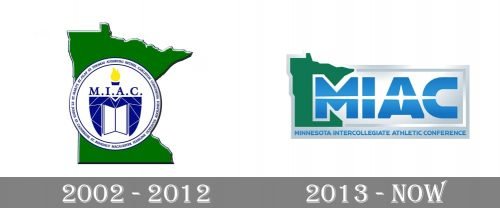
 In the previous version, there were two parts: the abbreviation over the black background and a burning torch. The emblem used in 2000-2012 featured both the map and the torch. There was also a rather complex design in the background, which made the logo look cluttered.
2013 – Today
In the current version, you can see the lettering “MIAC” in a futuristic style. A white highlight goes across the middle of the blue letters breaking each of them down into two parts. The “A” has an unusual elongated hole. In the background, there is a green map of the state of Minnesota.


