One of the largest financial services companies in France, LCL S.A. was founded in 1863 in Lyon by Henri Germain. Back then, it was known as Crédit Lyonnais. By 1900, it already gained the status of the world’s largest bank.
Meaning and history
For much of the bank’s history, the LCL logo was based on a combination of blue and yellow. There was some playing around with the shades and, more notably, the shape of the elements.
What is LCL
LCL S.A. is a large French financial company. The abbreviation comes from the old name Le Crédit Lyonnais. Prior to its nationalization in 1945, it constituted the largest part of the banking sector in the country.
1863 – 2005
It might be not that easy to accurately trace the original logo, especially given that in the 19th century views on what is brand identity and its parts were dramatically different from current ones.
However, many people are familiar with the primary logo used before 2005, when the bank was renamed. It’s one of its best-known logos in living history.
Its distinctive part was the square emblem in yellow and blue. The emblem housed a rather abstract symbol made up of four arrowheads. The sharp point of each of the arrowheads was directed towards a small circle. As a result, the circle was like the center of a flower. Alternatively, it could be interpreted as the sun rising above the sea (or above the river, which is more likely in the case of the French city Lyon).
The sun-above-the-river theory can be supported by the fact that below the “sun,” there is a blue rectangle and that the gold color is used.
Most importantly, though, the emblem contains the letters “C” and “L,” which form the abbreviated name of the company. Due to it, this part of the logo could be used separately in many circumstances.
However, the primary version of the LCL logo also included the full name of the company. It was placed to the right of the emblem. The designers opted for a neat and highly legible sans serif typeface. The color blue is of the same shade as the one used in the emblem. There are two horizontal lines, above and below the wordmark. They help to make the lettering and the symbol look like parts of a single whole.
2005 – present
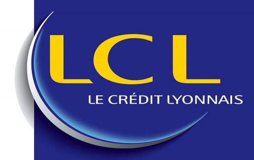
Having preserved the palette of its predecessor almost unchanged, the updated logo presents a more modern and dynamic image.
The centerpiece of the design is the abbreviation “LCL” in yellow, which is positioned inside a dark blue rectangle. The abbreviation is the new official name of the bank. The rebranding took place in 2005, in an attempt to get rid of negative references to the numerous scandals that the company had gone through over the previous decades.
The abbreviation was set in a type that combined classic proportions with a unique touch. While the overall look of the letters was pretty traditional, you can notice those unexpectedly rounded lower left-hand angles on the “L’s.”
What’s more, the two “L’s” aren’t identical – the initial has its lower right-hand end cut diagonally, while the final “L” has proper square ends. We can assume that the difference has to do with the large swoosh (crescent) seen in the emblem. The diagonal end makes the initial “L” “rhyme” with the swoosh.
The swoosh itself is silver with light blue and dark blue shades. It creates a dynamic impression and adds some depth (due to the shades). In terms of the meaning, we can suggest two main themes
- the company’s strive to be ahead (due to the implied motion)
- protection the bank promises to its customers (due to the way the swoosh creates a kind of fence to “protect” the letters)
Colors and font
The saturated blue in the 2005 LCL logo appears more beautiful and deep than the one used in the older version. The font has a pronounced custom touch.


