

![]() Las Vegas Desert Dogs Logo PNG
Las Vegas Desert Dogs Logo PNG
Located in Nevada, the Las Vegas Desert Dogs bring excitement and action to the community at the Michelob Ultra Arena. Given that the team does not have a long history, it is not surprising that there are no exceptional achievements. Like other lacrosse teams, though, the Desert Dogs drew a sizable crowd of fans and supporters. In turn, they try to ensure that the games are enjoyable and engaging. They have even moved to better serve their devoted followers.
Meaning and History
The city’s professional lacrosse franchise, the Las Vegas Desert Dogs, is the 15th expansion team in the NLL. Launched on June 21, 2021, the Desert Dogs kicked up their inaugural season at the end of 2022. The team chose its name for a reason. Besides reflecting its location, the name stood for the values and qualities of the team. The desert dog is a symbol of loyalty, diligence, humility, and teamwork. They are sly and clever, amiable but brutal, strong on their own, and unstoppable when they are together.
What is Las Vegas Desert Dogs?
Las Vegas Desert Dogs are a pro sports team from Nevada. This lacrosse team brings thrilling and high-intensity action. The Georgia Swarm is the Las Vegas Desert Dogs’ main opponent.
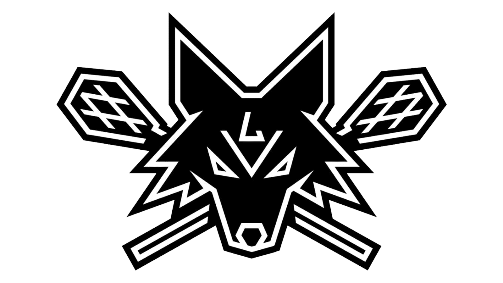
2022\23 – Today
![]()
The Las Vegas Desert Dogs’ black and white logo has a dog facing front with two lacrosse sticks on either side. The dog has a very courageous and fearsome look, which is enhanced by squinted eyes. The lacrosse team’s name is spelled out in strong, uppercase typeface beneath, reflecting the team’s fierceness and determination. A watchful eye will also notice the team’s initials on the dog’s forehead. They are done in an abstract way and resemble wrinkles on its forehead. The black color palette evokes images of the nighttime in the desert, when the desert dogs are free to roam and show their authority to anyone who crosses their path.
Font and Color
The logo features a single font and only turns to different font sizes for more interest. The font has no serifs and uses thick strokes. The font perfectly resembles Phonk Sans Black font.
A monochrome color palette is used for the logo. It looks modern and powerful. The black color is a symbol of strength, authority, and sophistication. It is very suitable for a sports team that desires to appear tough and confident.


