

![]() Kolkata Knight Riders Logo PNG
Kolkata Knight Riders Logo PNG
Kolkata Knight Riders were Indian Premier League champions in 2012 and 2014 and have acquired, according to Forbes, the highest brand value in the IPL. Kolkata Knight Riders has some top-notch global players and millions of fans around the world, as it is owned by famous actors Shah Rukh Khan and Juhi Chawla.
Meaning and history
![]()
Kolkata Knight Riders is a cricket franchise owned by the world’s most famous Bollywood actor Shah Rukh Khan through his company Red Chillies Entertainment in association with actress Juhi Chawla and her husband Jay Mehta from the Mehta Group.
The team is also referred to as ” All the Kings men”. The Knight Riders’ official motto is Korbo, Lorbo, Jeetbo Re, which is translated as “We will do, We will fight, We will win”, and the same words became the title of the team’s anthem, which was written by composers Vishal and Shekhar.
The official colors are purple and gold. The team’s uniforms were designed by India’s most famous designer Manish Malhotra. The team has its own mascot, his name is Hoog Lee, a lazy and charming Royal Bengal Tiger who loves hamburgers more than anything else.
One interesting fact about the Kolkata Knight Riders. The cricket team has 11 players on the field, but one of the club’s owners, Shahrukh Khan, has his own number, 12, depicted on his team uniform.
Of course, the beginning of the team’s popularity was due to its management – world-famous actors. Indeed, in the first few years of its participation in the premier league, Kolkata Knight Riders was not distinguished by outstanding results. The team’s performance, however, improved from the fourth season, allowing them to qualify for the IPL playoffs and reach the Twenty20 Champions League. They eventually became IPL champions for the first time in 2012 and repeated the success in 2014 by defeating Kings XI Punjab by 3 wickets in the final.
What is Kolkata Knight Riders?
Kolkata Knight Riders is the name of a professional cricket team, established in 2008 in Kolkata. The club is one of the ten members of the Indian Premier League, and by 2023 it has two wins in the IPL championships.
In terms of visual identity, Kolkata Knight Riders are bright, eye-catching, and powerful. The logo of the club is executed in an intense color palette, which looks royal and noble, but the shapes of the characters and graphical elements add a fighting spirit to it.
2008 – 2012
![]()
The original Kolkata Knight Riders logo was introduced in 2008 and stayed in use by the club for the first four seasons in the Indian Premier League. It was a gold and black banner with glossy lettering and a three-dimensional emblem placed in the right part of the composition. The emblem depicted a classic golden knight helmet with a fire coming out of its right top part. The lettering was set in a sharp designer font with elongated lines of thick stable bars.
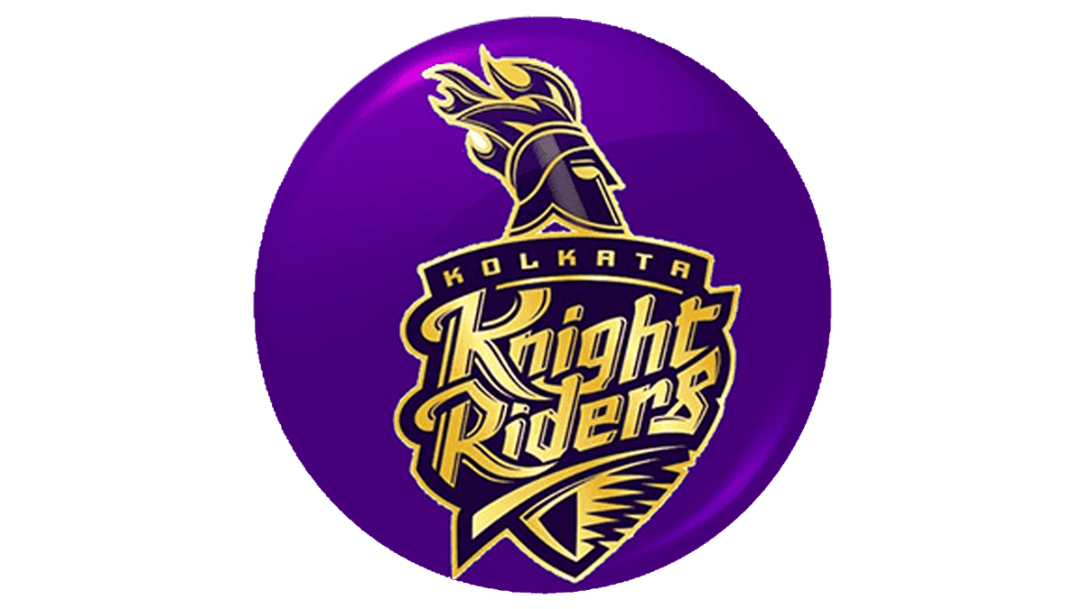
2012 – Today
![]()
The redesign of 2012 has introduced a new design concept and color palette for the Kolkata Knight Riders logo. Now the badge is executed in a purple and gold color palette, with the stylized lettering written in gold characters over a purple triangular shield, with the emblem placed on top of it. The emblem depicts a contoured helmet placed in profile, facing to the right, with an enlarged flame above it. The “Kolkata” inscription is set in all capitals over an arched gold banner roofing the crest.
Font and color
The lettering from the primary version of the Kolkata Knight Riders logo is set in two custom designer fonts, with “Kolkata” in geometric sans-serif, and classy shapes of the characters, and the “Knight Riders” in a fancy yet stable stylized script with elongated and curved lines of some letters.
As for the color palette of the Kolkata Knight Riders visual identity, it is based on the combination of deep purple, and glossy gold. This scheme is usually associated with royalties and traditions and evokes a sense of excellence and precision.


