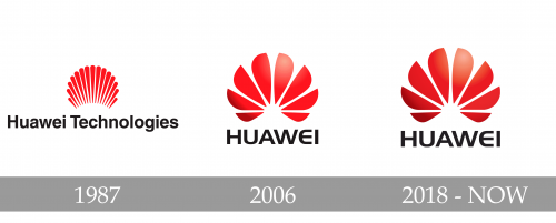
While the logo of the Chinese company Huawei has been upgraded not less than three times, it has stayed consistent in its core visual metaphor.
Meaning and history
The Chinese company Huawei is one of the leaders in the field of telecommunications, a leading supplier of smart devices and infrastructure in the field of information and communication technologies.
The Huawei company was officially registered in 1987. The head office was located in Shenzhen, the home of Ren Zhengfei, a Chinese entrepreneur, retired military officer, and founder of Huawei. Despite his military career, Zhengfei had been passionate about development and invention since his youth, and he served in the military as an engineer.
Ren Zhengfei dreamed of creating a brand in the field of telecommunications, capable of successfully competing with foreign companies. This is how Huawei came into being. The name of the company consists of two parts, where the word “Hua” is most often used to refer to the Celestial Empire and ethnic Chinese, and “Wei” – achievement or great accomplishment. So, putting the two together we get something like “China Achievement” or simply “Great Achievement”.
The first activity of the company was the resale of automatic telephone exchanges. It was planned to acquire capital in this way, with the help of which it would be possible to establish its own production in the future.
All the proceeds from resale were used for research. And in three years the company began to work on its own products: equipment, telephone switches, and software for signal transmission. And three years later, in 1993, Huawei released the most powerful at that time Chinese programmable switching system C&C08, designed to improve communication in provinces and small towns.
Since then, Huawei has never stopped for a minute. In 2003, the company decided to focus on the production of smartphones and tablets. In 2010, the company was ranked in the top 500 global large companies and top 5 large innovative startups. Along with the release of new models, the company continued to invest in research. Already in 2015, Huawei rose to the third place by the number of smartphones released in the world. By February 2019, the company had signed more than 30 5G contracts and installed more than 40 thousand 5G stations worldwide.
Today, Huawei employs about 200 thousand specialists around the world, and almost half of them are engaged in research and development. Huawei actively cooperates with Google, and with the German company Leica. Huawei products are now represented in more than 170 countries and regions, and the company’s developments and gadgets are used by 3 billion people around the world.
What is Huawei?
Huawei is the name of a Chinese consumer electronic manufacturer, which was established at the end of the 1980s. Today the brand operates worldwide, selling its telecommunication and IT products on all continents. The main production facilities of Huawei are located in China.
1987 — 2006
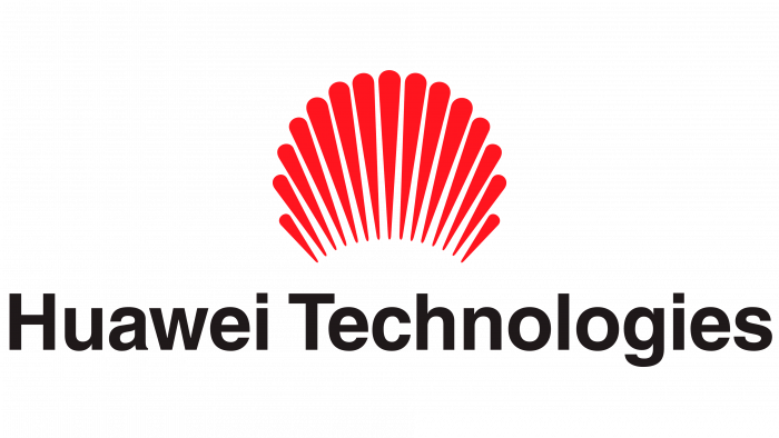
The story of the company started in 1987, and the original Huawei logo was adopted around that time. The emblem hinted at the meaning of one of the hieroglyphs forming the word “Huawei” in Chinese – it means “flower.” The earliest logo contained some of the elements that have been used on the following versions, too: the multiple petals, the red color, and the upward movement (similarity with the rising sun).
2006 — 2018
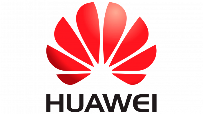
By 2006, the brand consultancy Interbrand modified the emblem. The petals grew wider and adopted a sharp angle, while their number grew smaller. A 3D effect was introduced for the first time, while the similarity with the rising sun grew even more perceptible.
2018 — Today
Another update took place prior to the launch of the P20 and P20 Pro smartphones in the spring of 2018. The shape of the “flower” stayed essentially the same, while the and color were slightly modified.
Colors
During the first 30 years of its history, the Huawei logo featured a bright shade of red, which was replaced by a cooler and slightly darker one in 2018.


