HP is the new name for the Hewlett-Packard, American IT Company, established in 1939. The company is best known for producing computers and accessories, but at the very beginning of its history, it was focused on software and computing services for commercial and individual customers.
Meaning and history
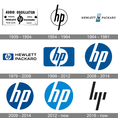
The iconic “HP” monogram on a circle has always been a part of the company’s visual identity, since the introduction of the first logo in 1939, though throughout the years the symbol gained color, cleaner contours, and perfection in everything.
1939 – 1954
The original HP logo was executed in a monochrome color palette and depicted a white italicized lowercase lettering set on a solid black circle, with the tails of the letters elongated and coming out of the circle to top and bottom, changing the color to black. The “Hewlett-Packard” inscription was written on the sides from the emblem in the capitals of a bold strong typeface.
1954 – 1974
The redesign of 1954 removed the additional lettering from the HP logo, and clean its contours. The new emblem featured a black monogram, placed on a white background and enclosed in a thin circle. The blacktails of both letters were crossing the circular frame.
1974 – 1981
The “Hewlett-Packard” lettering came back to the HP logo in 1974, after a new redesign. The badge, introduced this year was composed of a slanted vertical rectangle in blue and black, with a white circle and “HP” lettering in the middle. The additional lettering was executed in a classy serif typeface and italicized under the same angle as the emblem.
1979 – 2008
In 1974 the color palette of the logo was changed to calm blue, white and black, where the white circle with blue lettering was set on a blue rectangle with softened corners, and the two-layered “Hewlett-Packard” inscription in black capitals was placed on the right from the graphical part.
1999 – 2012
The black lettering was removed from the logo in 1999, and the blue and white emblem became the only element of the HP visual identity. The lines of the letters were cleaned and refined, and the whole composition started looking more professional and sophisticated than ever.
2008 – 2014
In 2008 the blue background was changed to white and the circle changed its color to blue, making the narrowed “HP” lettering white and “hiding” their elongated tails. With the reversed colors the badge started looking more interesting and crispy.
2009 – 2014
In 2009 the lettering on the badge was slightly refreshed, by writing them with more space in and between. Both letters were also a bit enlarged, which added brightness and more contrast to the circular blue and white badge.
2012 – Today
The redesign of 2012 brightened up the color palette of the HO logo, replacing its solid blue shade with a light sky-blue, which looks tender, friendly, and welcoming. The letters on the logo remained untouched, but with the new background, they started looking thinner and finer.
2016 – today
This logo is mainly used on premium products. It was developed by Moving Brands studio a few years earlier. The logo consists of only vertical lines that would form lowercase letters “h” and “p”. They are italicized and have straight cuts. This simplicity and symmetry create a very stylish, futuristic, and in some way mysterious logo. Unless you know the brand, it would be hard to guess who it belongs to.
Symbol
The emblem is pretty simple: just the name of the company written in two lines and a white rectangular with a green border. All the three words are written in a sans-serif font, the first line is in bold. The HP symbol is far from being imaginative, but at least it is easily recognizable and doesn’t leave you in doubt as to whom it belongs to.
Emblem
Unlike the logo that belongs to Hewlett Packard Enterprise, the HP emblem is pretty experimental. It consists of four lines angled at 13 degrees. Every line has a different length and is supposed to represent a part of the company’s name. The logo is sleek, elegant, and definitely looks innovative. However, a person can’t easily understand what company the emblem belongs to unless he is already familiar to it as the “HP” lettering is hardly readable.
The mark was created between 2008 and 2011 by the British creative agency Moving Brands. It looked so unusual that it was only in 2016 that the company dared make it is official logo.
Colors
While the older HP logo featured a white lettering on the blue background, the new one can be performed in a variety of colors.
Font
The “HP” insignia is made in a totally futuristic typeface. The “H” and “P” characters are formed with four diagonal slashes.


