Whether for a car brand or a tech company, creating a logo that represents the brand and also somehow resonates with the consumers is very important. It creates brand recognition and helps companies in developing an identity for themselves over time. But how do you make the choice of colors for the logos of technology brands?
Common Technology Colors
When it comes to tech companies, there are some colors that are seen more often than others. The color theory behind such preferences has been of interest for quite some time. So much so that we see essays and papers written about the effects different hues have over the viewer. Design students are often asked to write such texts and you can easily find free essays on technology companies that talk about such topics in detail. Most often, you will see blue as the preferred selection, with black and white being other effective colors. However, blue is a color that is seen being used by some of the largest firms in this category, including IBM, Dell, HP, and SAP.
Blue signifies success and power, other than being the favorite color in the world. Older insignias with this hue usually preferred darker shades combined with black. Both these are powerful tones that add an element of sober authority to a design. However, as this sector grew and matured, lighter and brighter branding became more common. The dark blues transformed into more electric shades. This was so popular that some of the earliest software programs also had an overall bright blue tone.
Signaling Newness
With Apple’s rainbow-colored insignia back in the 1980s, the idea to use rainbow hues to signify a sense of newness was born. The firm wanted to show the world that it was new and fresh, bringing different ideas to the tech landscape. And this combination of multiple hues never died. It was seen in multiple branding choices after that, with eBay, Google, and Microsoft being some examples. In all of these cases, the marketing was based around the fact that new and bold ideas were being brought to the market and the playful energy brought by yellow, red, green, and blue all together gave that understanding.
So, How to Choose the Right Palette?
Other than personal preference, the right color palette for any tech firm relies on a few factors. The selection you make can impact your company either positively or negatively, which is why it is important to give this step its due attention.
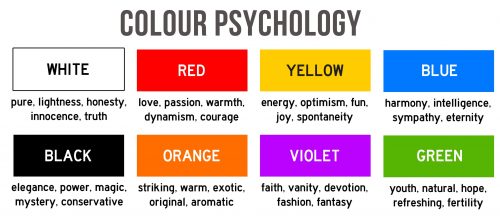
Before anything else, you should understand some of the meanings that are usually reserved for different hues:
- Red – love, anger, passion
- Orange – energy, power, joy
- Yellow – hope, happiness, satisfaction
- Green – nature, new beginnings, success
- Blue – peace, sorrow
- Black – class, evil, mystery
- White – purity, cleanliness, peace
On the basis of these, you should first decide what you want your brand to signify. Using color psychology, you can come up with designs that are dynamic not only in their palette but also in their meaning. Is your firm going to portray having a serious, ‘corporate’ culture or are you going for a design that takes a more fun approach? Making any good design starts from such an introspection so make sure you include this step in your process.
Keep An Eye On Your Competition
Whenever designing any kind of strong visual or graphic content, be sure to take into account what your closest competitor has done. If they’ve used purple in their insignia, try not to use it in yours because it can make things a little confusing for the consumer. You should aim to convey a new message and create an identity different than your competition. Only then will customers be able to remember the visuals of your brand instead of always having to search for the right firm they’re looking for.
Using a Neutral Base with an Accent Works Well
If you cannot come up with a nice selection of hues, you can use black or gray as a base and then add color as a highlight. A light but bright or neon shade that is contrasted with a neutral base often makes for very cool designs. One example of this is the Nvidia logo which not only looks great but also creates a long-lasting digital presence. So, if you have some primary elements or images to use in your design but are unsure of the exact palettes, start with a neutral base and then add a contrasting tone for a striking effect. You can even keep the whole base white if you want.
Check Current Trends
You may also want to check what the current trend is when it comes to different ways of creating an insignia. Are warm hues more in? Or are people liking more contrasty hues? Social media is a great way to run some polls or ask your customers about their opinions. This often leads to the best kind of research you can do when deciding what kind of emotion or reaction you wish to be related to your brand’s identity.
Another reason to stay updated with trends is to do something completely different and carve your own lane. That is a great way for any business to develop its own identity and not be confused with any other tech firm.
Conclusion
There are a number of resources you can use to figure out how different hues make the viewers feel. Some evoke a sense of calm while others signify excitement. Some look clean while others look confusing. Using all the knowledge available and doing proper market research, just like you would for developing any product, is essential when coming up with a logo design. Because an insignia that is memorable and well-designed stays in the minds of the customers for much longer than one that is derivative and forgettable.


