Home Credit specializes in installment lending primarily to people with little or no credit history. It is an international non-bank financial institution based in the Netherlands. It works in around ten countries.
Meaning and history
The company was started in 1997 in the Czech Republic.
1997 – 2009
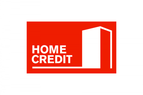
The original Home Credit logo was more direct than the current one. It wasn’t as stylish, too.
You could see a part of a rectangular prism (cuboid), which represents a building (or an open door). To the left, the lettering “Home Credit” can be seen. The image is housed inside a red rectangle with white and red trim.
2009 – 2017
The red has grown slightly warmer. The white trim disappeared and was replaced by a single white stripe in the lower part of the design. The shape of the wordmark and the “door” slightly changed without altering the overall style of the emblem.
2017 – Present
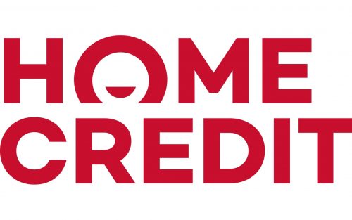
The red background and the “door” are gone. Instead, we have the name of the brand in red with a white background.
And yet, in spite of losing many of its elements, the logo is even more meaningful than its predecessor. This results partly from the way the word “Home” is positioned slightly behind the word “Credit,” which symbolizes a coin going into the hole in the moneybox.
The “O” with a semi-circle inside works for the same purpose. It also represents a smiling face making the emblem friendlier.
Font
The Home Credit logo has always featured an austere sans serif typeface. While the shape of the glyphs has been slightly updated over time, the overall style has remained the same.
Colors
The main color, red, has always been rather bright. The original version featured a cooler hue than the ones released in 2009 and 2017.


