Today, Hitachi is not just a Japanese brand known for its quality appliances, but a huge financial and industrial group, which includes more than 1100 companies. However, to this day, for consumers from all over the world, Hitachi is known for its wide range of household appliances, including refrigerators, multicookers, vacuum cleaners, air conditioners, and much more. Established in 1910, Hitachi is a reputable company with a very confident and long history.
Meaning and history
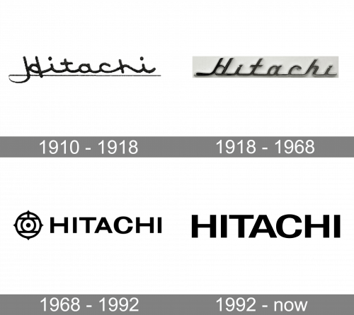
The oldest part of the logo is the Hitachi Mark, which, according to the company history, was created by the founder, Namihei Odaira, in 1912. The name of the new company was made up of two hieroglyphs, “hi” (“sun”) and tachi (“rise”). Odaira placed the hieroglyphs inside a circle to form the emblem that is still used on the corporate flags, badges, and awards. It can also be seen before the company name on billboards and signs.
1910 — 1918
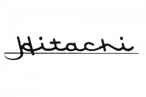
The original wordmark used left-tilted, cursive letters, colored in black. They were written in one go, meaning there’s a line connecting them in the bottom. Furthermore, there’s a thin line underneath the wordmark.
1918 — 1968
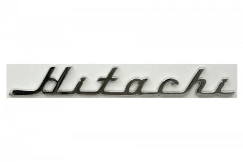
In 1918, they tilted the letters the other side and made them more linear. The thin underline was gone, but the connecting stroke was ironed out into an almost single horizontal line in the base of the word.
1968 — 1992
The international version of the logo introduced in 1968 showcases the word “Hitachi” in a minimalist all-caps sans. While the type is utterly generic, the design gets a unique touch due to the emblem. It is rather intricate and is formed by multiple elements. On the whole, it resembles an eye, which adds the impression that the logo is “looking” at you.
1992 — Today
The primary logo features the word “Hitachi” in capital letters. The logo is red or black, while the background is white.
In addition to the company name, the Corporate Statement Hitachi logo sports the motto “Inspire the next.” While the letters are grey, the design element above the “t” is colored red.
Font
The type featured in the wordmark resembles the Helvetica 73 Bold Extended and the Univers Bold fonts.


