The logo of the Buffalo Wild Wings Bowl featured a literal implementation of the name of the bowl. You could see a winged buffalo at the top of the design. From both sides, there were three white stars. Below, the name of the game, “Buffalo Wild Wings,” was written in white across a black banner. Below the banner, you could see a yellow field featuring the word “Bowl” in black. The “O” was formed by a football. The overall shape of the Buffalo Wild Wings Bowl logo was a shield.
Meaning and history
The name Buffalo Wild Wings was used from 2015 to 2017. Originally, the game was played as the Tangerine Bowl (from 1947 to 1983). It is currently known as the Citrus Bowl.
What is Buffalo Wild Wings Bowl?
Buffalo Wild Wings Bowl is the intercollegiate football bowl game, which was held in 2013 in Arizona. The Bowl was established in 1989 and has been changing its name almost every season.
1996
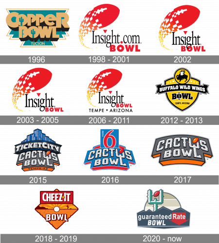
The Buffalo Wild Wings Bowl was established as the Tangerine Bowl, which changed to the Copper Bowl in 1996, with the new logo. The badge of the Bowl, created in 1996, featured a cool gold and turquoise composition with the geometric banner in a double white and gold outline, and a massive sans-serif lettering with a black shadow and two turquoise cactuses replacing the negative spaces in both letters “O”. The “Tucson” tagline was set in the uppercase of a more traditional sans-serif font, written in gold over the turquoise background.
1998 – 2001

In 1998 the name of the Bowl was changed to the “Insight.Com Bowl”, and the logo was redrawn according to the sponsor’s corporate style. It was a red, white, and orange rocket, stylized as a rugby ball, and flying from the left part of the badge. The lettering on the logo was set in a simple yet elegant serif typeface, with the narrowed letters in black, the dot above the “I” replaced by a solid red triangle pointing down, and the dot inside the wordmark enlarged and also colored red. The second line of the inscription comprised an extra-bold capitalized “Bowl” in intense red.
2002
In 2002 the “.Com” part in the logotype was removed, and all elements of the badge became a bit smaller, which made the whole logo look more delicate and elegant. With the shortened version of the wordmark, everything became more logical and balanced. The red “Bowl” got shifted to the left, and now the “O” was intertwined with the right on the tail of the black letter “G”.
2003 – 2005
The redesign of 2003 also played with the “Bowl” part of the badge, making it smaller than on the previous version, and moving it a bit to the right. Now the first letter of the tagline was set on the right from the tail of the “G”. As for the main emblem and logotype, they all remained untouched.
2006 – 2011
The red “Bowl” became a bit smaller again, and the whole badge got the new underline. Now it was a lightweight black “Tempe Arizona” inscription in the uppercase of a clean and modern sans-serif typeface, with the two words separated by the solid black triangle pointing down, just as the one that was replacing the dot above the “I”. The “Insight” lettering got a bit narrowed, which was now more visible due to the wide shapes of the tagline’s letters, and a lot of space there.
2012 – 2013
In 2012 the Bowl was renamed the Buffalo Wild Wings, and the new logo was drawn in a completely different style and mood, with the use of a yellow and black color palette, and some small white accents. The badge featured a shape of a wide triangular crest with the sides arched from the center. The crest had a yellow body and a triple black and white outline. The upper part of the badge was decorated by a solid yellow circle in the same black and white outline, and a cool image of a black bull with white wings, drawn in profile facing to the left. Across the crest, there was a solid black ribbon in a white outline set, with the bold geometric inscription with massive white letters. The black “Bowl” was placed under the ribbon and had its “O” replaced by a vertically set rugby ball. The upper part of the logo was decorated with six solid white five-pointed stars, and the bottom part — with the “Tempe, Arizona” wordmark in simple lightweight black sans-serif letters, enclosed between two white horizontal lines.
2015
The name of the bowl was changed to the Cactus Bowl in 2015, and the new badge was introduced in the same year. The new concept boasted a gray banner with orange shadow and massive gothic-style lettering on it. The upper part of the logo was decorated by the banner with the “Ticket City” sponsor’s wordmark, and the blue city landscape drawn above it. As for the main lettering, it has its classy letters written with wishbone details and diagonal cuts of some lines. As for the color of the letters, they were set in white and light gray, which made them look voluminous. The “L” in the “Bowl” has its vertical bar elongated and crossing the bottom line of the letter “U”, set above it, and it created a Cactus-like image, with the small rugby ball diagonally placed on the top.
2016
The color palette of the Cactus Bowl logo was changed to blue and red in 2016. The upper part with the “Ticket City” banner and the city landscape image was removed, and now there was a solid blue square card with the enlarged red numeral “6” on it. As for the main part of the logo, it featured the same style of lettering but had the rugby ball drawn in red, and all the shadows on the banner too.
2017
With the redesign of 2017, the upper part of the Cactus Bowl logo was completely removed, and the color palette was changed again. Now the background of the banner was set in solid gray, with the letters in the same white and light gray texture, and a bold black outline. As for the shadows and the rugby ball, set diagonally over the letter “U”, they were executed in bright orange.
2018 – 2019
The new name of the Bowl and its new logo was introduced in 2018. The Cheez-It Bowl had fun and bright rhombus badge in orange, which was horizontally divided into two parts: the upper triangle with stylized sun rays, and the bottom one with solid orange texture and some darker small spots all over it. The white circle in a dark brown outline was set in the center of the badge, like the sun, with the rays coming out of it up and to the sides. Under the circle, the bold white “Bowl” in a thick outline was written, and on the top parts of the logo — a horizontally oriented rectangular banner with the softened angles was drawn in dark red and had a white narrowed “CheezIt” logotype on it. The inscription was set in a clean sans-serif typeface, and had a small yellow square with a burgundy dot, separating two parts of the wordmark.
2020 – Today
The logo of the Bowl gets redesigned again in 2020. The circle with light beige and white horizontal stripes was hiding behind the wide blue banner with triangular elements over its top border. The “GuaranteedRate” inscription in a traditional sans-serif was written in white letters above the stylized italicized “Bowl” in square capitals, over the blue banner. The “Rate” part of the inscription was set on a solid red arrow pointing down. Another element of the badge is the calm-green cactus, with the dark red rugby ball on it. This element was taken from the iconic Cactus Bowl logos.


